Subscribe to Hello World
Hello World is a weekly newsletter—delivered every Saturday morning—that goes deep into our original reporting and the questions we put to big thinkers in the field. Browse the archive here.
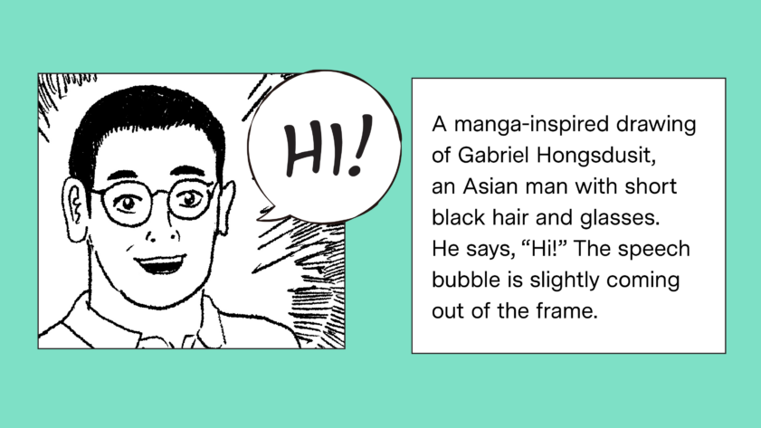
Hello, world! I’m Soo (rhymes with “zoo”), an editor here at The Markup and one of the new hires seen in recent newsletters.
Zine: How We Illustrate Tech (and AI) at The Markup
A lot of what we cover is tough to visualize. We've developed a number of tricks to help—and a comic to tell you all about them
This week, visual designer Gabriel Hongsdusit published a comic zine about the difficulties of illustrating technology stories and tricks for how to overcome them based on his experience of making, commissioning, selecting, and art-directing visuals for our site. The zine is available in multiple formats: online, print, PDF, and in plain text to be accessible to readers with vision impairments.
The plain-text zine seamlessly inserts text descriptions of the comic panels between Gabriel’s narration, much in the same way audio descriptions for movies and TV shows describe what’s happening on screen between character dialogue. (I loved reading this behind-the-scenes story on the spicy audio descriptions of Netflix’s “Bridgerton” series.)
I talked with Gabriel about his approach to visual accessibility, his insights into the zine, and The Markup’s workflow below.
How did you plan for the plain-text zine?
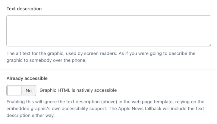
I like to think that here at The Markup, we’re always thinking about accessibility when it comes to our visual storytelling. We try to ensure that every photo, illustration, and graphic that’s published on our site has alt text. There are a lot of reminders baked into our workflow to consider screen reader accessibility. For example, when we publish a graphic, we have a field for alt text that asks us to “describe the graphic to somebody over the phone.” There’s also a toggle for graphics whose HTML can be natively read by screen readers. If we try to publish a visual without alt text on our site, we get a warning message.
When we came up with the idea of publishing a comic on our site, we knew we had to think about accessibility for screen reader users from the get-go. I read this really helpful blog post about comics accessibility that introduced me to the idea of writing a detailed text transcript. I liked that approach because it’s a really simple and elegant way to present information to a screen reader user. In a comic or manga, there are two things to describe: text and imagery. A detailed text transcript presents both things panel-by-panel, much like how a visual reader would consume an image-based comic.
What else is important to know about your approach to visual accessibility?
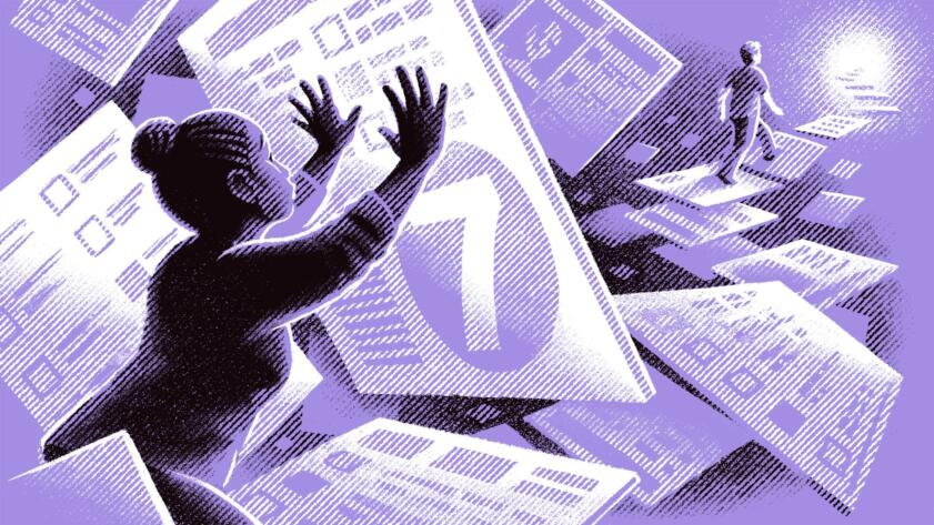
I think it’s important to be very intentional when you include race and gender in alt text. There’s a great guide on writing image descriptions that recommends describing race and gender only if it is relevant, known, and consistent. I try to follow those guidelines. For example, our zine references this fantastic illustration by Brian Britigan, which we describe as:
Hello World
A Racially Biased Scoring System Helps Pick Who Receives Housing in L.A.
And it’s probably happening in your community too
An illustration of a Black woman pushing up against an enlarged square with the number seven on it. There is a White person walking over the squares as steps in the background. On each square are survey questions.
Race is relevant in the image because it accompanies a story about a racially-biased scoring system that favors White people over Black people. It’s known because I asked Brian to draw the two people in the piece as Black and White. And it’s consistent because both people’s races are being described.
If those three criteria are not present, I try not to include race or gender in image descriptions, because I don’t want to assume those things based on perception alone.
Thinking about accessibility with visual storytelling is one way we can make our work more inclusive and participatory.
Be sure to check out the visual zine and plain-text zine, and let us know your thoughts. If you’re a screen reader user and you’d like to share your experience reading the plain-text zine, you can reach Gabriel at gabriel@themarkup.org.
And a special shoutout to the illustrators whose work was used in our zine: Brian Britigan, Anson Chan, Joi Fulton, Ryan Raphael, Adrián Astorgano, Jarred Briggs, Ariel Davis, Chris McNally, Chanelle Nibbelink, Victor Bizar Gómez, Jaimie Shelton, Eva Redamonti, and Allison Vu.
Thanks for viewing, reading, and/or listening.
Soo Oh
Editor
The Markup