Read this zine in plain text.
Challenging technology to serve the public good.
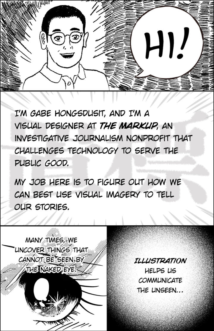
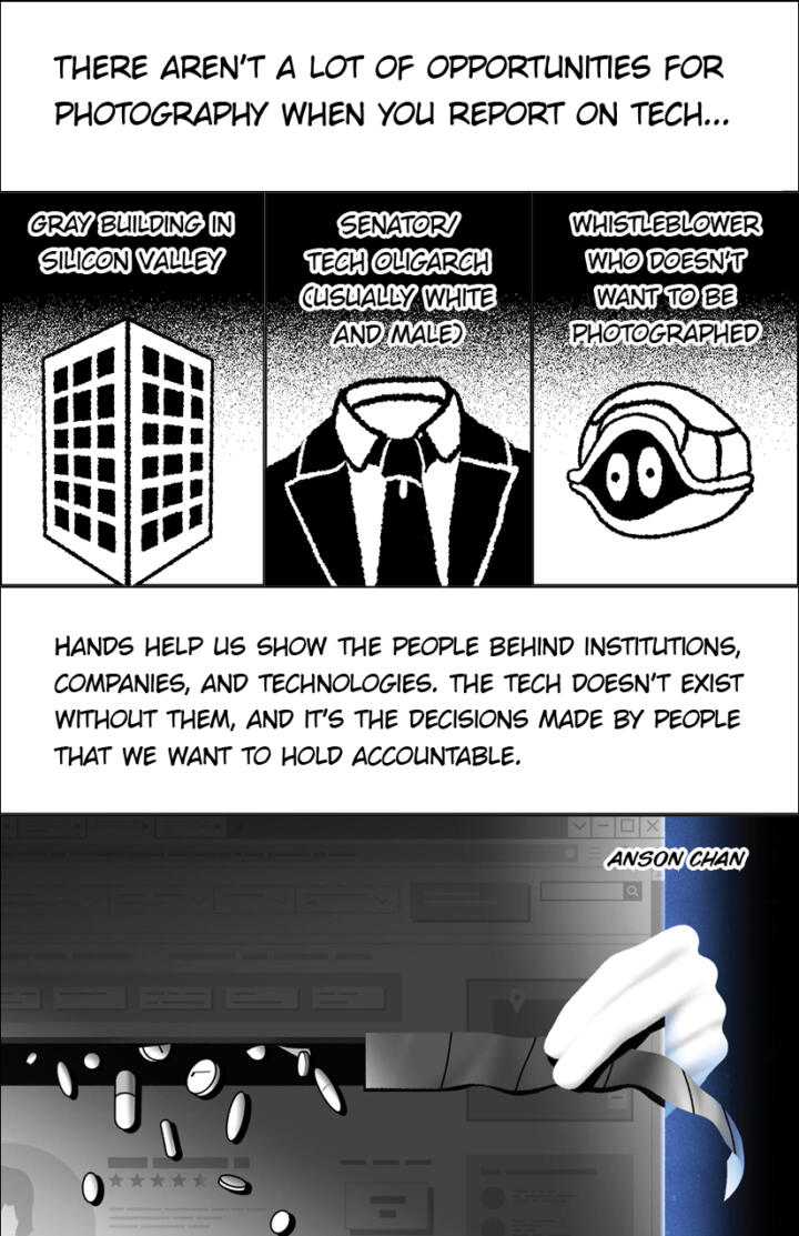
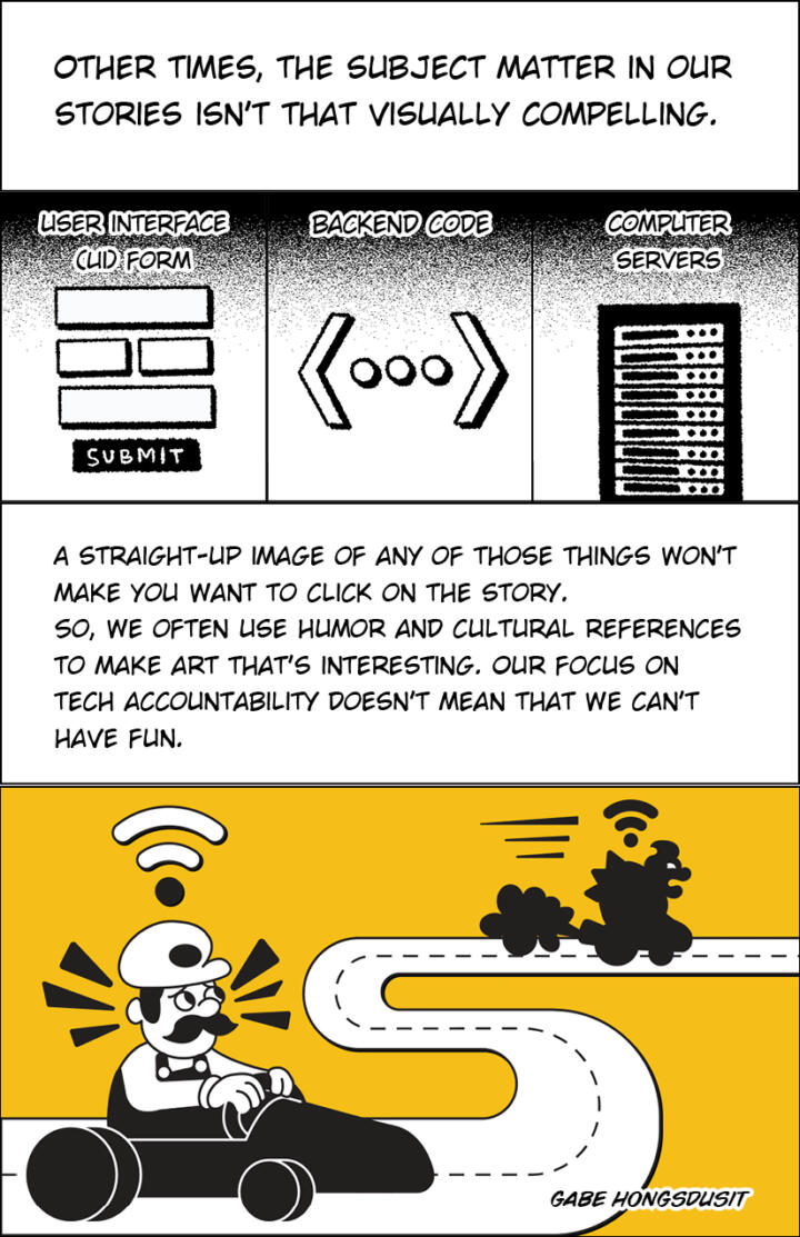
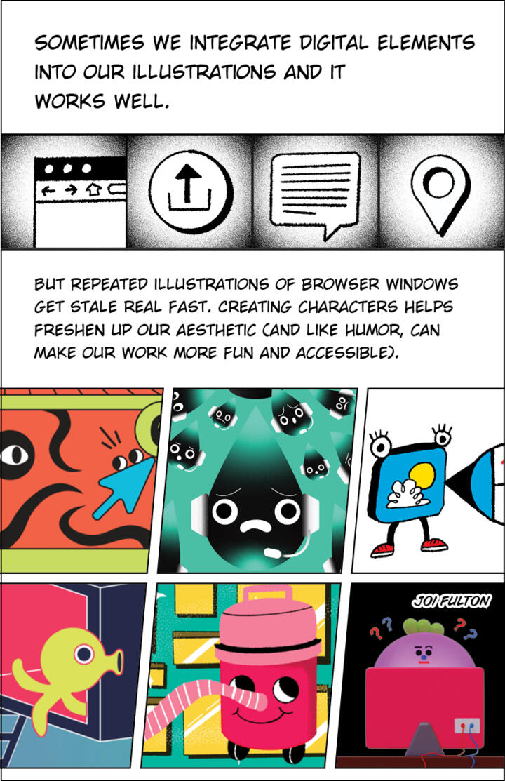
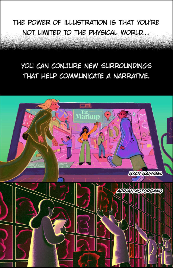
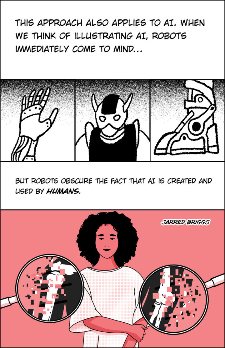
A lot of what we cover is tough to visualize. We've developed a number of tricks to help—and a comic to tell you all about them

Hello World
And it’s probably happening in your community too

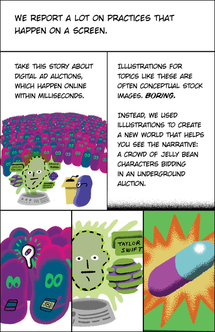
Privacy
In mere milliseconds, online advertisers scrutinize your personal data and bid for your eyeballs
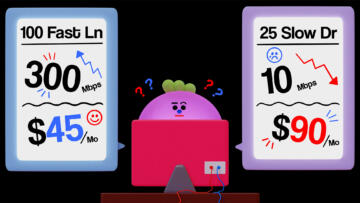
Build Your Own Dataset
All you need to test for disparities in internet speeds and pricing is a computer, internet access, a Google account, and some free time