Read this zine with images. We used this blog post as a guide to writing a transcript that would make this comic more accessible.
Cover
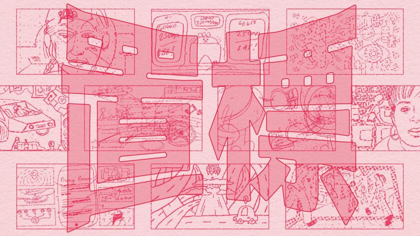
Cover illustration featuring panels of rough pencil sketches of illustrations that The Markup has published. The center of the cover has the header text “How We Illustrate Text (and AI) at” in its own bubble. Below that is The Markup logo in a speech bubble. At the top and bottom of the cover are the Chinese characters 標記 which translate to “The Markup.”
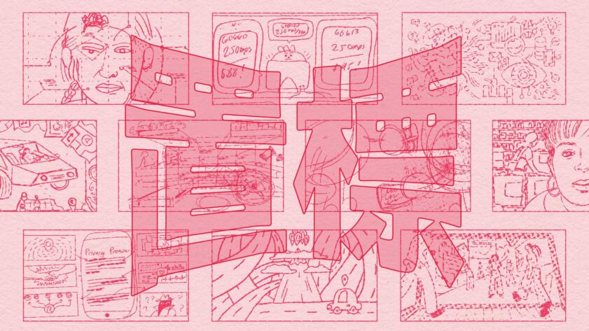
Zine: How We Illustrate Tech (and AI) at The Markup
A lot of what we cover is tough to visualize. We've developed a number of tricks to help—and a comic to tell you all about them
Page 1
Panel 1: A manga-inspired drawing of Gabriel Hongsdusit, an Asian man with short black hair and glasses. He says, “Hi!”
Panel 2: “I’m Gabe Hongsdusit, and I’m a visual designer at The Markup, an investigative journalism nonprofit that challenges technology to serve the public good. My job here is to figure out how we can best use visual imagery to tell our stories.”
Panel 3: “Many times, we uncover things that cannot be seen by the naked eye.” Below is an illustration of a manga-style eye, with sparkles and pronounced eyelashes.
Panel 4: “Illustration helps us communicate the unseen…”
Page 2
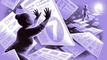
Panel 1: “Take this story about a scoring system in Los Angeles that determined who got subsidized housing.”
Panel 2: An illustration of a Black woman pushing up against an enlarged square with the number seven on it. There is a White person walking over the squares as steps in the background. On each square are survey questions.
Panel 3: “This illustration by Brian Britigan tied together lots of abstract concepts that didn’t naturally have visuals:”
Panel 4: The word “racism” written over a close-up image of the Black woman from the previous illustration.
Panel 5: The phrase “access to resources” written over a close-up image of the White person walking away on squares.
Panel 6: The phrase “…and the simple algorithm that affected everything” written over a close-up image of one of the squares showing a number seven.
Page 3
Panel 1: “To help people understand our stories, we use four themes and motifs.”
Panel 2: The header text “Hands” above an illustration of a hand, with the finger and thumb pressed together like a snap to form a heart shape. There is a little heart icon floating above it.
Panel 3: The header text “Humor and Pop Culture” above an illustration of a distorted cartoon mouse with buck teeth.
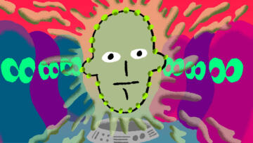
Panel 4: The header text “Characters” above an illustration of a cartoon face with pie eyes (the pupils are shaped like a pie with one slice removed from it) and pronounced eyelashes. The face has a wide button nose and smile.
Panel 5 : The header text “World-building” above an illustration of an open door leading to a winding road and clouds.
Page 4
Panel 1: “There aren’t a lot of opportunities for photography when you report on tech.”
Panel 2: The header text “Gray building in Silicon Valley” above an illustration of a building.
Panel 3: The header text “Senator/tech oligarch, usually White and male” above an illustration of a headless suit and tie.
Panel 4: The header text “Whistleblower who doesn’t want to be photographed” above an illustration of a turtle hiding in its shell.
Panel 5: “Hands show that people are behind institutions, companies, and technologies. The tech doesn’t exist without them, and it’s the decisions made by people that we want to hold accountable.”
Panel 6: Illustration of a grayed-out web browser showing a hospital portal. A white hand behind it is pulling off a strip of the browser and pills are falling out of that strip. There is a blue glow behind the edge of the browser window.
Page 5
Panel 1: “Other times, the subject matter in our stories isn’t that visually compelling.”
Panel 2: The header text “UI Form” above an illustration of four blank fields on top of a button that says “submit.”
Panel 3: The header text “Backend Code” above an illustration of the code symbols “<…>.”
Panel 4: The header text “Computer Servers” above an illustration of a computer server.
Panel 5: “A straight-up image of any of those things won’t make you want to click on the story.
So, we often use humor and cultural references to make art that’s interesting. Our focus on tech accountability doesn’t mean that we can’t have fun.”
Panel 6: Illustration of an Italian plumber racing cars against an evil turtle. The plumber is lagging behind and has a low Wi-Fi symbol above his head. The turtle is ahead of the race and has the full Wi-Fi symbol.
Page 6
Panel 1: “Sometimes we integrate digital elements into our illustrations and it works well.”
Panel 2: Illustration of the close-up of a browser window.
Panel 3: Illustration of a round upload button, with an up arrow pointing out of a three-sided rectangular line.
Panel 4: Illustration of a chat bubble.
Panel 5: Illustration of a location pin.
Panel 6: “Illustrations of browser windows get stale real fast. Creating characters helps freshen up our aesthetic (and like humor, it can make our work more fun and accessible).”
Panel 7: An illustration showing a black-tentacled creature chasing a blue cursor with googly eyes.
Panel 8: An illustration showing water droplets falling from a faucet and wearing ChatGPT headsets.
Panel 9: An illustration of a square weather-app character wearing red shoes. There’s a close-up vignette on the side of it showing a red pin sticking out of it.
Panel 10: An illustration of a yellow octopus peeking out of an abstract structure.
Panel 11: An illustration of a smiling pink vacuum character.
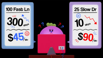
Panel 12: An illustration of a puzzled character with a round face, behind a computer monitor.
Page 7
Panel 1: “We report a lot on practices that happen on a screen.”
Panel 2: The header text “Take this story about digital ad auctions, which happen online within milliseconds,” written over an illustration of an auctioneer at a lectern presenting user data in the form of a hologram to an audience of advertisers.
Panel 3: “Illustrations for topics like this are often conceptual stock images. Boring! Instead, we used illustrations to create a new world that helps you see the narrative: A crowd of jelly bean characters bidding in an underground auction.”
Panel 4: An illustration of an advertiser character placing the winning bid. The character is wearing a badge showing a teal and purple pill and holding up a paddle.
Panel 5: A close-up image of a user hologram with floating icons and text around the head (“Taylor Swift”).
Panel 6: An illustration of a banner unfurling over an image placeholder to reveal the advertisement: a teal and purple pill.
Page 8
Panel 1: “The power of illustration is that you’re not limited to the physical world…”
Panel 2: The text “You can conjure new surroundings that help communicate a narrative” is written over a dark background.
Panel 3: An illustration of two people walking into a laptop screen, which has several people inside it working on various screens. The Markup logo appears at the top.
Panel 4: An illustration of scientists analyzing a wall with boxes of human heads. Some scientists have clipboards, others are picking up the heads off the shelves.
Page 9
Panel 1: “This approach also applies to AI. When we think of illustrating AI, robots immediately come to mind…”
Panel 2: An illustration of a robotic hand.
Panel 3: An illustration of an anime-style robot.
Panel 4: An illustration of a robotic foot.
Panel 5: “But robots obscure the fact that AI is created and used by humans.”
Panel 6: An illustration of a woman, with her left hand holding her elbow. Next to her are magnifying glasses showing a close-up of her X-ray, but the image dissolves into pixels.
Page 10
Panel 1: “Julien Posture, who writes a weekly newsletter on visual culture, wrote this spot-on quote:”
Panel 2: “From abuse of underpaid labour in post-colonial settings to the objectification of people’s lives and work as ‘data’ to the extraction of rare minerals to power increasingly demanding computational needs, AI runs not on sci-fi futuristic utopia but on the appropriation of today’s world’s material and human resources.”
Panel 3: “It can feel like we’re living in end-times for artists when AI, trained on images without consent from their creators, can conjure up new images within seconds.”
Panel 4: “But our hope is to use illustration to hold PEOPLE and the decisions they’ve made through AI and other forms of technology accountable.”
