While generative AI actively seeks to devalue creative work, we turn to illustrators and their expertise to amplify and improve our reporting on technology. Illustration is a powerful storytelling tool at The Markup, where our investigations tend to be about things happening behind screens and browser windows, invisible or seemingly innocuous to the naked eye.
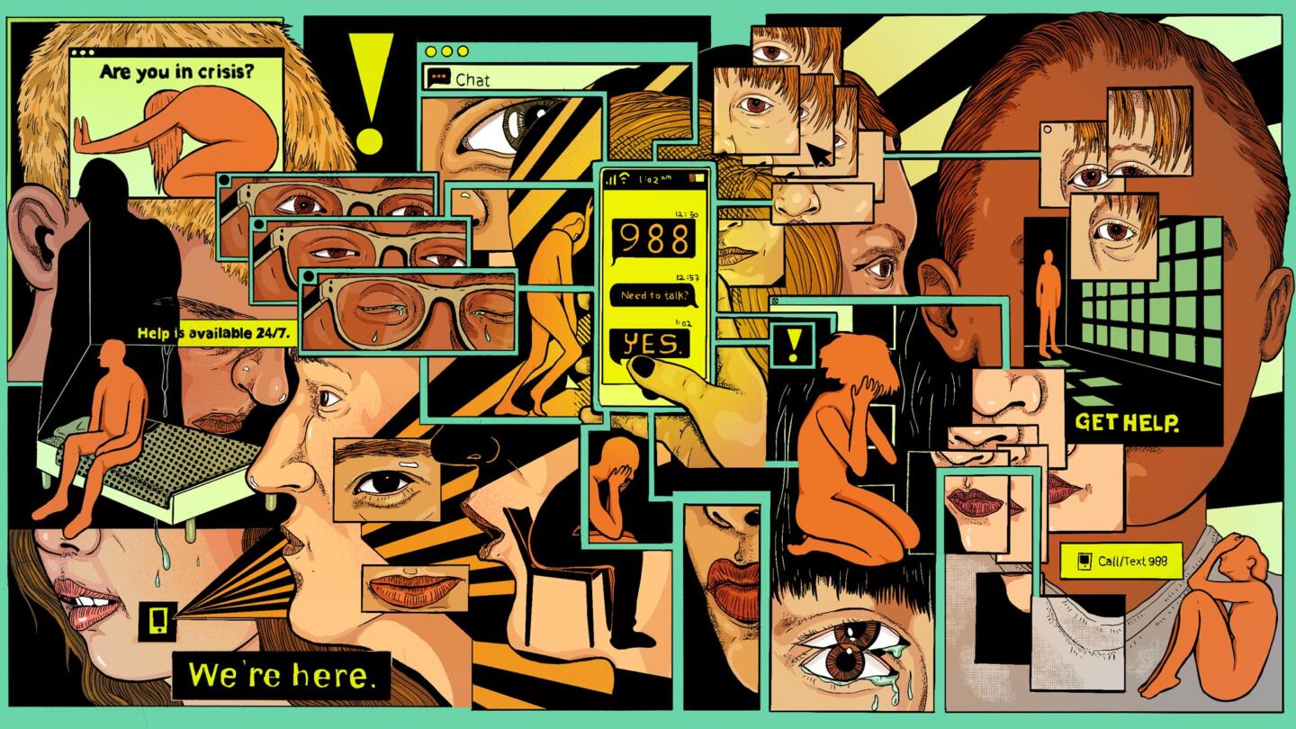
This year, artists have helped us bring readers into these complex stories. An arresting image of pop-ups and vignettes of people in crisis, inspired by Dutch graphic artist MC Escher, tells a story of how suicide hotlines are sending sensitive data to Facebook. Or an illustration of an ethereal floating caterpillar, referencing the timeless children’s book by Eric Carle, invites readers to learn more about ChatGPT’s complicated ability to create bedtime stories. I also illustrated a zine on how we illustrate tech and AI at the Markup.
Here is a sampling of some of the most evocative illustrations that we published this year, and the stories that accompany the art.
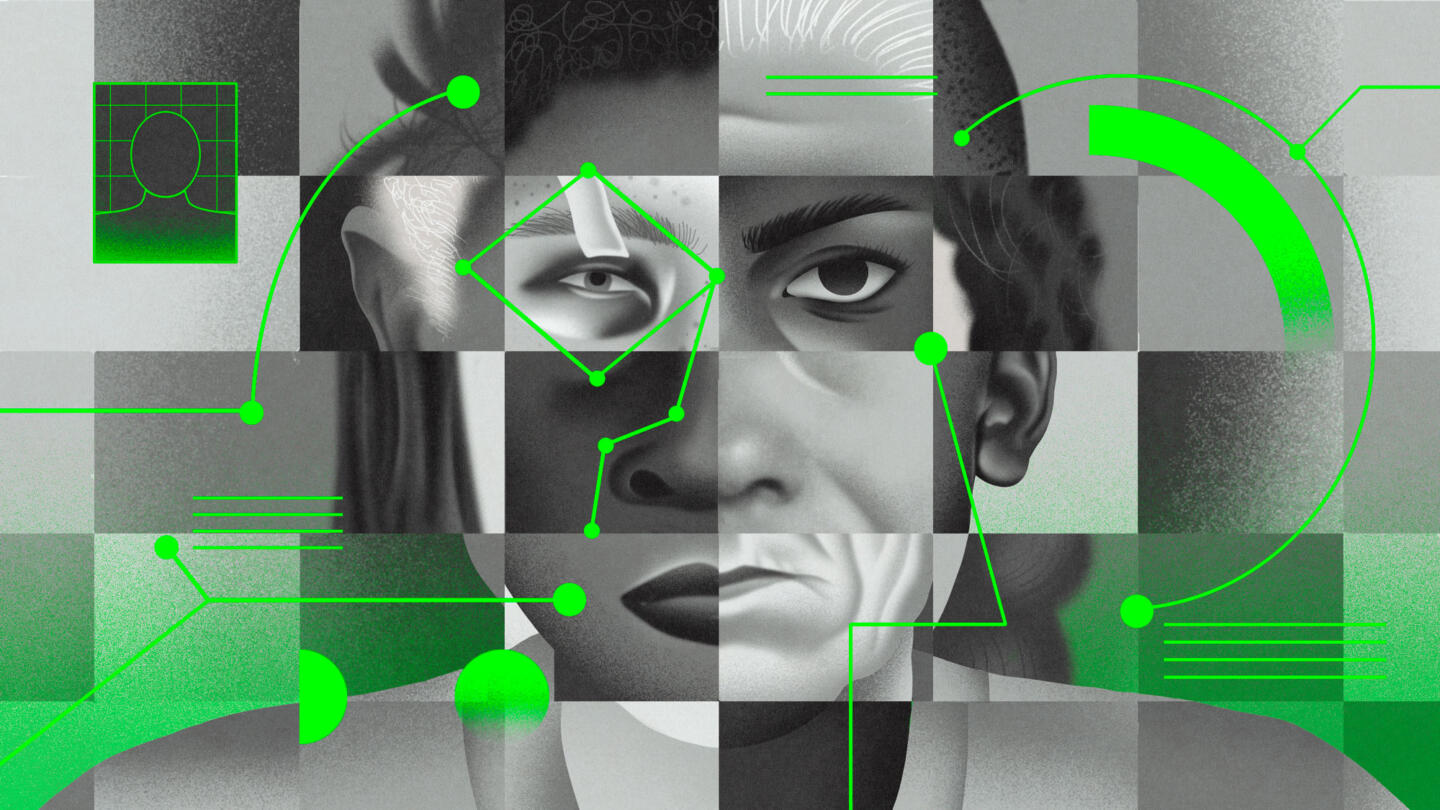
Ariel Davis created a tapestry of skin tones, hairstyles and facial features in this captivating illustration about a database of mugshots being used to train AI.
Special Database 18
The National Institute of Standards and Technology (NIST) has maintained a dataset of mugshot photos of 1,573 people for decades, including 175 minors—until we asked about them
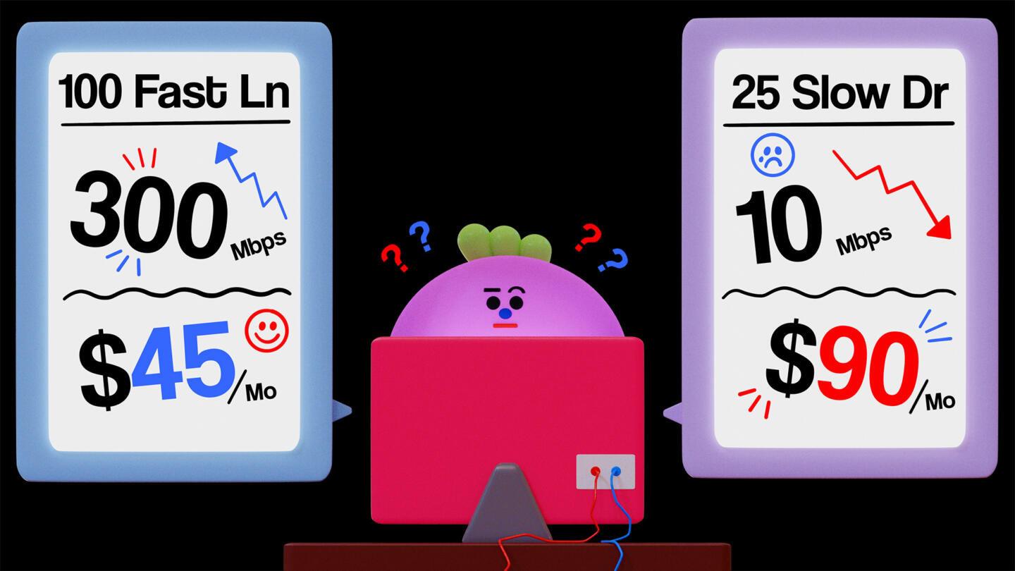
For this guide on collecting data from internet plans, we wanted to show that it was accessible and participatory—almost like playing a video game; Joi Fulton’s 3-D character acts as a delightful stand-in for the reader.
Slow Internet? Find Out What Side of the Digital Divide You’re On
All you need to test for disparities in internet speeds and pricing is a computer, internet access, a Google account, and some free time
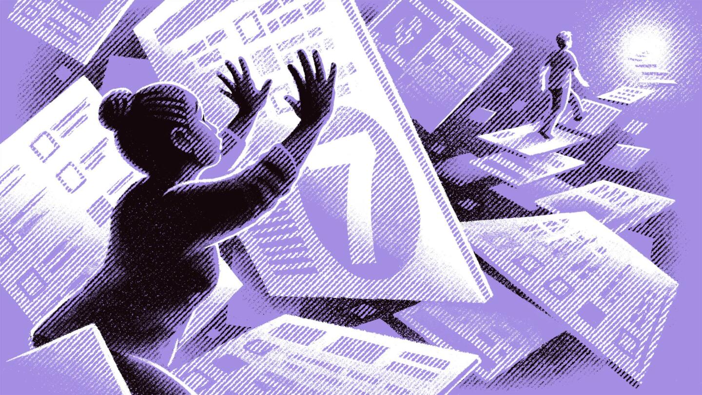
Brian Britigan took a cinematic approach to visualizing algorithmic discrimination. Our wide-shot perspective shows a Black woman blocked by imposing survey questions and scores, while a White person walks toward the light in the distance, no obstacles in sight.
A Racially Biased Scoring System Helps Pick Who Receives Housing in L.A.
And it’s probably happening in your community too
Each time you load a page with ads, a lightning-fast auction takes place to determine what targeted ad will appear. Taking inspiration from Alice in Wonderland, we came up with an underground auction of jelly bean characters to explain the process.
How Your Attention Is Auctioned Off to Advertisers
In mere milliseconds, online advertisers scrutinize your personal data and bid for your eyeballs
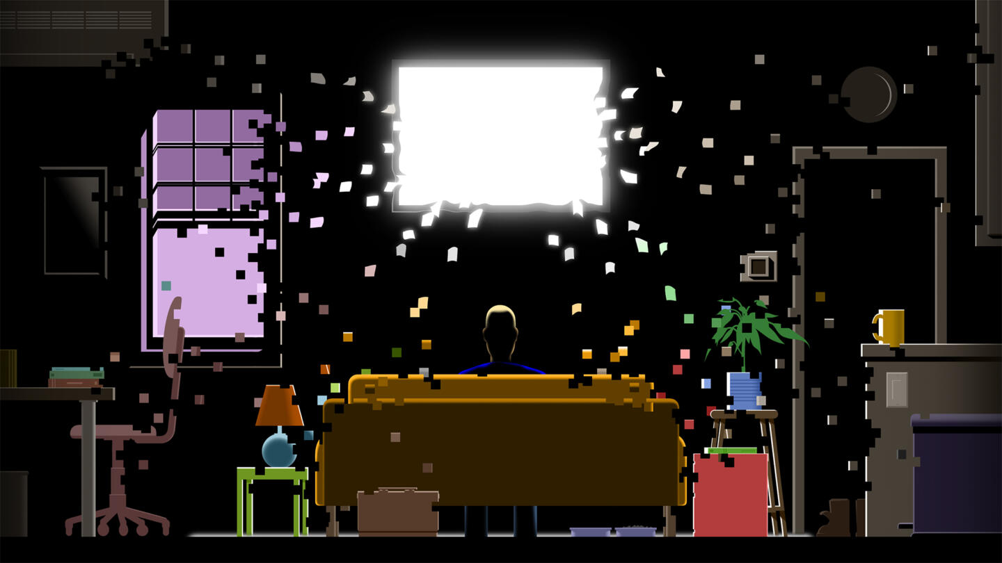
The ghostly, hypnotizing TV screen in Anson Chan’s illustration reminds me of the movie Poltergeist and does a fabulous job of showing how a smart TV watches you as much as you watch it.
Your Smart TV Knows What You’re Watching
Here’s how to turn off “automated content recognition,” the Shazam-like software on smart TVs that tracks what you’re watching
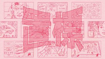
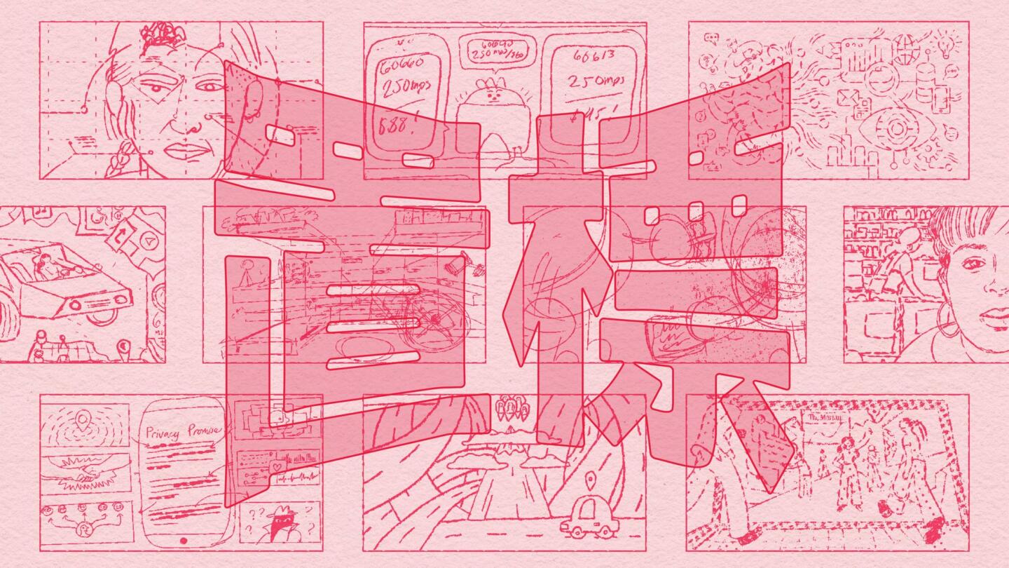
To show how we illustrate tech and AI at The Markup, I created a zine heavily inspired by manga, featuring The Markup’s name in kanji, Chinese characters used in Japanese, and rough thumbnail sketches of illustrations that we’ve published.
Zine: How We Illustrate Tech (and AI) at The Markup
A lot of what we cover is tough to visualize. We’ve developed a number of tricks to help—and a comic to tell you all about them
Eva Redamonti’s Escher-like maze is a rich, dizzying composition of vignettes on a sensitive subject that’s difficult to illustrate: suicide hotlines.
Suicide Hotlines Promise Anonymity. Dozens of Their Websites Send Sensitive Data to Facebook
The Markup found many sites tied to the national mental health crisis hotline transmitted information on visitors through the Meta Pixel
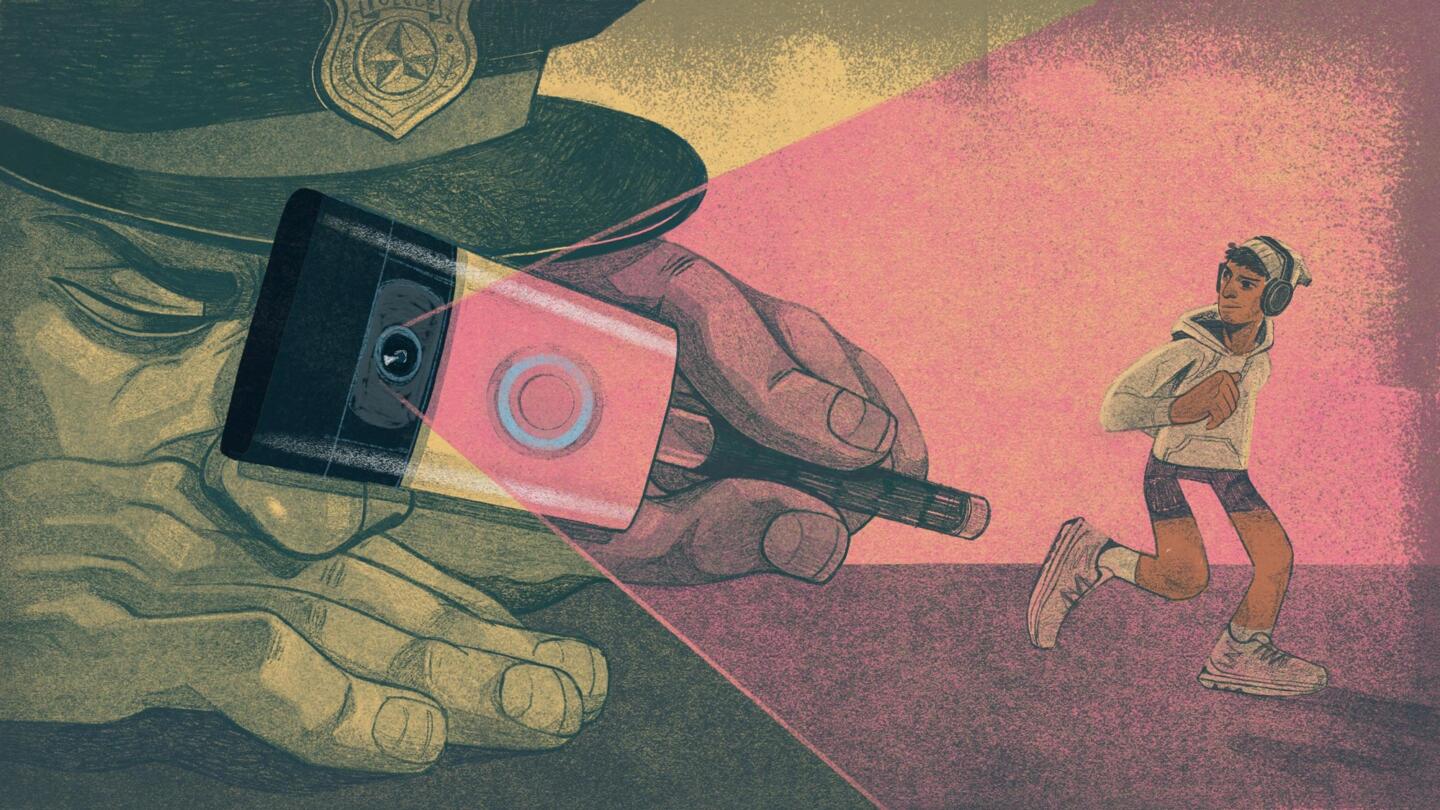
I love how Victor Bizar Gómez plays with scale in this illustration; the menacing size of the policeman spying on a Latine jogger adds so much tension to this image.
How Ring Cameras Have the Power to Perpetuate Bias to Police
Cops already listen to the needs of wealthy and White residents far more than that of people of color. Tech companies threaten to make the problem worse in the way they share community surveillance.
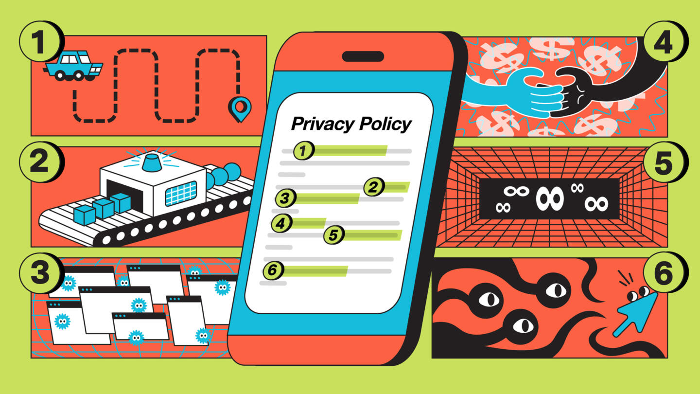
Privacy policies are dense, dry documents. For this guide, I wanted a visual that broke down the different sections of a privacy policy in a fun, unexpected way, taking cue from the color palette and aesthetic of Nickelodeon cartoons.
How to Quickly Get to the Important Truth Inside Any Privacy Policy
An investigative data journalist and a former tech lawyer teach you how to spot tricks and hidden disclosures within these interminable documents—and even how to claw back some privacy
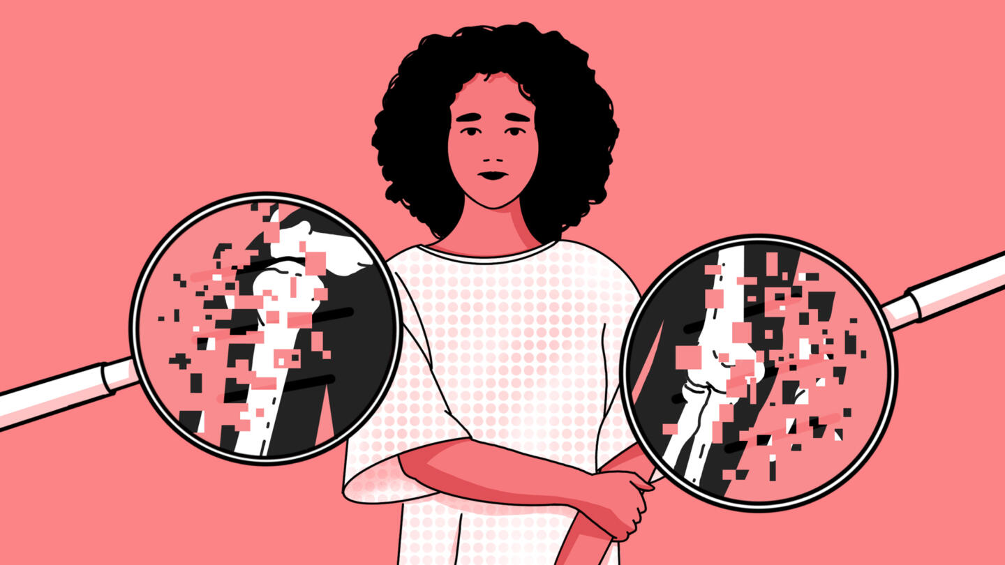
Jarred Briggs’ interpretation of the limits of AI cancer detection technology through pixelating an X-ray is an elegant solution in this clever visual, and reinforces the fact that the most important part of this story is the person, not the AI.
An AI Diagnosed Her with Breast Cancer. Then She Ran an Experiment to See How Accurate It Was
A conversation with Meredith Broussard
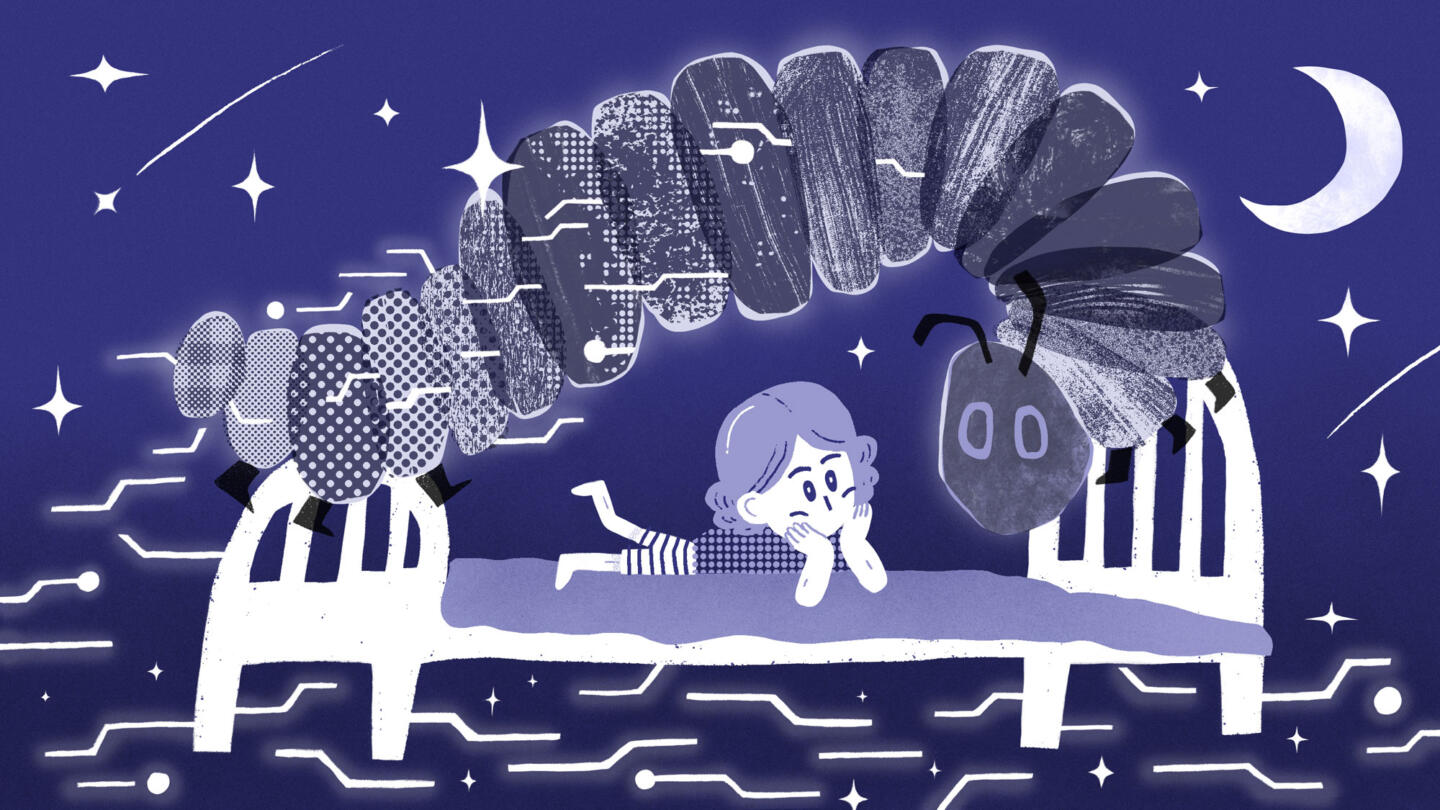
Sean Oh’s beautiful, graphic illustration of an AI caterpillar (an homage to the illustrator Eric Carle) has so much soul. Its interplay of tactile textures, patterns and marks is a reprieve from the lifeless hyperrealism conjured up by generative AI.
The Very Hungry Algorithm: Bedtime with ChatGPT
Balancing enthusiasm and fear in the age of AI
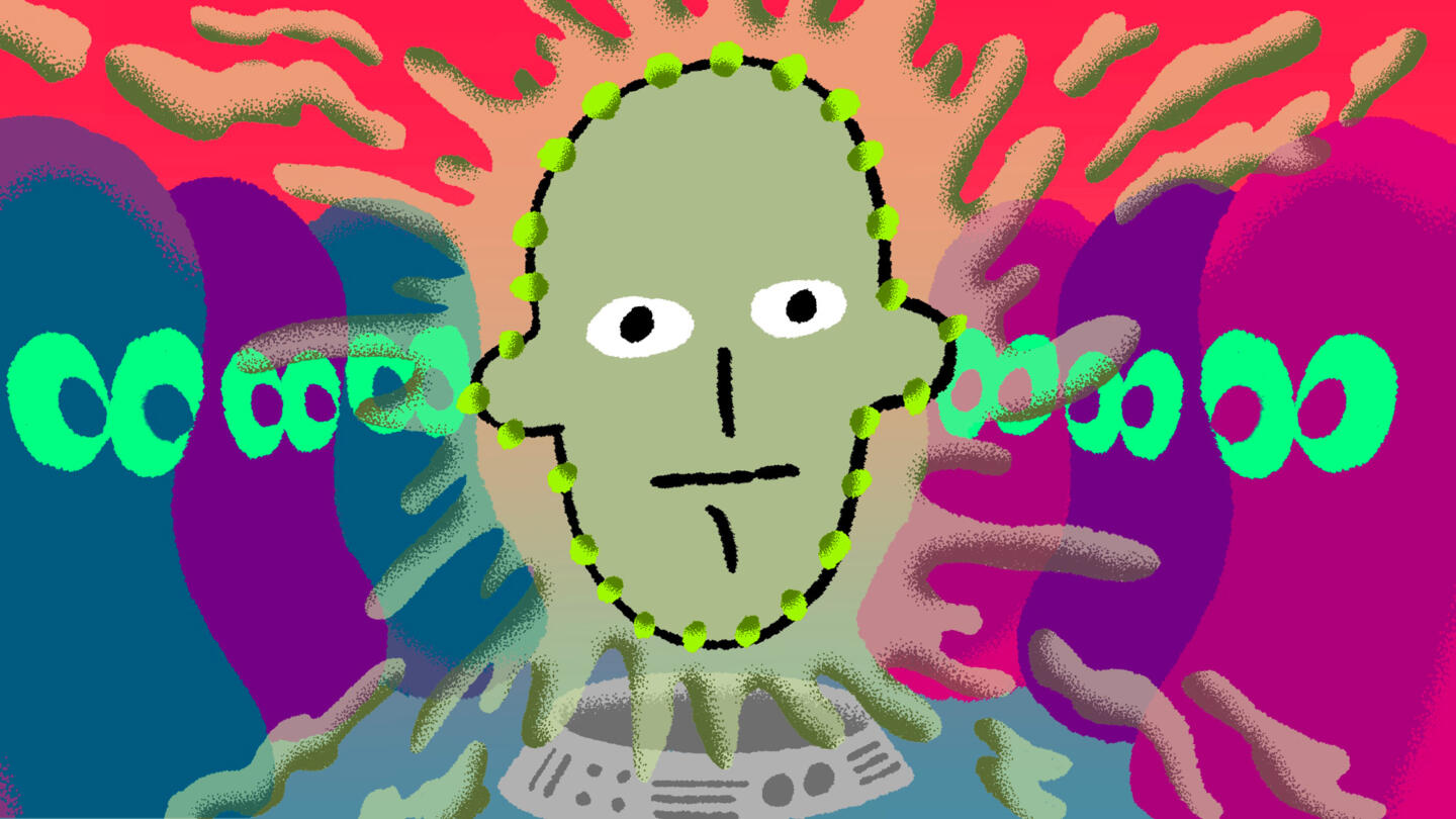
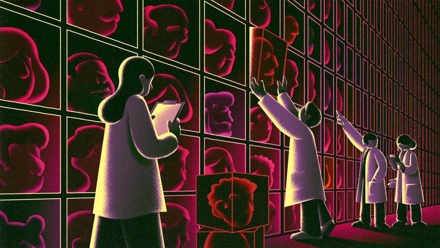
The moody, chilling lighting in Adrián Astorgano’s endless library of heads heightens the drama in this eerie illustration about the ways ad companies, represented by spooky scientists in this case, package, describe, and commoditize you.
From “Heavy Purchasers” of Pregnancy Tests to the Depression-Prone: We Found 650,000 Ways Advertisers Label You
A spreadsheet on ad platform Xandr’s website revealed a massive collection of “audience segments” used to target consumers based on highly specific, sometimes intimate information and inferences
Visualizing big tech companies like Meta can often lead us to cliches like blue thumbs and angry emojis. Julia Galotta’s creature hiding in the shadows is a memorable representation of a presence that is silently monitoring and tracking teenagers. The monster, who is literally absorbing into itself everything this girl has read online, is a great metaphor for the ubiquity and massive size of online tracking.
Facebook Watches Teens Online As They Prep for College
An investigation by The Markup found Meta’s pixel tracking students from kindergarten to college
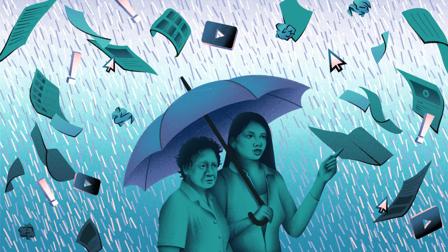
Allison Vu depicted intergenerational communication beautifully in this stunning illustration about misinformation in Vietnamese American communities. I’m especially impressed by its restrained color palette and rich detail in the facial features of the depicted women.
Second-Generation Americans: What to Do When Loved Ones Are Sharing Misinformation
Don’t get into a political argument. Talk about misinformation instead