This article is copublished with
This article was copublished with Big Local News, a Stanford effort that uses data, tools, and collaborations to empower journalists to better cover their community. Explore the platform and membership benefits.
Does your neighborhood pay more money for slower internet compared to neighborhoods across town? This step-by-step guide helps you answer that question and more.
We’ll show you how to collect data on internet plans offered in your area and different ways you can analyze those plans to test whether they seem fair and equitable. We won’t dictate how you analyze the data or what conclusions you come to. But we’ll make it easier for you to collect evidence in a way that requires no special technical skills and is statistically defensible, reproducible, and low-tech.
All you need is a computer, a Google account, and (yes) internet access.
Last October, The Markup investigated how four major national internet service providers (ISPs) disproportionately offered the worst deals in neighborhoods that were lower-income, historically redlined, or had the fewest White residents compared to other parts of the same city. We focused our investigation on the biggest city in each state, but following publication, we got a flood of requests from government officials, advocacy groups, educators, and local news organizations from across the country asking how they could collect and analyze internet plans in their own cities and communities.
Still Loading
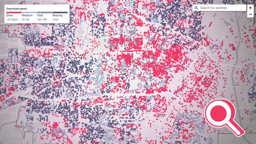
See the Neighborhoods Internet Providers Excluded from Fast Internet
Explore The Markup’s interactive map to see where AT&T, CenturyLink, and Verizon offered only slow internet speeds in major U.S. cities
While none of those ISPs denied our findings, each insisted they had not deliberately given worse deals to households in marginalized areas and rather pointed to business considerations that serve their bottom lines—such as the cost of maintaining slow, older network infrastructure—or pointed to government subsidy programs that make internet more affordable for low-income households.
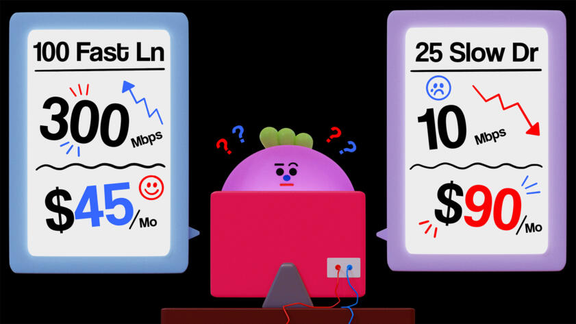
The Markup’s initial story about how ISPs contributed to the digital divide was based on a huge database we put together. We gathered data by writing software that went to each ISP’s website and saved the availability, speeds, and prices of the plans they offered for more than a million addresses. We found that each of these ISPs offered very different speeds for that same base price, even within the same city. Cross-referencing those offers with information about each address’s surrounding area, we discovered that, in all but two of the cities we tested, ISPs disproportionately asked people in marginalized neighborhoods to pay premium prices for substandard service.
But you don’t need to conduct your research at this scale. For example, last year, the California Community Foundation manually searched 165 Los Angeles addresses on ISP websites and discovered Charter Communications’ Spectrum internet service, the dominant internet provider in Los Angeles, consistently offered worse deals to lower-income portions of the city. (In an email to The Los Angeles Times, Charter dismissed the report as “intentionally misleading.”)
In your city or community, you might want to look only at where an ISP offers service and where it doesn’t. Or maybe you’re interested in whether a discounted rate for a set period of time after initially signing up is offered at some addresses but not others. You could even just find the median internet speed an ISP offers in your area, which is an important story on its own.
Let’s get started.
Investigating Internet Plans Step-By-Step
1. Pick a geographical area and a target
Determine where you want to analyze internet plans. This could be any town, city, or county.
Once you’ve picked a place, you can figure out what ISPs serve that area. BroadbandNow is a website that allows you to search for ISPs operating in any given zip code. Try searching a variety of different zip codes in the area to make sure you’re capturing all the possible ISPs.
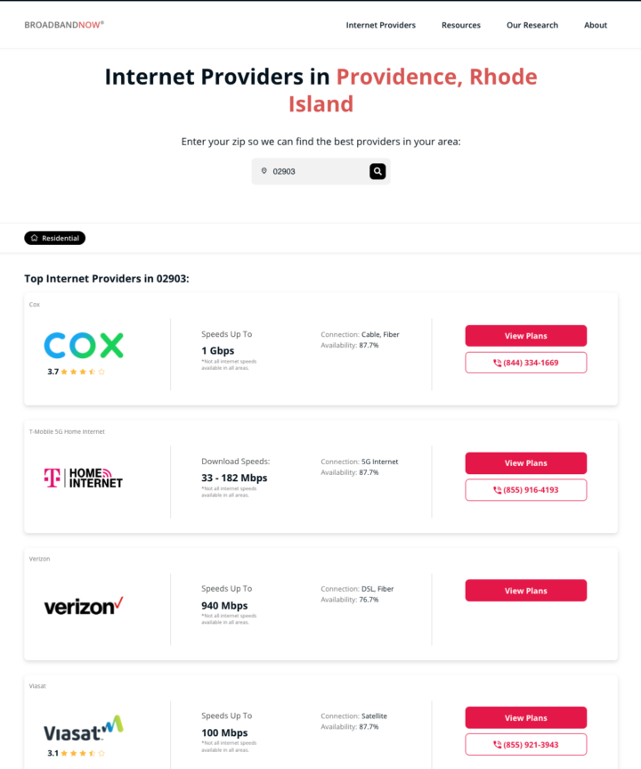
BroadbandNow will show you all types of broadband connections, including cable internet, DSL, fiber, satellite, and fixed wireless. For our original investigation we focused just on cable internet, DSL, and fiber, but you can pick whichever ISPs spark your curiosity or are relevant to you.
2. Generate some random addresses
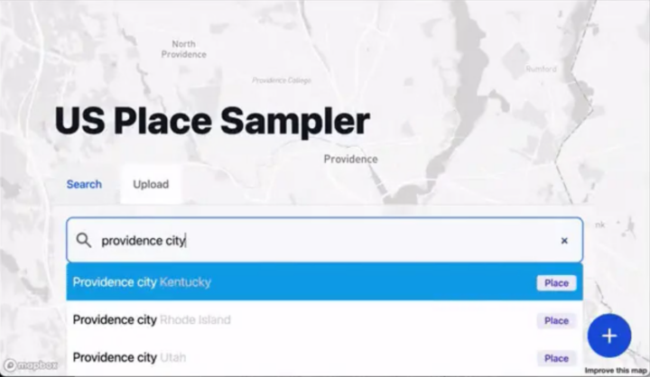
To gather data on what internet plans are offered in the area you selected, you need to get a list of real addresses in that area. To conduct your research fairly, you’ll want to get and use a random sample of addresses, because in addition to other benefits, it minimizes bias. In our investigation, we wrote computer code to select addresses randomly. But we wanted a simpler way for anyone to get random addresses, so we partnered with Big Local News at Stanford University to develop the United States Place Sampler (USPS).
To use the tool, simply visit https://usps.biglocalnews.org.
Here’s how to figure out the number of addresses you want:
- Go to USPS and enter the city, county, or state into the search bar. For example, “Providence city Rhode Island.”
- When USPS zooms into the area, the selection bar at the top by default says, “I would like 200 total addresses from [the area you picked].” Click on “total” and change it to “percent of.” Then, change 200 to 1. At a minimum, you’ll want to sample one percent of addresses in the area.
- Click “Sample.” For Providence, we got back more than 900 addresses.
A few important caveats:
- For small geographical areas: If you get fewer than 400 addresses back, increase the percentage until you surpass 400 addresses—or just ask USPS to give you exactly 400 addresses. This makes sure you have plenty of addresses in your sample.
- Our guidance errs on the side of oversampling: Oversampling is almost always better than undersampling. We wanted to be especially rigorous in our original investigation, so we sampled 10 percent of addresses, which was way more than recommended. (We also automated it, so that made it a lot easier.)
If you want additional guidance and rigor: We highly recommend reaching out to a statistician from a nearby university (they’re often quite excited to chat about statistics). Talk to them about the right sample size for what you’re looking to do. Importantly, if you plan to conduct a disparity analysis, you’ll need to make sure that the population of each social group (such as lower- and upper-income households) is comparable. For example, you don’t want thousands of addresses for upper-income households and a few dozen addresses for lower-income households. An expert can help you figure out how to make sure you have enough addresses for each social group you hope to analyze. See tips in the section “Organize the data into groups.”
Once USPS displays your list of addresses, click the “+” in the bottom right corner and then hit “CSV” to download the list of addresses.
3. Put everything into a spreadsheet and format it
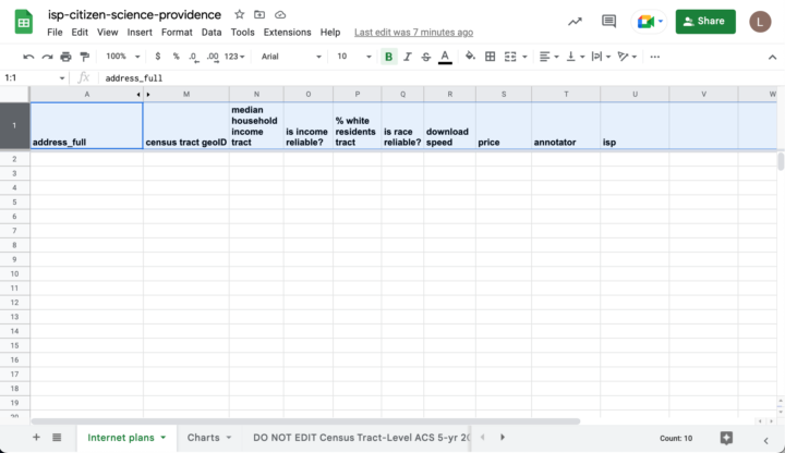
Before you start checking ISPs for plans, you’ll need to properly format the spreadsheet of addresses you just downloaded and pull in socioeconomic data for the analysis you’re about to do. You’ll perform these steps in Google Sheets (but you can move to Microsoft Excel afterward, if you prefer).
Copy our template
First, open the template spreadsheet we’ve created for you (we built in a lot of extra features that will help you later):
- This will prompt you to make a copy of it in your Google Drive. Select “Make a copy.”
- Rename the file to reflect the area you’re looking at. For example, “isp-citizen-science-providence” for an experiment in the city of Providence, R.I.
Import the addresses
In the template spreadsheet, highlight the first row of data in the “Internet plans” tab by clicking on the “1” at the beginning of the row.
Go to the “File” dropdown and click “Import.”
A window of your Google Drive will pop up. Click on the tab that says “Upload” and follow the instructions to upload the .csv file filled with addresses that you downloaded from the USPS tool.
This next step is important. You’ll be asked how you want the data to be imported. Under “Import location,” select “Replace data at selected cell” from the dropdown, and then “Import data.”
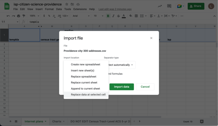
Select the address data to import—in our case “Providence-city-300-addresses.csv”—and specify how to import the data into the spreadsheet.
Now the addresses you downloaded should be in the spreadsheet. Thanks to the Google Sheet template, the dollar and percentage columns should already be formatted nicely, unnecessary columns are automatically hidden, and socioeconomic data on income and race/ethnicity should be automatically added from Census Bureau’s American Community Survey.
The automatically added demographic information for each address is tied to its respective Census tract, a bounded geographic region delineated by the Census Bureau typically representing between 480 and 3,200 housing units.
For more information about how “median household income tract” (column N) and “% white residents tract” (column Q) are calculated and stored, see the section “Where did the socioeconomic data come from?” in the FAQ below.
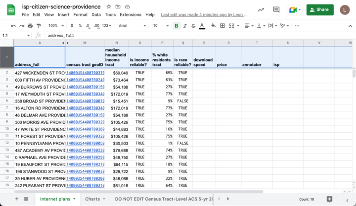
census tract geoID” column.If your area of interest has more than one internet provider, you can make a copy of the “Internet plans” tab for each provider. This way you can check the same addresses for plans from each provider and save that data with the same column names. (This should simplify analysis later.)
At this point, you can continue working through Google Sheets or, if you prefer, export the document to Microsoft Excel.
4. Get internet plan data
Once you’ve selected your ISP(s) and created a spreadsheet of all your addresses, now comes the fun part! And by “fun” we mean “extremely methodical.”
You’ll collect this data by hand. Go to the website of the ISP you’re interested in and find where you can search for internet offers by address. Then enter each address from your spreadsheet and record details about the plans offered.
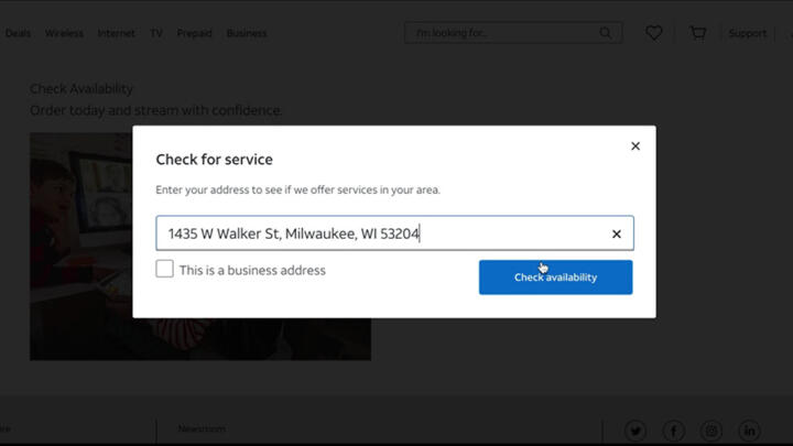
For each address, here’s a standard set of data you can collect: the download speed of the cheapest offer, the price of that cheapest offer, the download speed of the fastest offer, and the price of the fast offer.
Many ISPs have options allowing customers to bundle internet services with phone or telephone service. Unless you decide to specifically look at bundles, we recommend looking exclusively at internet-only offers as a way to keep your analysis simple.
If the ISP’s site doesn’t recognize an address, there could be a variety of reasons. Here are three we’ve run into:
- The address is not eligible to buy internet for some reason. For example, it’s a vacant lot.
- The address could be incorrectly formatted or outdated.
- The address is a real residential address and the ISP isn’t serving it.
The USPS tool pulls addresses from an open source dataset that is imperfect, so if an address isn’t recognized, you can try to manually confirm it. For example, you could type an unrecognized address into Google Maps and see if it’s a real location.
Now comes the fun part. And by ‘fun’ we mean ‘extremely methodical.’
If you think that it’s a real residential address, and an ISP doesn’t recognize it, we recommend either deleting the entire row of data and moving on to the next address on your list or keeping track of these cases in a new column.
If the address is a real residential address without service, you should set the speed and price to zero.
We don’t know all the reasons why an address won’t be recognized, so if you run into additional situations, you’ll have to use your best judgment about what to do next.
Collect data on only 20 addresses to start
Before diving into collecting data for hundreds of addresses, we suggest first doing a quick, manual test with only the first 20 addresses from your list. This lets you get familiar with the process and what types of offers the ISP website will show you, which lets you figure out if there are additional data fields (columns) you want to collect. The California Community Foundation’s report on Los Angeles, for example, also logged the number of months the initial discount period of an offer lasted before the price reverted to the plan’s full price.
You can account for these additional data fields using descriptive column names. In the template we included “fastest download speed (Mbps)” (column R) and “fastest price” (column S), but you can change these (or make new columns) for whatever metrics you think are most important to measure for your community, based on what you find from this initial test.
This quick test can also help you figure out what outcome to focus on. In our initial investigation, we found that AT&T, Verizon, and CenturyLink kept prices the same across varying speeds, so we focused mostly on differences in the speeds of base plans. But other providers may do the opposite—offer the same speeds for different prices. In that case, it might make more sense to analyze differences in price. Other ISPs might offer tiered plans where price and speed both vary. In that case, you might want to calculate the cost per Mbps (dividing the price by the download speed) and analyze that. In any case, you are ultimately testing the value of plans, specifically who’s getting the best and worst deals.

If providers always offer the exact same prices and speeds but don’t offer service everywhere, you could analyze where internet services are available and where they’re not.
Knowing which of these factors are fixed (they never change) and which vary (they do change) is essential for setting your experiment’s scope.
Collect your full data set!
Once you’ve run your test and decided what data points to track, it’s time to collect that data for all of your addresses.
If you’ve been logging addresses for a while, ISP websites may stop functioning. This means you are likely being “rate-limited” or blocked (learn about why this happens and our tips for how to handle it in “Why is the ISP’s site slow or no longer loading?” below).
So you’ll have an idea of what to expect, without rate-limiting slowing down the process, it took one person roughly one to two hours to log information for 100 addresses during a test run we did on the website of Cox Communications.
Data entry is exhausting work! We suggest not doing more than 45 minutes of internet plan gathering in one sitting. Space out the work and take frequent breaks. Spacing out requests will also reduce the likelihood of your getting rate-limited or making mistakes.
For further advice on this step, see the “Notes on Bookkeeping” section below.
5. Analyze the results
With your hand-collected internet offers handy, you can start your analysis. Whatever you’re interested in testing—whether it is speed, price, value, or availability, you can test for disparities.
Check if the Census data is reliable for each address
If you’re using our template, we do this for you! In our Google Sheet, we precalculated something called the “coefficient of variability” to measure whether socioeconomic data from the Census is reliable based on a given address. We set the values for “is income reliable?” (column O) and “is race reliable?” (column P) to TRUE if the estimations are of “high” or “medium” reliability.
Doing this check is necessary because the American Community Survey uses estimates calculated from a sample of survey responses from the area. When responses are sparse and populations are small, the “margin of error” produces unreliable socioeconomic data because the range of possible values is too vast.
Filter out rows with FALSE values in those columns if you plan to analyze disparities based on income or race and ethnicity.
Organize the data into groups
Now that you’re confident you have reliable socioeconomic data, you will need to decide how to organize addresses into groups based on what you’re trying to learn, and compare outcomes in each group.
We aren’t going to tell you how you should drive your analysis because your analysis should be specific to your questions, geography, and the dataset you produced. We haven’t analyzed every ISP, or every geographical area, so you’ll likely know a lot more than we do in a short amount of time.
You’ll likely know a lot more than we do in a short amount of time.
We can, however, give you examples of what we did. To group addresses by socioeconomic factors, we tried two approaches in our initial investigation: grouping by quartile (i.e., dividing the data into four equal-sized bins based on median household income or racial/ethnic diversity) and using fixed percentage thresholds (e.g., where “lower income” was 50 percent below the city’s median household income).
You should try several variations that seem reasonable based on the distribution of demographics in your locale (you can view this in the “Charts” tab on the spreadsheet) and see if they return the same patterns. We encourage you to be rigorous, experiment, and come to your own conclusions.
Make a map
Each address in the data you’re working with has corresponding geographical coordinates. You can use mapping software to display how advertised internet plans are distributed across the area you’re investigating.
To show the detailed data we collected in our investigation, we used Kepler—a mapping platform with a user interface (here’s a guide to it)—or you can be fancy and use any GIS software to map your data.
6. Share what you found
Once your data is complete, find a place to publicly share the results and your methodology (here are some tips for writing a methodology). We suggest hosting the underlying data (internet plans and any screenshots) on GitHub, Google Drive, a public Google Sheet, or on Big Local News (they made USPS with us!).
If you want to upload your data to Big Local News, go to biglocalnews.org. Name your project with your region’s name, the provider, and then the word “internet” (e.g. “Cleveland-att-internet”). Toggle the button in the project settings to make it an open project. If you would like the data to be archived with the Stanford Libraries and made publicly available, reach out to biglocalnews@stanford.edu, and we’ll help! Afterward, you’ll have a public link you can easily share out.
If you intend to share the methodology with the public, we suggest you reach out to each of the ISPs in your study for comment. As journalists, it’s a core part of our practice to go to someone for comment if we’re writing about them and give them a chance to respond. As part of our bulletproofing process at The Markup, we also send an early draft of our “Show your Work” methodology, code, and data to external reviewers (like academics and industry professionals) and then finally to each ISP with an additional list of questions based on our data and reporting.
Notes On Bookkeeping
Keep track of dates: Note when you start and finish collecting data. It helps others understand the scope of your experiment and how recent or relevant the information is. Plus, companies might change their internet offers, but you’ve recorded what they were when you looked on certain dates—make sure you know exactly what those dates are!
Keep a journal: Keep track of observations from your early quick tests, outliers that pop up when you collect data from ISPs, as well as your analysis methodology once data collection is complete. You can extrapolate lessons and explain decisions that you made for those who might want to investigate the same ISP in a different city.
Take screenshots: It can be useful to capture screenshots of some (or all) of the offers you record from an ISP’s website. If you publish your findings, including some screenshots is a great way to share what you’ve found. It’s also a good way to confirm what offers you saw on an ISP’s website on a specific date. The Awesome Screenshot browser extension is a great way to easily take consistently sized screenshots of any webpage you’re viewing. Remember to stay organized: Label each screenshot with its corresponding location, so finding it later is quick and painless. You can also save the webpage as HTML, which is a useful artifact for data scientists.
Keep track of units: Download speeds should be recorded in megabits per second (Mbps). This means multiplying fast fiber speeds of gigabits per second (Gbps) by 1,000, and dividing slow copper speeds of kilobits per second (Kbps) by 1,000. For example, if the fastest plan for an address is 2 Gbps download, you record it in the spreadsheet as 2000.
FAQ
Where did the socioeconomic data come from?
While it is possible to obtain socioeconomic data from the Census itself, or the helpful, independent Census Reporter tool, we automated the process for you. Census Reporter shared with us socioeconomic data from the American Community Survey’s most recent five-year results (2016–21), which we incorporated into the template spreadsheet tab named “DO NOT EDIT Census Tract-Level ACS 5-yr 2021.”
Census data is organized into a geographical hierarchy (state, county, city, etc., all the way down to “Census block”). For the spreadsheet template, we use the Census’s socioeconomic estimates for each address’s Census tract. We used a finer granularity, Census block groups, for our initial investigation of major cities, but tracts provide more reliable estimates of the population in less dense regions. Since we wanted this guide to be usable everywhere in the country, we set up the system to import data on tracts.
Importantly, Census tracts are between 480 and 3,200 housing units (and 1,200 and 8,000 people). If you are planning to collect data in a small town, you will see little to no variation in socioeconomic factors, since every address will be in the same Census tract or handful of tracts. In that case, you might want to compare the data for your town to data you collect for other towns nearby (or across the county).
Why is the ISP’s site slow or no longer loading?
This happens because the ISP has noticed you’re not using its website for its intended purpose—purchasing its products or services—and has “rate-limited” or blocked your IP address from entering more addresses. If this happens, don’t worry, it is likely only temporary. You can sometimes get around it by clearing the cookies on your web browser or switching to another browser on your device. Another option is to switch your IP address by using a VPN or simply moving to a different location. You can also put the data collection on pause for a day or two and then try again. Rate-limiting on ISP websites is one reason these sorts of investigations are better projects for a group of people rather than an individual working alone.
Acknowledgements
We thank Christine Parker (Institute for Local Self-Reliance), Aaron Schill (National Digital Inclusion Alliance), Bill Callahan (Connect Your Community), and members of the California Community Foundation (Shayna Englin, Natalie Gonzales, and Lindsey Skolnik) for reviewing an early draft of this guide.
We also thank Joe Germuska (Northwestern University Knight Lab) for generously providing us a file of Census data.