Hello, friends,
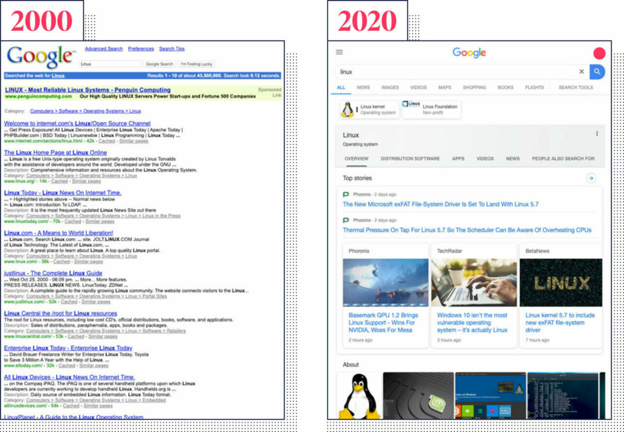
If you use Google search regularly (and the data shows that most people do), you have probably noticed that the first page of search results are increasingly populated by a bunch of info boxes aimed at answering your query—or taking you down a rabbit hole of new ones.
Those boxes contain all sorts of things, drawn from all sorts of sources: dictionary definitions, summaries of Wikipedia entries, maps, and related search queries. But one thing that those boxes have in common is that they are Google products.
This means that you may get faster answers to your queries. But it also means that independent websites—not owned by Google—may get fewer clicks.
It wasn’t always this way. In its early days, Google search results were referred to as the “ten blue links” that led to different websites. “We want to get you out of Google and to the right place as fast as possible,” Google co-founder Larry Page said in 2004.

We wanted to assess just how much real estate Google was giving itself above the traditional 10 blue links. So in typical Markup fashion, we did some scraping, developed a novel analysis method we called “web assay,” and then did some math. What we found showed that Google hogs the top of the search results.
In an analysis of more than 15,000 recent popular queries, we found that Google devoted 41 percent of the first page of search results on mobile devices to its own properties and info boxes. And when we looked at the equivalent of the first screen on an iPhone X, that figure jumped to 63 percent.
We published our investigation, “Google’s Top Search Result? Surprise, It’s Google,” by Adrianne Jeffries and Leon Yin, in July. The article showed the impact of Google’s actions on sites like Hipmunk, a travel site that blames its demise in part on Google’s boosting its own travel offerings at the top of search results.
In response to our investigation, Google said that our sample was “non-representative” because it used Google Trends and was therefore more likely to include Google’s “knowledge panels” than a random sample would. However, Google does not offer random samples of search results to researchers or media.
But that got us wondering: How different is the average person’s experience? Was there a way for our readers to see for themselves how much space Google was taking up in their own search results?
And so, we decided to build a tool. Markup investigative data journalist Maddy Varner worked with our graphics editor, Sam Morris, to create a browser extension that would let people see what their search results would look like without all the Google content up top.
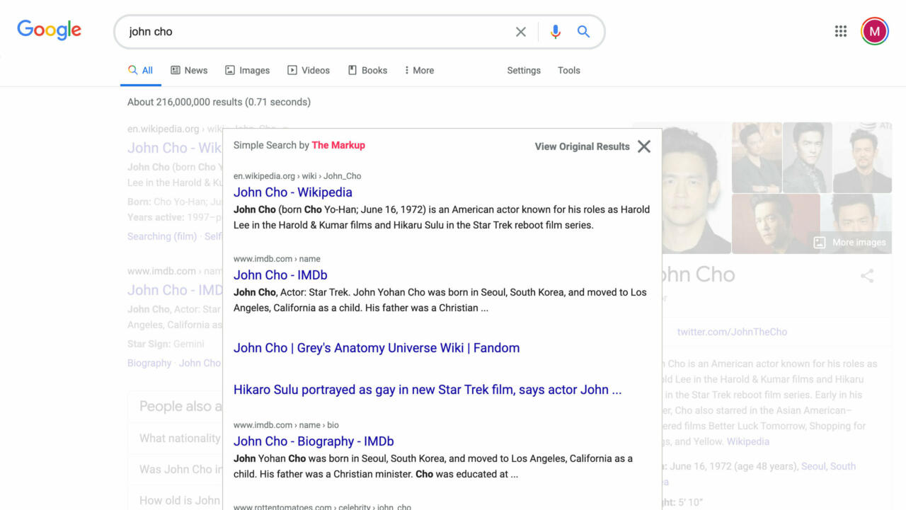
This week, we released the tool that they built. Simple Search is software you can add to Firefox and Chrome web browsers. It layers a new view on top of the info boxes at the top of both Google and Bing search results.
The first time I used it, I literally gasped when I saw the blue links pop up. I felt as if I had been transported back in time to the early days of the internet, when searching the web was like walking into a candy store and seeing a million delightful treats on the shelves—all those wonderful websites out there just waiting to be discovered.

And at that moment, I realized that, despite all our months of investigations and the countless hours we spent analyzing the data and getting our analysis reviewed by experts in the field, Simple Search might actually be the most compelling way to convey what we have found. Because we had figured out how to make the story personal.
It reminded me of Blacklight, the tool we released in September that made the online privacy story personal. Blacklight allows users to see how their own data is being collected by any website they visit or are considering visiting. Simple Search allows users to see what their searches would look like if search engines didn’t hog all the top real estate on results pages.
Building tools is not a normal activity for newsrooms. Tools are expensive, time-consuming, and difficult to maintain. But tools like Simple Search and Blacklight can be illuminating. In some sense, they are a build-your-own-adventure form of investigative journalism that allows each reader to be able to see how a larger issue impacts them personally.
And that is why we call our tools journalism-as-a-service. Because they are truly a service to our readers. We hope you enjoy using them, and we would be grateful for any support you want to send our way to help us keep building and maintaining them.
Thanks, as always, for reading.
Best,
Julia Angwin
Editor-in-Chief
The Markup