Have you noticed that Google search results often turn up a lot of Google content at the top? We did.
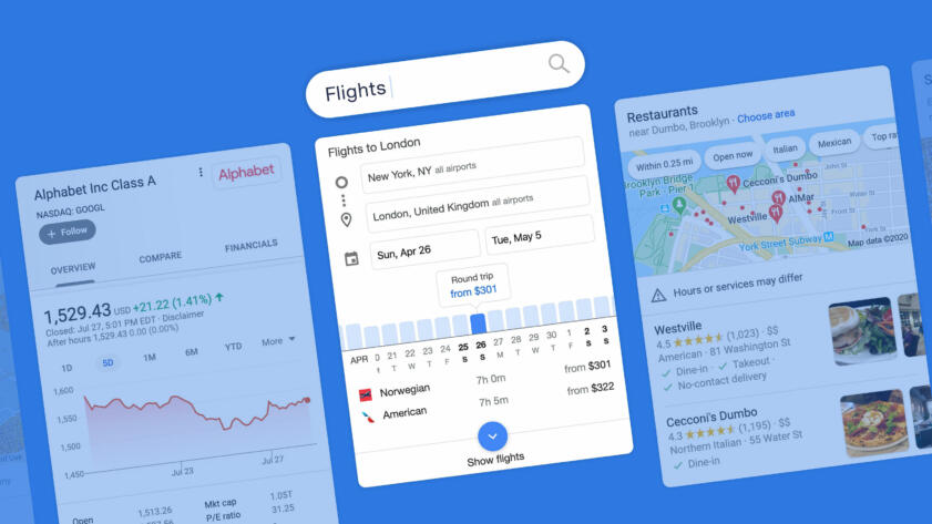
In July, The Markup’s Adrianne Jeffries and Leon Yin published an investigation showing Google products took up a huge amount of real estate on search results pages in our sample. They analyzed 15,000 popular search results and found that the search engine gave 41 percent of the first page and 63 percent of the first screen on mobile devices to Google properties and what the company calls “direct answers,” which are populated with information copied from other sources. In more than half of those searches, Google gave 75 percent of the search page to itself.
Simple Search
Simple Search is an extension that highlights the “traditional” or “ten blue link” search results provided by the search engine, laying them over the info boxes and other content. Close the window to view the full results page. Compatible with Bing and Google search engines.

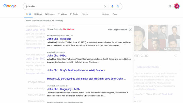
We built a browser extension, Simple Search, to show you just the “traditional” search results. The extension places them in a box above the plethora of search engine products. You can tab through pages of results, submit new queries, and go back to the full results page easily. It is available for Firefox and Chrome browsers and works for both Google and Bing search engines.
The extension lets you travel back to a time when online search operated a little differently.
A 1998 review in Salon of a then young startup called Google noted that the company’s PageRank algorithm acted like an “automated peer review,” crawling through 60 million pages’ worth of links to figure out which sites had the most (and most important) referrals.

Google the Giant
Google’s Top Search Result? Surprise! It’s Google
The search engine dedicated almost half of the first page of results in our test to its own products, which dominated the coveted top of the page
And while other “portals” had become “crowded, blinking arrays of commercial distractions,” the article continued, Google’s design was simple—just 10 “blue links” per results page that linked out to the most relevant webpages to your query.
Nowadays, you don’t always have to click any of the “blue links” to get information related to your search—Google gives you what it thinks is important in info boxes of information pulled from other websites (as do other search engines, including Bing).
In a response in July to The Markup’s analysis of Google results, spokesperson Lara Levin wrote, “Providing feedback links, helping people reformulate queries or explore topics, and presenting quick facts is not designed to preference Google. These features are fundamentally in the interest of users, which we validate through a rigorous testing process.”
Congress has started to take notice of what comes up on the search page. Representative David N. Cicilline (D-RI), chair of the House antitrust subcommittee, said that The Markup’s investigation proved that Google had built a “walled garden” and that the practice was “economically catastrophic for other companies online.”
So what would Google look like without those walls?
Try out Simple Search and see.
It doesn’t modify the search pages. Simple Search just adds a box on top of them listing the search engine’s “blue link” results. And you can use it whenever you want: You can toggle Simple Search on or off with a single click in your browser and easily close the box if you want to see the search engine’s other results beneath it.
Simple Search
Simple Search is an extension that highlights the “traditional” or “ten blue link” search results provided by the search engine, laying them over the info boxes and other content. Close the window to view the full results page. Compatible with Bing and Google search engines.


