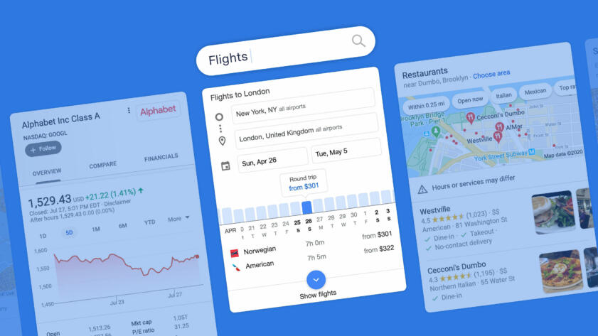
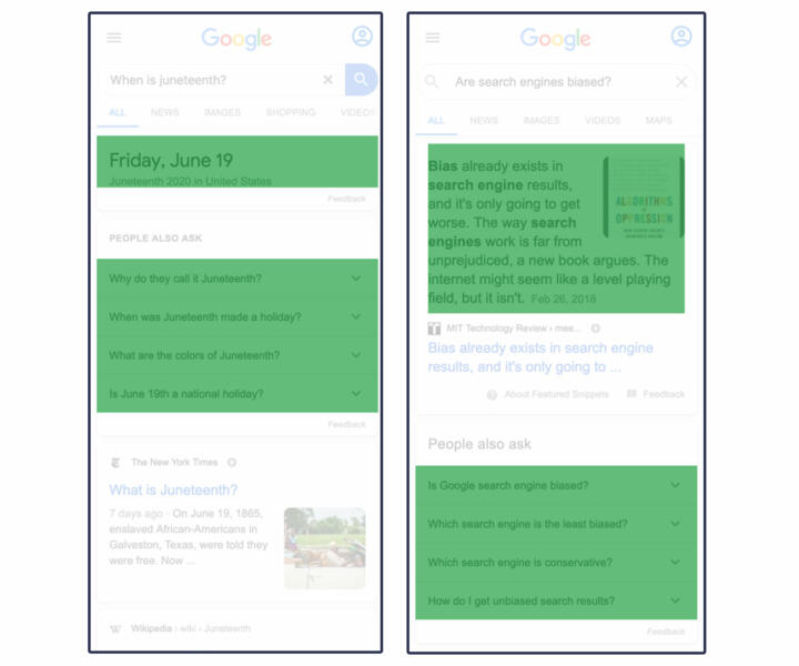
In recent years, Google has greatly expanded its delivery of search results that are meant to answer users’ queries right on the search page, with no need to click through, using information that Google scraped from the web or collected from partners. It has also expanded results that highlight Google-owned products, such as YouTube, Google Images, Google Maps, Google Flights, and a seemingly never-ending stream of “related” search queries that take users deeper and deeper into Google’s most valuable product, Search. These types of results, which we’re calling “modules,” often appear in boxes and have typically been visually distinct from Google’s traditional ranked search results—though those distinctions are starting to blur.
We designed an experiment to measure the quantity and placement of these Google-created and self-referential search results and how they compare to other types of results and links. In particular, we wanted to compare them against results and links for websites not owned by Google. Here we will refer to that bucket of outward-leading content in search results as “non-Google.”
Review our data and code
Because there is no current, randomized sample of Google search queries that is publicly available, we created a sample of 15,269 searches from all topics appearing in Google Trends between November 2019 and January 2020. We used Google’s division of searches into root words and ran each of those through Google Search on a mobile emulator for an iPhone X.
We then used a novel technique to measure how much space Google apportioned to various types of results and links on the first page of search results. (Details in Appendix 1.)
We classified search results into four categories: Google, non-Google, ads and AMP (originally an acronym for “accelerated mobile pages”), which are pages written by third parties (often news sites) in a markup language created by Google and cached on Google’s servers for quick loading on mobile. We categorized as “Google” those results or links that send users to Google sites and YouTube, as well as text inside Google “modules” that does not link out. (See more in the Categorization section below.)
We found that Google results dominate the first screen, taking up 62.6 percent of it in our sample. That percentage drops when considering the entire first page, where Google’s share was 41 percent. By comparison, Google apportioned 44.8 percent of the first results page to non-Google websites, 13.3 percent to AMP pages, and one percent to ads.
In addition, we found that non-Google results were pushed down to the middle and lower middle of the page, while Google gave its own results the choicest locations at the top of the search results, as shown in this plot.
What Is on a Google Search Page As You Scroll Down?
Percentage of real estate across our sample, normalized page length
Top
Middle
Bottom
0%
20%
40%
60%
80%
100%
We found that in more than half of the searches in our sample, Google content took up at least 75 percent of the first screen. In one in five searches, non-Google content was entirely absent from the first screen.
Placement on the search page matters. Data from the search engine analytics tools from software firms Advanced Web Ranking and Sistrix shows that the click-through rate drops off dramatically from the top to the bottom of the search results page on mobile devices. (The same dynamic takes place on desktop.)
The effects of Google’s actions on web browsing behavior cannot be overstated. It’s estimated that in the United States, Google serves nearly nine in 10 web searches. The company says it receives more than 63,000 queries each second.
It’s important to note that we used a novel categorization method to determine which results to consider “Google” and which to consider “non-Google.” There are no universally agreed-upon standards.
Google spokesperson Lara Levin said that because our sample is not random, our results may contain more Google “answers” and AMP results than a truly random sample would have.
She criticized our categorization choices, saying that AMP content should be counted as non-Google and stating that not all results that we labeled “Google” benefit the company. “Providing feedback links, helping people reformulate queries or explore topics, and presenting quick facts is not designed to preference Google. These features are fundamentally in the interest of users, which we validate through a rigorous testing process.” (See further comments in the Google Response section.)
When we measured the effects of multiple potential interpretations of Google and non-Google results, our classification system turned out to be neither the strictest nor the most generous for either, instead falling in the middle. In every definition option we explored, Google still gave itself the most space on the coveted first screen.
Background and Introduction
In 1997, Sergey Brin and Larry Page registered Google.com as the home for an innovative search engine that would help people find what they were looking for on the web.
It quickly claimed market share from existing search engines, such as Yahoo and MSN. By the end of 2004, Google was the most popular search engine in the U.S., and it now captures 88 percent of the U.S. search engine market, according to Statcounter.
In 2004, the year Google went public, Page laid out a vision for Google as a pure reference tool:
“Most portals show their own content above content elsewhere on the web. We feel that’s a conflict of interest, analogous to taking money for search results. Their search engine doesn’t necessarily provide the best results; it provides the portal’s results,” Page told Playboy. “Google conscientiously tries to stay away from that. We want to get you out of Google and to the right place as fast as possible.”
Yet in the past decade, Google has reoriented toward answering queries itself by gathering and scraping information from other sources and presenting them directly on the search page, and directing users to other profitable properties it owns: Google Maps, YouTube, Google Travel, etc.
“Our products have come a long way since the company was founded more than two decades ago,” Google said in a 2019 SEC filing. “Instead of just showing ten blue links in our search results, we are increasingly able to provide direct answers—even if you’re speaking your question using Voice Search—which makes it quicker, easier and more natural to find what you’re looking for.”
Google even experimented in March 2018 with returning just the answer and no search results for some queries.
In 2010, Google acquired a company called Metaweb, which became the basis for a database about relationships between entities and information—mostly people, places, and things—called the “knowledge graph.” The knowledge graph powers many answer modules, sometimes called “knowledge panels,” that Google creates and delivers prominently in search results.
It seemed particularly important to study Google’s changes in its search results as Google faces antitrust scrutiny in the U.S. and Europe.
In 2017, the European Commission fined Google €2.42 billion after finding that Google had “abused its market dominance as a search engine by giving illegal advantages to another Google product,” referring to its comparison shopping service, now called Google Shopping. In 2018, the commission sent questions to Google’s local business search competitors. And last year, it confirmed it had launched a preliminary investigation into whether Google is illegally prioritizing its Google for Jobs product in its search results. Google said it disagrees with the commission’s decision on Google Shopping, which it has appealed.
In the United States, the Federal Trade Commission closed an investigation in 2013 into whether Google was illegally scraping content and prioritizing the company’s properties in searches after Google agreed to allow websites to opt out of having their content scraped for its properties, including Google Flights, Google Hotels, and local business listings. The agency also concluded that Google’s prioritizing its own content “could be plausibly justified as innovations that improved Google’s product and the experience of its users.”
In 2019, the Department of Justice and 50 attorneys general from states and territories separately opened antitrust investigations into Google. The FTC is also reviewing acquisitions from major technology companies, including Google, to determine if they suppressed competition. Many of Google’s answers-type results, which seek to answer questions in the search page, grew out of acquisitions. These include the “knowledge graph,” as mentioned earlier. Google Flights also grew from an acquisition.
Some researchers have tried to quantify the effects of Google prioritizing its own content in search results. Moz, a company that sells tools to the search engine optimization industry, has run a list of searches on a desktop browser at various intervals over years, looking at the placement of the first “traditional organic result,” which they define as “ten blue links”–style results.
These unpaid results have drifted down the page over time, replaced first by ads and now by Google content, Moz found. In 2013, the first “organic” result appeared an average of 375 pixels down the page. In 2020, it was down even farther, an average of 616 pixels. Unlike our study, Moz did not count any links in Google-created modules as “organic.” In a Twitter thread at the time, Google spokesperson Danny Sullivan criticized the study as a “dated assessment.”
In 2019, an analysis by search engine analyst Rand Fishkin found that half of all Google searches in its data ended without the user clicking on anything. Of those who did click on something, 12 percent followed links to Google Images, YouTube, or other Google properties. The study was based on more than one billion searches from more than 10 million U.S. desktop and non-iOS mobile and desktop devices collected by Jumpshot, a now-defunct provider of “clickstream” data.
Google acknowledged in comments to Congress in November 2019 that one major reason people end a search is because Google’s modules provided the answer on the search page.
Other search engines, including Bing and DuckDuckGo, also sometimes provide “answers”-type results on their search pages. Together, Bing and Duck Duck Go garner less than 10 percent of web traffic, according to Statcounter and SimilarWeb.
A 2019 study by Eric Enge looked at whether being included in Google modules increased or decreased the number of clicks to websites and found mixed results. A 2020 study by Sistrix found that knowledge panels and featured snippets reduced clicks to other websites.
A study released this year by Northwestern researchers Nicholas Vincent and Brent Hecht measured the presence and placement of Wikipedia links from several search engines, not just Google. The study employed a spatial approach to audit search pages beyond counting traditional or “ten blue links”–style results. They found that Wikipedia links often appeared in prominent places, suggesting that “powerful technologies like search engines are highly reliant on free content created by volunteers.”
The Wall Street Journal tested whether Google was preferencing YouTube over competitors in the “videos” module and found that when searching for exact titles of videos posted to competing platforms DailyMotion, Facebook, and Twitch, YouTube overwhelmingly came up first and occupied most of the slots in the video carousel. Google spokesperson Levin told both the Journal and The Markup that it gives no preference to YouTube.
Various news outlets have reported on issues with Google’s modules, ranging from sexism and inaccuracies in featured snippets to a loss of traffic that threatens the existence of smaller websites. The Outline published multiple stories in 2017 and 2018 about modules’ effects on online publishers, written by one of the authors of this investigation. One of those articles reported that Google scraped information from CelebrityNetWorth.com without permission and displayed it in featured snippets, leading to a drop in the site’s traffic. Another examined the effects of Google’s modules on traffic to websites dedicated to African American literature. The Outline also published a story about inaccurate information in featured snippets, and The Guardian reported that Google was providing a sexist direct answer to the question, “Are women evil?” in a featured snippet. Google changed the last one after the story published and said it wasn’t responsible for “content across the web” that ends up in search results. Google spokesperson Sullivan, a former journalist, wrote extensively while he was a reporter about modules and what he called Google’s “One True Answer problem”—that the search engine wants to provide one answer to every query, but often botches it.
Like the Sparktoro and Moz studies, our investigation examines how much of Google’s search results page directs users to non-Google versus Google content. However, it goes further by measuring how much of the first page is taken up by Google and non-Google search results and links and uses a more precise definition. It also measures how much of the first screen and the first full page are taken up by Google and non-Google search results and links, and two other categories. As such, it provides a deeper analysis of Google-created and self-referencing results and how they compare to non-Google results.
Methodology
Categorization
We categorized search results into four types: ads, AMP, Google, and non-Google.
Categorizing results was the most significant challenge we faced in this project. There are no universally agreed-upon definitions for what a “Google” or “non-Google” result is. Some still refer to the latter as “organic” search results, but not everyone does. And links to external websites not owned by Google appear outside of those “organic” results, making that definition less useful for our purposes.
The difficulty in categorizing results is in part due to the increasing complexity in the look and provenance of the results themselves. When it launched, Google only served traditional results. It added advertisements two years later with the invention of AdWords—which did not look the same as traditional results.
More recently, Google has introduced another category, which the SEO industry calls “SERP features.” (SERP is an acronym for Search Engine Results Page.) SERP features include what we are calling modules as well as traditional “organic” results that go beyond the headline and description style of the original “ten blue links” and may have multiple clickable components within them, such as text links and images. Google calls these fancier traditional results “rich results.”
Diluting the once-clear visual markers even further, Google has even begun putting links to Google Scholar inside some traditional results. They appeared in academic articles about history, computer systems, and medication in our sample.
Google’s many different kinds of modules don’t all behave or look the same either. Some refer only to Google content and some link entirely to the outside web. Others, like knowledge panels, typically include non-clickable text and links to both Google and non-Google sites. Yet others, like many “featured snippets,” are mostly made up of non-clickable text except for a source link to the external website from which the text was scraped, often without the website’s explicit knowledge.
Google further muddied the waters recently when it decided that if a non-Google website link appears in a scraped “featured snippet” module, it would remove that site from traditional results below (if it appeared there) to avoid duplication.
In order to conduct our study, we reviewed source code from Google search result pages to determine where information served in results comes from and where the associated links will take the user, which is the basis for our definitions. (The technical details of how we did that are outlined in Appendix 2.)
We categorized results that take users to Google-owned products and services including YouTube, Google Maps, Google Flights, Google Images, and to additional Google searches as “Google,” no matter where they appear on the page. The category also includes unusual Google-produced content, such as Augmented Reality animals.
We counted the clickable portion of results that lead to websites not named above as “non-Google.” In the case of traditional results, we also counted the accompanying non-clickable text as non-Google because that text and the headlines for traditional “organic” search results are written by those websites themselves (although Google can override it).
If a result in a module was mixed—for example, a Google Hotels module that contained ads, a “check availability” link and information about hotels—we counted the area of clickable links to whatever category they belonged. For instance, in knowledge panels, we counted links to the above-named Google products as “Google” and links to other sites as “non-Google.”
In the case of featured snippets and other modules that contain text that does not link out, we counted the non-clickable text as Google because the module was created—and its text selected—by Google. Knowledge panel–type modules mention specific Google databases in the code from which they appear to be culled.
Google disagrees with this definition and has disagreed with similar definitions of featured snippets in the past, saying it considers them high value “organic” content.
This Books tab takes you to a list of additional Google searches.
Takes you to Wikipedia.

This Video tab is mostly YouTube results.
These links take you to more Google searches.
Because we decided to hybridize our treatment of modules following our guiding principles of sources and links, a small amount of white space that is generally counted in other modules is not counted in the specific case of hybridized results. This causes a small reduction in the area attributed to Google in our study.
AMP results also posed a challenge in categorization. AMP is an open-source HTML-like markdown language Google rolled out four years ago and made a requirement for news publishers to get their content in the “top stories” module.
Publishers may serve ads on AMP pages from any ad network, as long as the ads are compliant with AMP standards. Google has said that more than 100 ad networks support AMP. Non-AMP sites are now eligible to appear in the “top stories” module.
AMP results do not take users to outside websites. When users click on an AMP result from Google search (and Gmail), they are taken to a cached page that is a clone of the website’s page and lives on Google’s servers. However, if users click further in the page, they are taken to the links within the source website, wherever those may lead.
AMP pages now appear in other modules and in the traditional results on mobile. And its developers encourage the use of AMP outside of webpages and beyond mobile devices.
Because of the complex nature of AMP—the content is created by outside websites but delivered from Google servers and has to meet Google’s specifications—we segregated those results into their own category. We include AMP in the denominator when determining amount of the page taken up by any category of content.
Choosing to include or exclude AMP from a category would have significantly altered results, as it appears in 80.7 percent of searches on mobile and takes up 13.3 percent of the available real estate in search results.
Levin, the Google spokesperson, objected to our decision, saying AMP results should have been categorized as non-Google. “Those are outbound links to publishers and other web creators. To suggest otherwise is not factual,” she said.
Lastly, we segregated ads into their own category. These included not just the ads at the top and bottom of the page, but also sponsored content, such as some paid shopping results.
Data Collection
Because there is no current, randomized sample of Google search queries that is publicly available, we created a sample of 15,269 searches based on topics appearing in Google Trends between November 2019 and January 2020.
We gathered trends in all available topics: business, entertainment, science and technology, sports, and top stories. (See details in Appendix 1 .)
We ran those queries on Google Search on a mobile emulator for an iPhone X in the same time period.
Analysis
We measured the percentage of real estate for our sample of 15,269 trending web searches that was occupied by each category as defined above, both for the first page—which are all results that load on the first page—and the first screen. (Researchers refer to the first screen as “above the fold.”)
We omitted the search bar and the area above it as well as the area below the “more results” button. This eliminated standard elements that appear on every results page but are not results and would otherwise have been counted as “Google.”
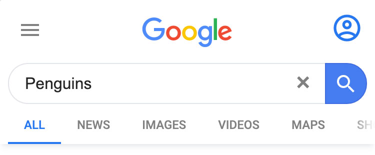
This section of the page is omitted.
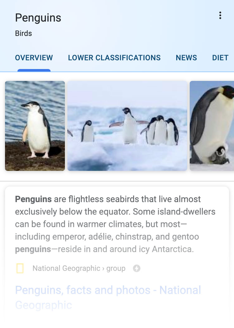
Analysis is restricted to this section.
We normalized the length of each search page to begin below the search bar and end below the "more results" button.
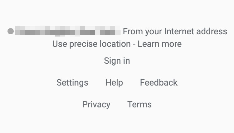
This section of the page is omitted.
In our sample, the length of the first page varied by query, from 1,400 to 9,100 pixels with a bell-shaped distribution and an average of 5,000 pixels.
We normalized the length of each search page to be able to examine the placement of elements at both the top and the bottom of the first page.
The top 15 percent of the normalized page is approximately the length of the first screen in an iPhone X, so we refer to that portion as the “first screen.”
We then used a novel web parsing technique to measure the presence and position of elements on the page. (See Appendix 1 for details.) This technique involved “staining” search results and links one of five colors, based on our categorization, then measuring the amount of space Google allotted to each category. (See Appendix 2 for details.)
1. Parse
Analyze the search results and categorize each module and section on the page.

2. Stain
Measure the pixels of each category on the page and stain it a color according to its category.

3. Aggregate
Combine pixels for each category on the page and divide by the sum of pixels in all categories.

To calculate the percentage of the area covered by the various categories of search results, we divided the total pixels covered by each category in our sample by the total pixels covered by all categories. This calculation does not include white space between results, or sections removed when we normalize the page length, such as the search bar, logo at the top, or other footer elements at the bottom, none of which are results.
This is the formula for the percentage of available area covered by results we categorized as “Google,” as defined in the Definitions section:
Xg =
g
g + ng + amp + ad
- Xg is the percentage of real estate occupied by Google
- g is the sum of real estate pixels occupied by Google products and answers
- ng is the sum of real estate pixels occupied by non-Google
- amp is the sum of real estate pixels occupied by AMP
- ad is the sum of real estate pixels occupied by ads
Where
Findings
We found that Google’s own results dominated the first screen (top 15 percent of the normalized page).
| First Screen | First Full Page | |||
|---|---|---|---|---|
| Area Covered | Frequency in Sample | Area Covered | Frequency in Sample | |
| 62.6% | 95.9% | 41% | 100% | |
| Non-Google | 19.2% | 80% | 44.8% | 100% |
| AMP | 12.1% | 22.6% | 13.3% | 80.7% |
| Ads | 6.1% | 8.1% | 1% | 9.5% |
Google apportioned only 19.2 percent of the first screen to non-Google results and links as opposed to 62.6 percent of the first screen to its own. For the entire first page, the share going to non-Google is higher, but still less than half, 44.8 percent.
In terms of frequency, Google results appeared in the first screen 95.9 percent of the time. In one out of five searches in our sample, not a single non-Google result or link appeared in the first screen; everything was either Google, an ad, or AMP.
Looking at the distribution of area covered by each category, in almost three out of four of our searches, 72.3 percent, Google apportioned no more than a quarter of the first screen to non-Google results and links. In 54.8 percent of our searches, Google gave itself the lion’s share of the first screen—75 percent or more.
As shown in the stacked area plot below, which is also in the abstract, Google placed the bulk of non-Google results and links in the middle of the first page, heavily toward the bottom-middle section. It placed results we categorized as Google mostly at the top and bottom of the page.
What Is on a Google Search Page As You Scroll Down?
Percentage of real estate across our sample, normalized page length
Top
Middle
Bottom
0%
20%
40%
60%
80%
100%
Well-established studies in the psychological sciences show that the placement of information on a page—namely the beginning and end of a list—favorably affects recall and evaluation. Other studies use this assumption as the basis for analyzing the rank of traditional search results.
Google delivered AMP results in a large majority of our search sample, 80.7 percent. In 22.6 percent of searches, AMP results were placed in the first screen.
Google served ads in fewer than 10 percent of our sample search results. When they appeared, ads were bunched at the top. Ad percentages varied by type of search. Google said ads are uncommon, but declined to specify how frequently they appeared.
Some of our results varied by type of search. Examining a smaller sample, of 700 search pages for each of the five topics of trending searches, we found some differences among categories. For health queries in our sample, for instance, Google took up nearly half of the first screen, 43.5 percent, with “answers.”
AMP results appeared in nine out of 10 searches in the entertainment, sports, and top stories trending categories in our sample.
Ads (including sponsored content) appeared in about 19 percent of trending searches from business and technology but a mere two to three percent from sports, entertainment and top stories. Below are two examples. (To see all examples, please refer to our Github.)
Business
| First Screen | First Full Page | |||
|---|---|---|---|---|
| Area Covered | Frequency in Sample | Area Covered | Frequency in Sample | |
| Non-Google | 32.6% | 84.4% | 49.9% | 100% |
| AMP | 4.7% | 10.3% | 8.7% | 65.9% |
| Google Product | 27.8% | 83.6% | 25.5% | 100% |
| Google Answer | 19.5% | 64.1% | 13.2% | 99.3% |
| Ads | 15.4% | 17.4% | 2.7% | 18.9% |
Entertainment
| First Screen | First Full Page | |||
|---|---|---|---|---|
| Area Covered | Frequency in Sample | Area Covered | Frequency in Sample | |
| Non-Google | 16.7% | 90.4% | 41.6% | 100% |
| AMP | 12.6% | 25.7% | 15.6% | 90.3% |
| Google Product | 42.7% | 97.1% | 31% | 100% |
| Google Answer | 26.7% | 83.4% | 11.7% | 99.9% |
| Ads | 1.2% | 1.7% | 0.2% | 2.4% |
Distance Down the Page
In addition to a stacked area plot, we used spatial element metadata to calculate how far a user would need to scroll before seeing various kinds of search results.
In our sample, a user would have to scroll past the first screen at least 75 percent of the time to reach the first traditional result (a subset of “non-Google”).
Google answers and products frequently appeared in the first screen, bolstering our main findings. For instance, when Google Images appeared in our sample, it was almost always in the first screen (75 percent of the time).
Median distance down page before first contact of page elements
50%
40%
30%
20%
10%
0%
Ad
Ad
Images
Google Images
Link
Non-Google Link
Answer
Direct Answer
Maps
Google Maps
Result
Traditional Result
Search
Google Search
Article
AMP Article
YouTube
YouTube
Limitations
Each of the choices we made, from screen size to the sample to categorization, carry with them limitations. Some would have had negligible effects on results. Others would have altered them significantly. What follows are the limitations we have identified, divided into sections.
Categorization
Our choice to count some modules or portions of modules as Google and some as non-Google, based on where the content comes from and where it leads, is an original approach meant to be accurate and fair. It is unlikely to completely please either Google defenders or its critics. Google disagrees with some of our categorization. (See Google Response section below.)
In addition, our decision to segregate AMP results is likely to be controversial, as some will consider them “organic” and others will consider them as evidence of Google’s increasing influence over the open web. Google said it considers them to be organic.
Under our definitions, Google apportioned 62.6 percent of the first screen and 41 percent of the entire first page to itself; it apportioned 19.2 percent of the first screen and 44.8 percent of the entire first page to non-Google results and links.
Had we chosen different definitions, our results would have also changed. When we measured the effects of multiple interpretations of what could be considered Google and non-Google, Google could cover a range between 48.6 and 83.1 percent of the first screen, and non-Google between 10.8 and 33.2 percent of the first screen:
- If we had counted all AMP as Google and left everything else the same, Google’s area would have grown to 74.7 percent of the first screen and 54.3 percent of the first full page. If we had considered all AMP to be non-Google instead, non-Google would have increased to 31.3 percent of the first screen and 58.1 percent of the first full page. (AMP covers 12.1 percent of the area at the first screen and 13.3 percent of the first full page.)
- Had we not hybridized “answers”-style modules but rather considered any result with an outside link as “non-Google,” no matter how much of the content was clickable, it would have shifted the first screen results by 14 percent. Leaving all other definitions the same, this change would increase non-Google results to 33.2 percent and drop Google to 48.7 percent of the first screen. It would have shifted full page results by only 3.1 percent.
- Using “traditional” results—the “ten blue links”–style—as the sole metric for non-Google results and only “modules” as Google results would have had a significant effect. Under that definition, non-Google area would make up only 10.8 percent of the first screen and Google would rise to 83.1 percent of the top. For the full first page, non-Google would bump up to 47.1 percent of the first page and Google would rise to 51.9 percent. Part of the reason both would rise is that AMP would no longer be its own category.
- Had we considered all “traditional” results as “non-Google” but continued to hybridize the modules, it would have resulted in a modest increase to the non-Google category, for a total of 19.5 percent of the first screen and 53.7 percent of the first full page. About 27 percent of traditional or “ten blue links”–style results are AMP, and one percent lead to YouTube or Google.com.
- Ads account for 6.1 percent of area at the first screen and one percent of all area on the first page. Had we considered ads to be part of the Google category, it would have grown to 68.7 percent of the first screen.
Using any of the above definitions, the result remains that Google gave itself the most area at the first screen. (See table in Github.)
Compared to other possibilities, our interpretation fell in the middle
First screen area devoted to Google and non-Google
-
Interpretation
Google
Non-Google
-
Interpretation with most non-Google
48.6%
33.2%
-
Our interpretation
62.6%
19.2%
-
Interpretation with most Google
83.1%
10.8%
Google criticized our choice to include feedback links as Google, saying they are meant solely for product development. But these links are non-consequential, accounting for only 0.05 percent of all area in the first screen and 0.03 percent of all area in the first full page, so they would not have affected any of our results.
Sample Selection
It is not possible to obtain a truly random sample of modern web searches. The most recent publicly available sample of representative search queries is 14 years old. It’s a set of 20 million queries from 650,000 AOL users and was criticized for being unethical since it was possible to identify individual users.
Google said in a statement that 15 percent of the queries it receives every day are new.
Because our sample of 15,269 searches was created from popular search queries, it fails to capture unique searches that individual users often make.
Our sample consists of all available categories (business, health, technology & science, entertainment, sports, top stories) from Google Trends for the U.S. between November 2019 and January 2020. (For more details, see Appendix 1 .) It may be different from a truly random sample in ways we do not know.
For instance, ads appeared in less than 10 percent of our sample searches and were even less common in entertainment and sports searches. We suspected this is low, compared to all Google searches. When we asked Google, spokesperson Levin said only that ads “do not show on most queries.”
Our sample was heavy on news and media results, which we found often return AMP results on mobile. We suspected this may be different from what we would have found with a random sample, had one been available. Levin confirmed that—and said that trending searches would also be more likely to contain knowledge panels. Knowledge panels appeared in three out of four searches in our sample.
About 1,539 records from our sample—about one percent of the non-duplicated searches—had become corrupted as a result of assets and JavaScript in the source code that expired between the time we gathered the search terms and the time we ran later tests as we refined our methodology. We removed these from our sample.
Location and Personalization
We fixed the location for our searches as New York City. Research from Brown University and Northeastern University suggests that geolocation most impacts queries for local establishments, whereas general terms exhibit essentially no personalization.
We did not log in to any Google account when making searches, and we performed searches in batches of 300, sequentially, with only seconds between them. This may have also affected the number of ads we were served.
Display
We chose a mobile format for our results because Google reports that more than half of searches are performed on mobile, and others have put the estimate at 60 percent.
Search results on a desktop would be different. For instance, Google’s desktop search results contain two columns of information, where mobile results contain only one. The extra column would result in differences in page placement.
To standardize the screen size, we used the dimensions of an iPhone X. An iPhone’s screen size is slightly above the median size for modern smartphone screens. Normalizing the page length reduces the effects of screen variation among smartphone models.
Choosing an iPhone X resulted in some links to the Apple app store in our sample, which we categorized as non-Google. Had we chosen an Android device, the links would have led to the Google app store which would have been categorized as Google.
White Space and Standard Page Elements
When calculating the percentage of results in any category, we only counted the area of the results themselves. We did not include white space between results, the search bar itself or other standard objects on the page.
These elements and white space together take up 28.7 percent of the full first page.
Google Response
Google disagreed with our categorization in the following ways:
- Levin objected to our decision to put AMP in its own category, saying that those results should have been categorized as “non-Google”: “Those are outbound links to publishers and other web creators. To suggest otherwise is not factual.”
- Levin objected to our categorizing direct answers, including knowledge panels and featured snippets, as Google, saying some rich traditional results contained similar information and we counted the latter as non-Google.
- Levin objected to our categorizing “feedback” links that prompt users to send feedback on featured snippets as Google. These links make up just .03 percent of the page.
- Levin objected to our categorizing featured snippets as Google. “It’s inaccurate to portray featured snippets as simply answering a question and never resulting in a click—many sites strive to have their content highlighted as a snippet, as it can drive meaningful traffic to their sites.” She declined to provide data on how much traffic featured snippets send to websites. (On the other hand, she also said that answering queries by putting knowledge panels on the search results page, without sending traffic to websites, is good for users. “Directly answering queries based on such information is not ‘diverting traffic’; it is doing our job as a search service,” she said.)
“This methodology, which is based on a non-representative sample of searches, is flawed and misleading,” Levin said in an emailed statement. “Providing feedback links, helping people reformulate queries or explore topics, and presenting quick facts is not designed to preference Google. These features are fundamentally in the interest of users, which we validate through a rigorous testing process.”
She said that many of the modules we called Google are developments in service of the user, such as knowledge panels and “people also ask” and “related searches” modules, which lead to more Google searches.
“That has nothing to do with ‘keeping people on Search,’ and everything to do with helping them find what they actually are looking for without wasting time clicking on irrelevant links or retyping their search,” her statement read.
Levin also objected to Google being singled out. “This methodology also does not consider a comparison of Google with any other search engines, many of which take a similar approach in terms of providing helpful features that display quick facts or help people explore related topics.”
Google has a 90 percent market share in the U.S.
Conclusion
We found that Google is putting results it creates, including those that refer to its own properties, in the choicest positions: 62.6 percent of the first screen was taken up by Google content, leaving just 19.2 percent for non-Google content in our sample.
We found that in more than half of searches, Google content took up at least 75 percent of the first screen. In one in five searches, non-Google content was entirely absent from the first screen.
Google’s own content is so ubiquitous on the search results page that it rivals non-Google content for dominance on the entire first page, with the categories taking up 41 and 44.8 of the available area, respectively, based on our definitions.
Google’s dominance of the search market—delivering 88 percent of the U.S. searches—means these choices have huge potential effects. Website owners depend on traffic from Google.
Google co-founder Larry Page said in 2004 that the conflict of interest created when a search engine also owns content may degrade the quality of search rankings—though at that time he was criticizing the competition about editorial content it was putting on its search pages, according to a statement from Google.
Google continues to roll out and acquire products that compete against other companies. These include YouTube—now the second-most popular website in the world; Google Flights and Hotels—which in 2019 dwarfed its U.S. competitors, Expedia.com and Booking.com; and answer modules, which compete with publishers including Wikipedia.
We found Google commonly returned its products in search results and featured them prominently.
Appendices
Appendix 1: Data Collection and Data Preprocessing
We created our sample using an undocumented API to collect real-time data from Google Trends every six hours from Nov. 5, 2019, to Jan. 7, 2020. We collected all trending queries for all topics Google provides: business, health, entertainment, sports, technology and top stories localized in the United States.
Each API call returned a JSON record, which we parsed to return an “entities” field (e.g. Skin rash, Allergy, Medicine, Molecule) that we used to conduct searches in a mobile emulator. This produced an average of 300 unique search queries a day.
To create a mobile emulator, we used Selenium to launch a headless Firefox browser. The browser was parameterized with an iPhone X user agent, and its screen dimensions (375 by 812 pixels). Focusing our study on mobile allowed us to standardize and bound the screen dimensions.
Every 10 minutes, a new emulator was launched on a server in New York City. The emulator visited Google.com and performed 50 sequential searches by typing and submitting queries into the search bar. For each search, the emulator saved the page source as HTML, as well a screenshot ofthe first full page. These batches of searches were performed sequentially, seconds apart.
We used the HTML source code as a basis of identifying the different units of analysis in our study. We collected a total of 42,104 records, but our final dataset contains 15,269 HTML records (each record is one search) after removing duplicate search terms and filtering out 1,539 corrupt records. We determined a record was corrupt if it contained elements that were greater than 700 pixels (86 percent of the screen) when we preprocessed the data in March 2020. This was a result of expired assets or JavaScript from the original source code.
In order to identify and quantify the different types of results and links on the search pages, we used traditional front-end web scraping to isolate DOM elements based on HTML characteristics.
We read the HTML of each search result into BeautifulSoup and wrote more than 60 custom web parsers to identify each type of result and its xpath (a unique identifier of CSS elements on a webpage). Our web parsers used HTML attributes (tag type, data-*, text, and JavaScript handlers like jsaction) and accessibility features (Accessible Rich Internet Applications [ARIA], alt text) to assign each result a categorization of ad, AMP, non-Google, Google product, or Google answer (more on that in the next section). Google product and Google answer together make up the “Google” category in our findings.
We discarded headers, like the search bar or tabs to things like “images” or “shopping.” We also discarded footers, which are also standard and made up of links to settings, help, feedback, privacy, and terms. Lastly, we discarded icons that lead to phone calls. These icons do not link out to websites, Google properties, or keep you on the search page. Instead we only look at the search results, including modules.
However, since these techniques were limited to static web pages, they did not provide essential spatial metadata about each result’s visibility, location, and dimensions.
To solve the problem, we came up with a novel approach that allowed us to “stain” results and measure their presence and position on a mobile web page. The approach, which we will call “web assay” here, was inspired by the biology lab method of identifying and measuring the presence of cell components and other substances through targeted staining or dying, called assays. We reimagined the technique for the web.
In addition, our choice to analyze selections of a rendered page was inspired by two browser extensions: Perceptual ad blocker, a project by researchers at Princeton University that uses visible features to select and show advertisements, and Abstract browsing, a Chrome plugin by visual artist Rafaël Rozendaal, which “shows you the skeleton of the web” by highlighting the composition of web pages.
Using web assay, we fed each search result page’s HTML back into the mobile emulator and used Selenium to select each element based on the xpath. Selecting elements in Selenium gave us extra information we sought, such as whether an element is visible, as well as the location, length and width of the element.
Using the additional spatial metadata from Selenium, we were able to calculate the area occupied by each result on the first screen as well as the entire first page. We did this by adjusting the length and width of each result according to the x and y offset from the location and clipping values outside the dimensions of the first screen (375 pixels in the x-direction and 15 percent down the normalized page) on an iPhone X and full first page.
We used this spatial metadata along with the categorization assigned by our custom parsers to estimate the area or real estate occupied by each category. We performed the same calculation on each search page in our dataset.
Appendix 2: How We Parsed Each Category
We categorized the results in mobile search results as non-Google (gray), ad (red), AMP (blue), or Google (yellow and green).
To do this, we created 68 web parsers using visual and programmatic markers to capture the unique results we frequently encountered in our dataset. To see all our parsers, refer to our GitHub repository. We used the same identifiers to test each parsers’ performance. (Read more about this in our error analysis section.)
Non-Google
Our parsers identified non-Google results by searching for <a> tags that included an “href” attribute (which indicates a hyperlink) and excluded a “data-amp” attribute and led to websites other than YouTube and Google.
In those cases, we hybridized the treatment of the modules, counting outside links as non-Google and unlinked text as Google. This means that some small amount of white space is discarded, which is different from results that are all one category.
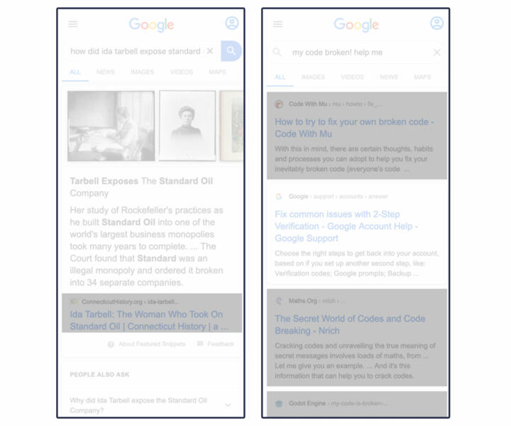
Non-Google real estate in the examples below is highlighted in gray. The example on the right shows non-Google links embedded within Google modules like the “featured snippet” or other “answers”-type results.
Ads
We primarily identified advertisements by the “ads” and “sponsored” icons Google includes on them. Ads include paid text-based search listings and paid Google hotel listings. Sponsored listings include certain Google Shopping products, and local services.
After January 2020, Google Flights no longer accepts fees from airline providers and is no longer marked as “ad” or “sponsored.” For this reason, we consider Google Flights to be a Google product rather than an ad.
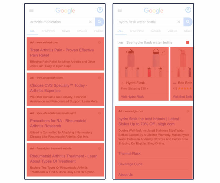
Our parsers looked for the presence of disclosures of ads in accessibility features, links which directed to Google Ad Services, and event listeners like “jsaction” that launched JavaScript functions when clicked. For calculations that involved real estate, we measured entire cards within carousels (left) and sponsored items (right).
Here is an example of several kinds of ads, in red:
AMP
Our parsers identified AMP content based on a “data-amp” attribute in <a> tags. For calculations that involved real estate, we used the same criteria as other categories, measuring the entire search listing, as well as the clickable module.
Common AMP elements are highlighted in blue below:
We categorized results that either link to other Google products when clicked or provide an answer on the search page as fully or partly Google.
We used a sub-category of Google “products” for results that lead the user to Google Maps, YouTube videos, Google Images, Google Flights, more Google searches, or Google Hotels. We also counted specialized content, like Google-created augmented reality animal models that turned up in our sample, as Google.
This sub-category includes YouTube embedded videos that play on the search page and images within search results that, when clicked, trigger reverse image searches on Google Images.
There is no single visual flag that we used to identify Google “products,” so our parsers used several methods to identify them. They looked at all non-AMP <a> tag elements with links and checked the domain of the hyperlink against known Google domains. If the URL starts with a backslash or any other symbol, we found it leads to a Google property.
Naturally, Google has more complex hyperlinked elements than just <a> tags. To capture these, we looked at HTML attributes like accessibility features (such as ARIA), JavaScript, and data attributes.
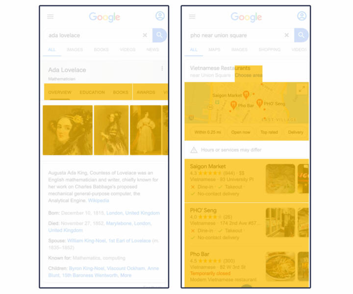
For results that contained linked Google “products,” we measured the area that is clickable. Examples of Google “product” results are highlighted in yellow below:
Google “answers” is a sub-category of Google. It refers to modules that contain Google-curated text and data visualizations, often scraped from the open web but sometimes with permission from the website owners. A Google “answer” can be presented as a data visualization, such as stock prices and popular times at your favorite restaurant.
Our parsers detected answers using accessibility features like ARIA, invisible headers, and data attributes in the source code—namely “data-attrid” attributes such as “kc:/music/recording_cluster:lyrics.” These legible, organized data sources are exclusive to “answers” and clearly show Google pulling down content from a named proprietary database. We found references in the code for “answers” to other named data sources such as ss, hw, wg, and okra. These references are always hierarchical queries, which are endemic to graph databases.
We measured the area of text-heavy Google answers by the rectangle that encases the text. Expandable answers are measured by the entire clickable element, and data visualizations are measured by the boundaries of the graphic.
Examples of Google answers are highlighted in green:
Appendix 3: Error Analysis
We used several approaches to check for errors.
Debugging
To check the performance of our web-parsing method during development, we used Selenium to inject CSS attributes to “stain” rendered elements according to category and saved the page source. This method altered the appearance of elements within the webpage, clearly delineating the categories of results. We also injected a custom attribute called “markup-category,” which altered the underlying source code and connected each stained element to a parser. This was an essential debugging tool for developing each of our custom parsers.
Spot-checking Stained Images
To evaluate the performance of our web parsers and the accuracy of our calculations, we spot-checked 741 stained search pages. We used the graphics library p5.js to visualize our staining technique directly on full-page screenshots of search pages.
Using the screenshot, we drew the borders of results and links for each category based on the spatial metadata returned by the web assay.
Each category was assigned a color consistent with the previous examples in our paper: gray for non-Google, green for Google answers, yellow for Google products, blue for AMP and red for ads.
Examples of stained images:
Using the Prodigy annotation tool, we created a user interface and a coder manual for two annotators to spot-check 741 stained images randomly sampled from our dataset. We had the annotators look for two types of errors.
1. Classification: unclassified or misclassified elements.
2. Measurement: an error in the area measured for an element.
The two authors of the paper were annotators. For search results with errors, we determined how many pixels were over- or under-counted for each category.
We found errors in 74 stained images (9.99 percent of our spot-checked images).
We found 14 stained images (1.89 percent of spot-checked images) with classification errors, eight of which resulted from misclassifying as “Google” buttons and filters that should have been considered ads.
Measurement errors occurred in 65 images (8.77 percent of the spot-checked images), most of which were undercounted area. This occurred primarily from missing text in AMP traditional search listings. This occurred in 23 searches, leaving out an average of 44.52K pixels, or 3.85 percent of area on the first full page.
When we compiled the pixel-level adjustments to correct for the 74 measurement and classification errors, we found that all categories were net under-reported. Accounting for these errors did not alter our percentages for any category in our sample by more than one-tenth of one percent on the first full page. We did not look specifically at the effect on any portion of the page.
Acknowledgements
We thank Christo Wilson and Ronald E. Robertson (Northeastern University), Pete Meyers (Moz), and Rebecca Goldin (Sense About Science USA and George Mason University) for comments on an earlier draft.
Correction
An earlier version of this story transposed the percentage AMP in our sample in two instances. The first switched the overall percentage of AMP on the first screen with that of the first page, the second transposed the percentage of AMP in a subset of business searches with that of the entire sample.
