Subscribe to Hello World
Hello World is a weekly newsletter—delivered every Saturday morning—that goes deep into our original reporting and the questions we put to big thinkers in the field. Browse the archive here.
Hi everyone,
Sisi here, and we need to talk about Donald Trump, Kate Middleton, and one very specific shark.
Let’s just get right into it.
Donald Trump
Earlier this month, the BBC broke the news that Donald Trump supporters are using artificial intelligence to generate different photos of Trump and Black people as a way to appeal to Black voters.
A series of news outlets wrote about the photos, and gave them a unique treatment that I’ve only seen emerge in the year or so since AI-generated images became easy to create.
-
The BBC published the images, but superimposed a red bar across the photo and added a red “FALSE” label, alongside a warning symbol. 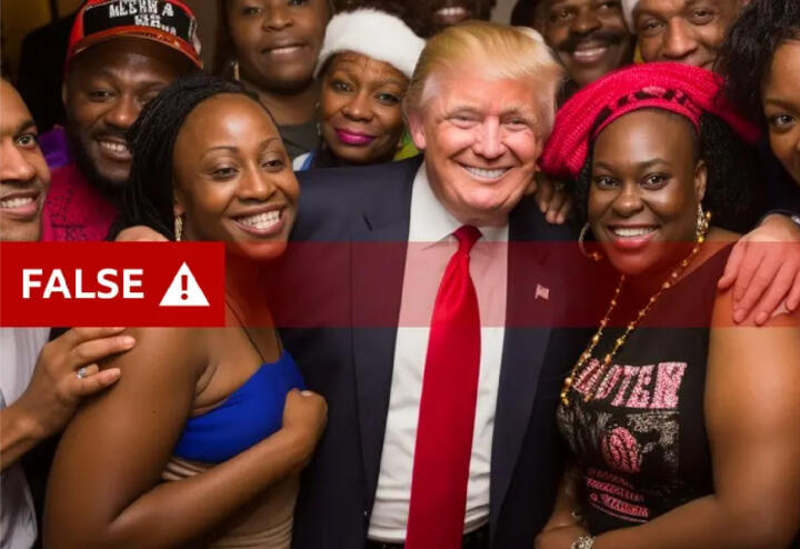
-
The Guardian took a similar approach, labeling the image as “FAKE” and putting the label right in the middle of the photo. 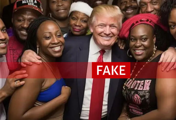
-
The Washington Post went one step further, labeling it as a “AI-GENERATED FAKE PHOTO.” 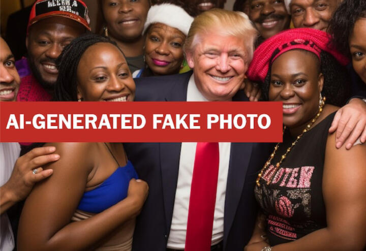
Some outlets, like the Associated Press and the Los Angeles Times, published articles about the AI-generated Trump images but didn’t republish the images themselves. The AP’s generative AI policy says, “We will refrain from transmitting any AI-generated images that are suspected or proven to be false depictions of reality. However, if an AI-generated illustration or work of art is the subject of a news story, it may be used as long as it [is] clearly labeled as such in the caption.” Other outlets, like the New York Post, did the opposite, publishing the images with no labels and using the regular caption to tell readers the photo was AI-generated.
Seeing newsrooms republish these images, even with big red labels, caused a small stir at The Markup. We dove into a discussion about whether these labels were good enough, and if the photos should have been republished in the first place.
My first reaction after looking at the BBC and Guardian examples was confusion. What does “FALSE” and “FAKE” mean? Did someone photoshop Donald Trump into a real picture? Are all the smiles fake? What, exactly, is false?
I spent a good period of my career designing and coding interactive graphics, and when I taught students how to fact-check their visual work, I asked them one main question: If someone glanced at your work for one, maybe two seconds, what impression would they walk away with?
As a journalist, if the answer to that question is anything other than what you intended, you’re not done. The rule applies to anything from a simple chart to a label on a photo.
In the three examples above, The Washington Post adds in the only label that would tell me one more piece of information: that the image is generated by AI.
News
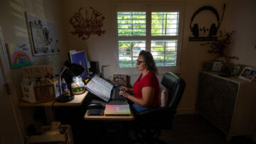
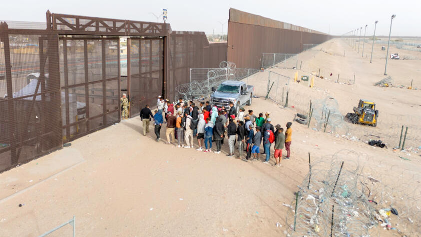
The Future of Border Patrol: AI Is Always Watching
Human rights advocates warn of algorithmic bias, legal violations, and other dire consequences of relying on AI to monitor the border
But is that enough? As some of our journalists pointed out, the image isn’t totally “fake,” at least not in the traditional sense. Yes, the images are not depicting a real event that took place. But let’s say someone made a photorealistic painting of this exact image. We wouldn’t call that “fake.”
The image is a fake in the very important way that it appears to have been made specifically to deceive whoever sees it into believing something happened that never did. So while it is not wrong, exactly, to label the image “fake,” only the Washington Post really nailed it by saying it’s both fake and made by AI.
More conventional fake images have existed for a long time, of course, and have not received this type of red label treatment from journalists.
Speaking of those, let’s talk about the Kate Middleton photo.
Kate Middleton
Yesterday’s news that Kate Middleton has cancer put an end to the firestorm of intrigue and speculation that started earlier this month when the official Instagram account of The Prince and Princess of Wales posted a family photo that people quickly noticed was digitally altered.The Associated Press published the photo, but once the organization found out it had been manipulated, the AP retracted the image and told all their clients to do the same. Meanwhile, Instagram labeled the image as an “Altered photo/video,” and users could only see the photo if they clicked past a blur filter. Many news organizations like the BBC, Vox, and The New York Times published the photo, but only alongside their own annotations of where it looked to be edited.
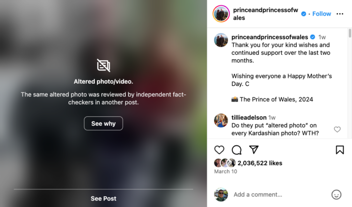
I asked our visual designer, Gabe Hongsdusit, who created our zine on how The Markup illustrates technology and AI and commissions nearly all our photography, if he thought news organizations should be republishing AI-generated or human-altered images when they report on them. He said yes: “It’s important to see the photo along with the clear label or annotation that it’s AI-generated so that we can help readers build the act of looking/discerning as a skill. They need to be able to see the actual image in order to do that.”
Gabe said that since the technology to doctor photos is so readily available, people’s “skill of discernment” is needed more than ever. He then pointed me to illustrator Julien Posture, who wrote eloquently about the Kate photo, and how this is just the beginning of what’s to come:
Something that I would pompously call a new ‘culture of visual inquiry’ is emerging. The very little visual literacy that used to be enough to navigate our mediascape is nowadays completely obsolete. The overwhelming quantity of deceitful content online has fostered a need for different, skeptical ways of seeing.
Hello World
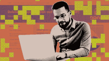
I Used ChatGPT as a Reporting Assistant. It Didn’t Go Well
The AI tool ignored basic instructions about sourcing and citations. But it’s a pretty good newsroom coding partner.
There’s no question to me that anyone who comes into contact with the internet these days will need to start questioning if the images they’re seeing are real. But what’s our job as journalists in this situation? When we republish viral or newsworthy images that have been altered or were generated by AI, what should we do to make sure we’re giving readers the information they need? Doing it in the caption or the headline isn’t good enough—we can’t assume that readers will read them.
One reason this photo, out of all the photos that have been altered, became such a big deal is because of all the rumors and conspiracy theories about Kate that preceded it. But people have been altering photos for a very long time. In fact, we’re all pretty used to magazines editing photos of celebrities to be thinner, poreless, or more “attractive” in some way, often without their knowledge or consent. So why isn’t there a big “ALTERED PHOTO” label on those images whenever we see them published by a news outlet? Or a “FAKE” or “FALSE” label? Why don’t celebrity photoshoots come with a giant “BEAUTY FILTER ON” label?
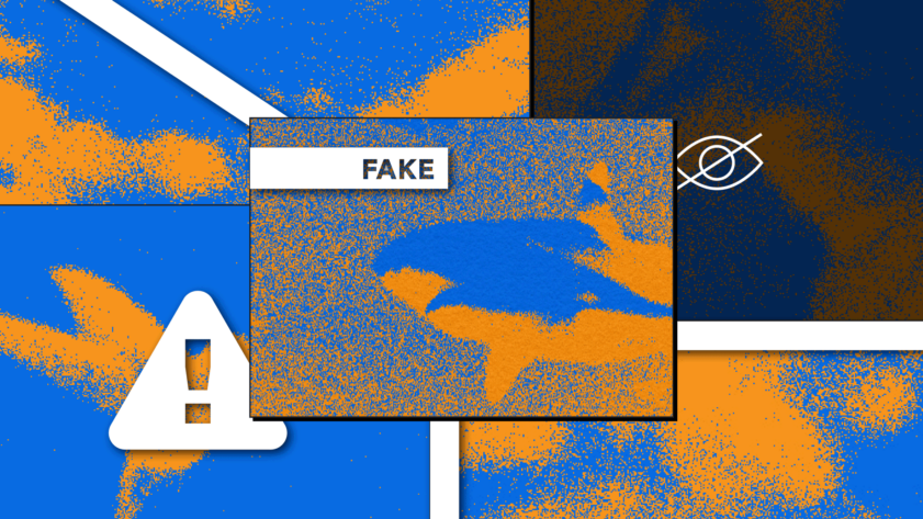
A Very Specific Shark
You may have seen this shark before … because every time there’s a water-based natural disaster, this shark likes to show up.
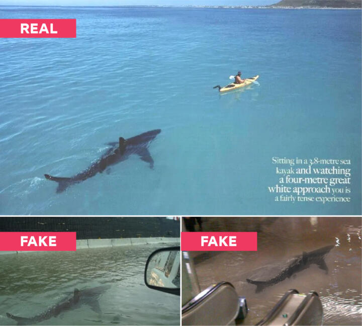
If you have yet to fall for one of the many photoshopped versions of this shark showing up during in a flooded train station (or the Kuwait Scientific Center), in the streets of New Jersey (or the streets of Puerto Rico), or after Hurricane Irene, then can call yourself lucky, because I fell for a photo of this shark swimming in New York City streets during Hurricane Sandy. That photo looked identical to the New Jersey, Puerto Rico, and Hurricane Irene photos above.
These photos are clearly fake. But why did no one put a big red label with the word “FAKE” on top of the photos back in the early 2010s when they were first circulated and multiple sites were debunking the images?
News
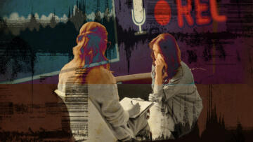
With AI, Anyone Can Be a Victim of Nonconsensual Porn. Can Laws Keep Up?
States around the country are scrambling to respond to the dramatic rise in deepfakes, a result of little regulation and easy-to-use apps
What exactly is it about AI-generated images that has spurred journalism to label misrepresentation in photos more clearly? And now that we’ve started to do it more obviously, shouldn’t we be doing it everywhere images are fake? Not just for AI?
These examples prove that there is no industry standard yet—we are, in fact, all still figuring it out. The AP’s stance could very well be the right one we should all adopt. At The Markup, we have a very similar policy: “If we publish imagery generated by AI because that is the point of the story, we will clearly label what art has been generated by AI.”
But in both the AP’s policy and our policy, it’s now clear to me that using “clearly label” as the standard is right, but it’s also too vague. It is our responsibility as journalists to make it obvious to you, our readers, what is going on in an image within the first one to two seconds of you seeing it. Our labels cannot rely on the peripherals: the captions, the headlines, even the surrounding article itself. Our labels cannot cause confusion. Our labels need to be crystal clear and in your face—because the AI and the fakers certainly are.
Sincerely,
Sisi Wei
Editor-in-Chief
The Markup