Subscribe to Hello World
Hello World is a weekly newsletter—delivered every Saturday morning—that goes deep into our original reporting and the questions we put to big thinkers in the field. Browse the archive here.
Despite their ubiquity in modern life, maps have a distinct set of challenges that set them apart from other visualizations, such as charts or tables.
Even by the standard of the large datasets we often work with at The Markup, geospatial data is voluminous and complex, because the physical world it encapsulates is big and messy.
A good map summarizes and simplifies the territory it represents, without distortion or destruction. As if such a task weren’t tough enough, any aspiring cartographer must also deal with the laws of geometry, which make it impossible to flatten the spherical Earth (technically an oblate ellipsoid) onto a two-dimensional plane without some compromises.
At The Markup, we add a final hurdle to this obstacle course: our privacy promise.
The Markup pledges to collect as little information as possible about our readers. We do not use tracking cookies on our site. We scrutinize third-party services before including them in our articles or elsewhere on our site. Many include trackers or analytics that would collect data on our readers. These may be standard across much of the web, but we don’t use them.
As a result, when we decided to map the addresses we’d collected in our investigation into internet speeds across the U.S., we ran into a familiar problem.
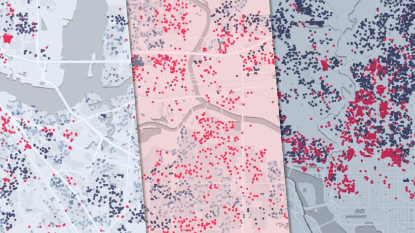
Investigative journalists Leon Yin and Aaron Sankin collected over a million internet offers in 45 U.S. cities and found a quartet of major ISPs routinely charged customers the same price for vastly different internet speeds (a practice called “tier flattening”).
By analyzing the download speeds providers offered to these addresses with Census demographics and digitized historical maps, Leon and Aaron found ISPs disproportionately offered the worst deals to neighborhoods with the lowest concentration of White residents and lower median incomes.
We wanted to plot our results on a map, so readers, activists and other journalists could pan across their city, zoom down to the street level, and see house-by-house internet speeds.
Initially we turned to Mapbox, an established leader for generating and publishing online maps. But when we embedded a map from Mapbox on our staging website, we found it assigned a tracker that could not be disabled without violating Mapbox’s terms of service.
This wasn’t the first time we’ve run into this problem with third-party services. Longtime Markup readers may remember how long it took us to find an email provider that allowed us to disable the trackers that would otherwise be sent out in our newsletters. We’ve also had to build our own privacy-protecting video player, donation platform, A/B testing tool, and more.
We went looking for a tracker-free map, and considered our options. We use Datawrapper for many of our basic charts and maps, but Datawrapper only supports up to 100 points on a symbol map. We had to plot more than 900,000 addresses.
We surveyed the vast landscape of mapping solutions, examining services such as Felt and Protomaps. Ultimately we settled on MapTiler, a Swiss company. MapTiler offered a flexible—and most importantly, tracker-free—suite of tools for hosting and styling map data. Their privacy policy clearly documents the information they collect and where, even specifying they only hold IP addresses of visitors in their memory for a short time before destroying them. And unlike some proprietary products, MapTiler sources its base map from OpenStreetMap, an open-source collection of geographic data.
As part of the investigation, Leon collected addresses from two open-source datasets, OpenAddresses and NYC OpenData, both of which came with latitude and longitude coordinates assigned to each street address. We used the command line tool tippecanoe to transform these addresses into vector tiles, carving up address locations into smaller subsets which could be quickly loaded in the browser.
Finally, we used MapLibre GL JS, an open-source derivative of Mapbox’s mapping library, to display the base map and address tiles on our website. We added features such as a tooltip with the details of every address, and filters to isolate neighborhoods by demographics.
The end result, which was published on May 11, reveals the stark disparities in internet speeds in major urban areas across the country. We hope it will open up a new frontier of Markup maps.