Subscribe to Hello World
Hello World is a weekly newsletter—delivered every Saturday morning—that goes deep into our original reporting and the questions we put to big thinkers in the field. Browse the archive here.
Hi everyone,
Gabe Hongsdusit here, The Markup’s visual designer. Last month, we published an investigation about how car insurers in Michigan charged more in Black neighborhoods. You might have noticed the opening animated illustration; our goal was to immediately grab the reader’s attention and bring them into the story in a memorable, humanizing way.
A story like this could have led with maps or data graphics, but either of those approaches would have been expected. The Markup’s visual sensibility is both fun and approachable; we use visuals to not only explain what’s going on in our stories, but to also delight readers. Illustration is an effective communication tool that can do both. Here is a behind-the-scenes look at how we came up with the art for this investigation.
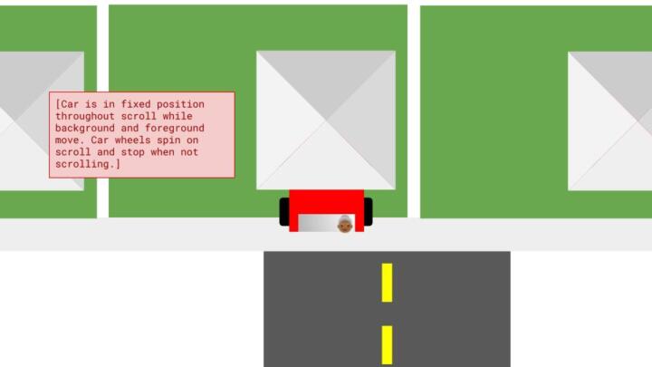
Soo Oh, the editor for this project, knew that this story needed something to ground the reader; otherwise they could get lost in the statistics and numbers of it all. She came up with the idea of an illustrated explainer that focused on one car driving from one Michigan neighborhood to another. The reader would follow the car’s journey as they scroll down the page.
Soo drafted a mockup using Google Slides and shared it with me and Joel Eastwood, our visualizations engineer. I thought this was a great idea and the mockup gave us a head start on figuring out each element of a dynamic illustration like this. To start, we needed a car, a neighborhood, and two houses as separate layers.
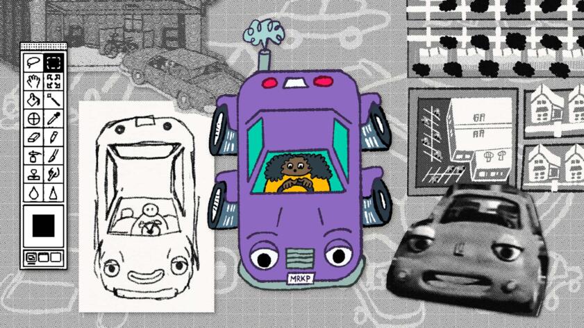
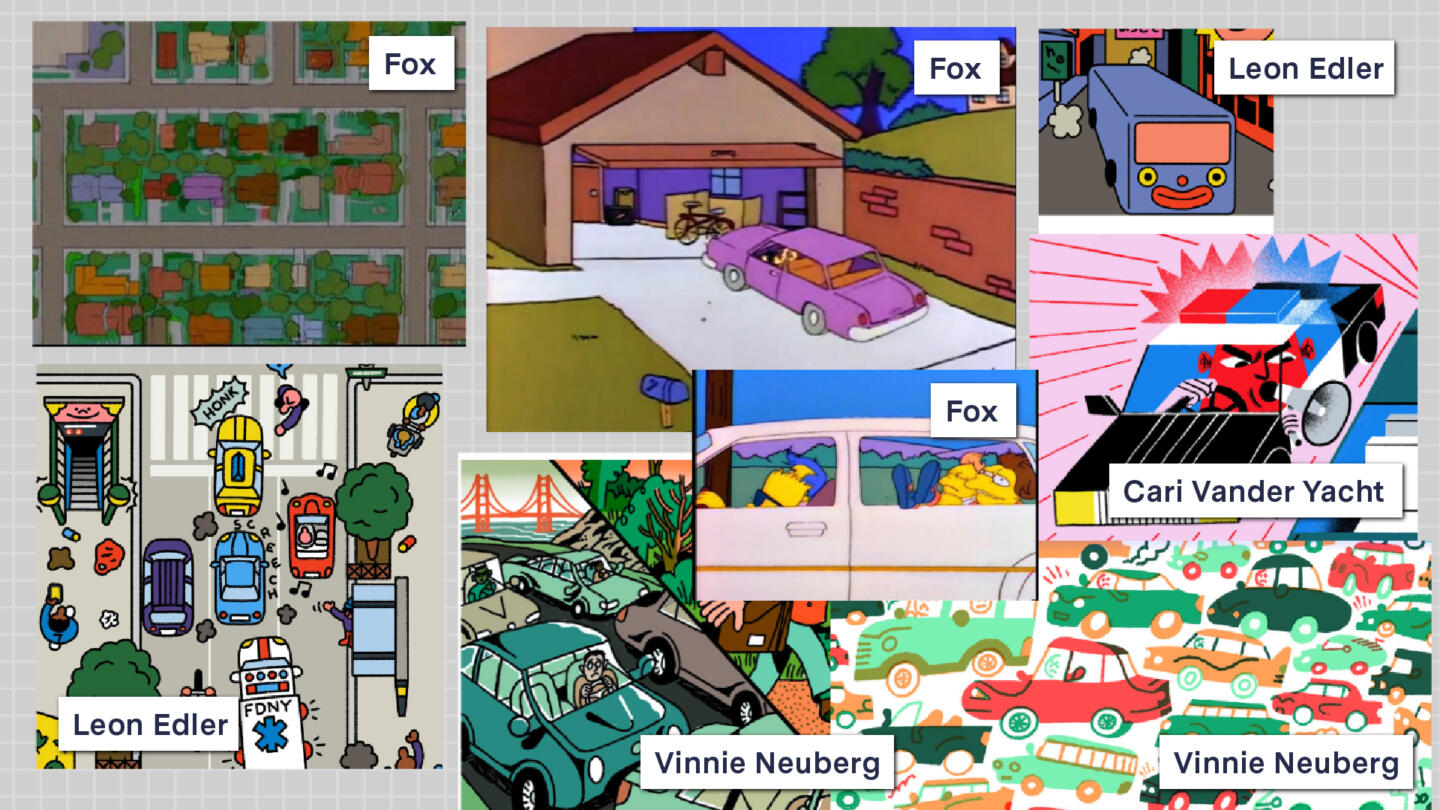
The idea of a car leaving a house to enter another one reminded me of the iconic opening to The Simpsons, which became a source of inspiration for style and color. I love opportunities to reference pop culture (see this IG post inspired by Star Wars) and The Simpsons has such a distinct color palette of blues, pinks and purples. I gathered screenshots of the show and other illustrative interpretations of cars in a moodboard to figure out the style.
The car was going to be a big element in the illustration. Since the reader was going to follow it from beginning to end, it needed to be distinct and memorable. Using my moodboard, I started sketching cars to familiarize myself with its basic shapes. I asked myself: How can I convey a car but not be too literal about it?
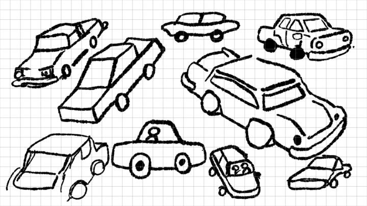
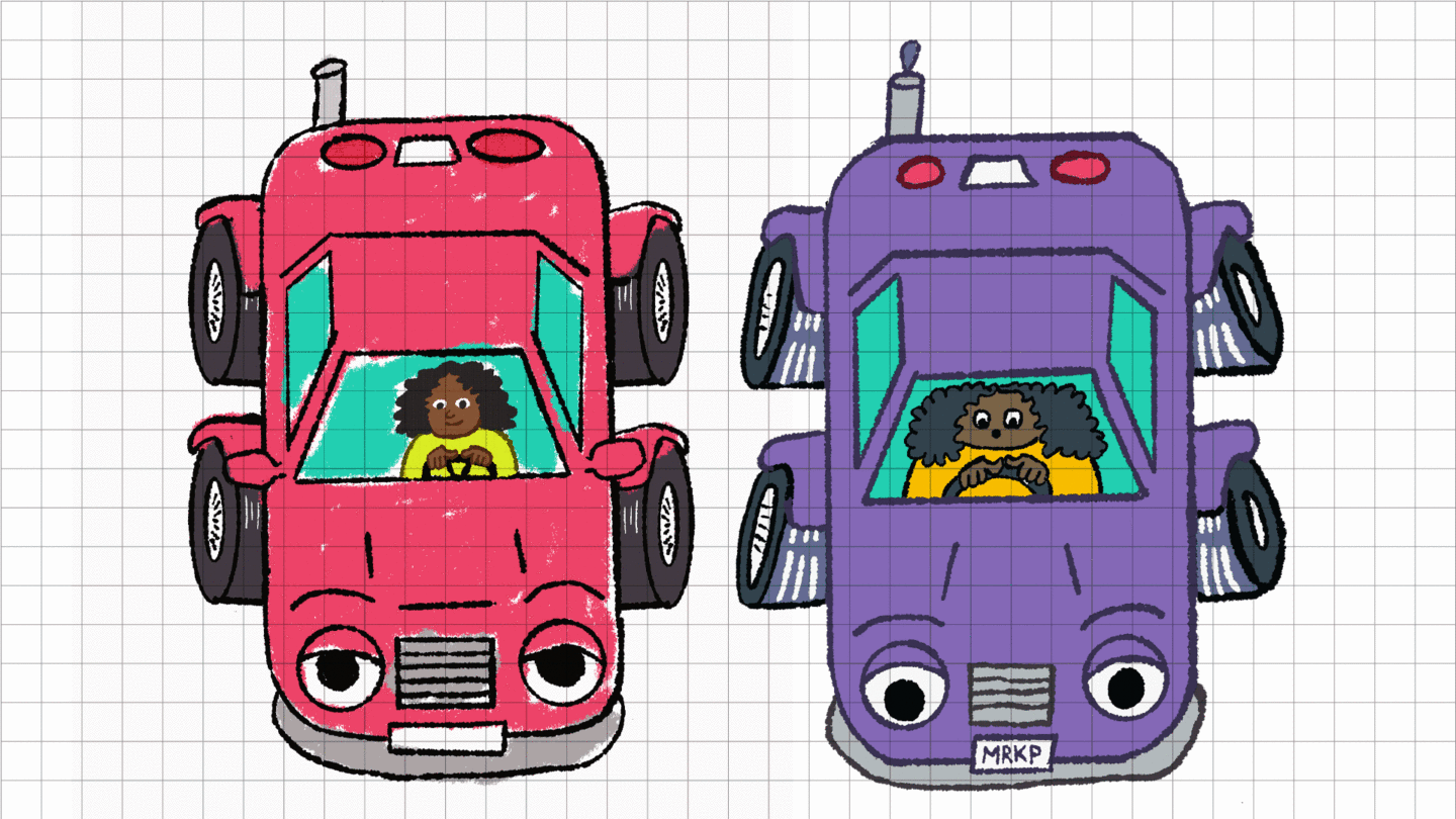
These Chevron car commercials gave me the idea to anthropomorphize the car as a character. I replaced the headlights with eyes and gave it a smile, which I eventually got rid of because it felt too cutesy for a story about racial discrimination. Earlier, more playful renditions of the car didn’t feel like a car enough; one editor said it looked more like a slug! We eventually settled on a character design that read as a car but was still stylistically playful.
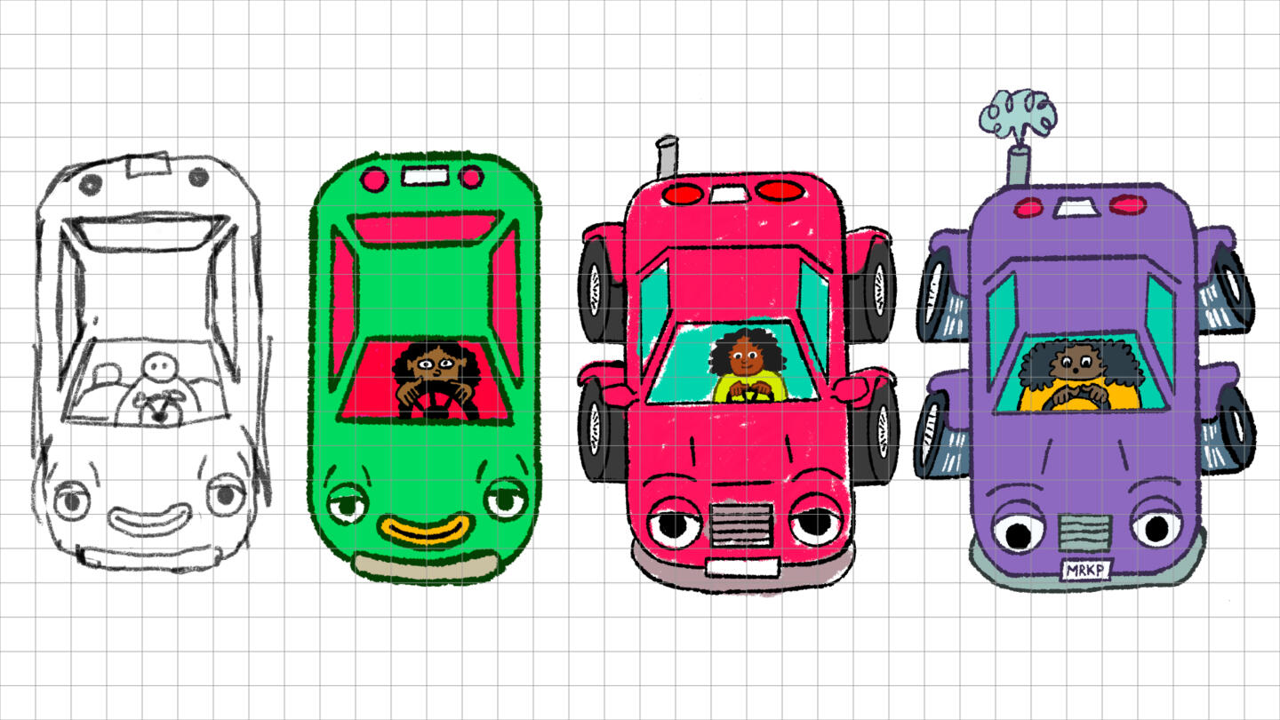
The progression of the car character. I gravitate towards illustrative styles that are more playful and interpretive, because realism in art is overrated.
The next step was adding subtle animated flourishes to make it seem like the car was really moving through the neighborhood. There was a lot of trial-and-error in figuring out the speed and frequency of the tire streaks. For example, I learned that just having one set of tire streaks didn’t work—no one who looked at the car felt like it was moving. But two streaks per tire successfully conveyed that there was nonstop action around the wheels and that they’re rotating hundreds of times. To further emphasize that yes, this car is moving, I also added a fun little cloud of smoke that poofed out of the exhaust pipe.
I also had to design the look and feel of the neighborhood. Earlier sketches of the surrounding houses were more realistically proportional to the size of the car, but the layout felt flat. Once I started playing with scale, I realized that the overhead view of the neighborhood didn’t have to be so realistic. Tinier buildings made your eye naturally gravitate towards the larger car character.
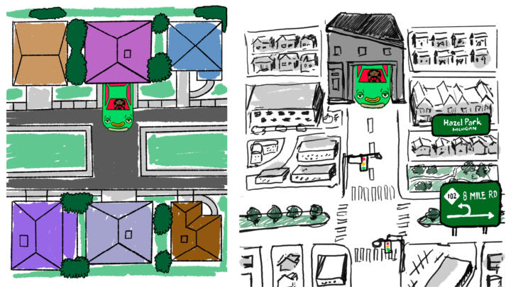
In the visual explainer, we wanted to emphasize how both Michigan neighborhoods were similar to each other. To show that, I divided the neighborhood into quadrants and used the same color palette of greens and pinks to make everything look consistent. I loosely based the neighborhood off of aerial satellite imagery of Michigan but I wasn’t too literal about it. We ended up with a total of four neighborhood blocks that Joel could lay out at his discretion.
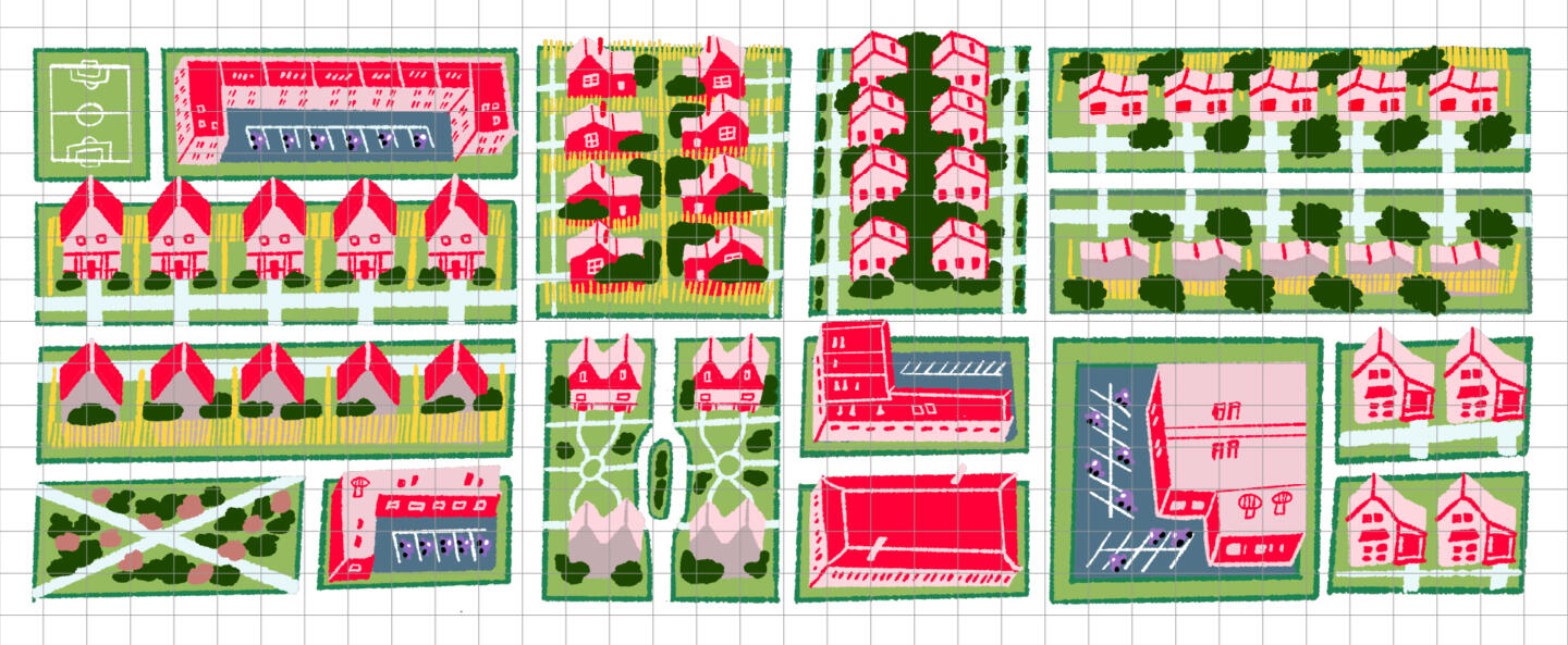
I handed off the illustrated assets to resident CSS expert Joel, who laid out the neighborhood beautifully on our website:
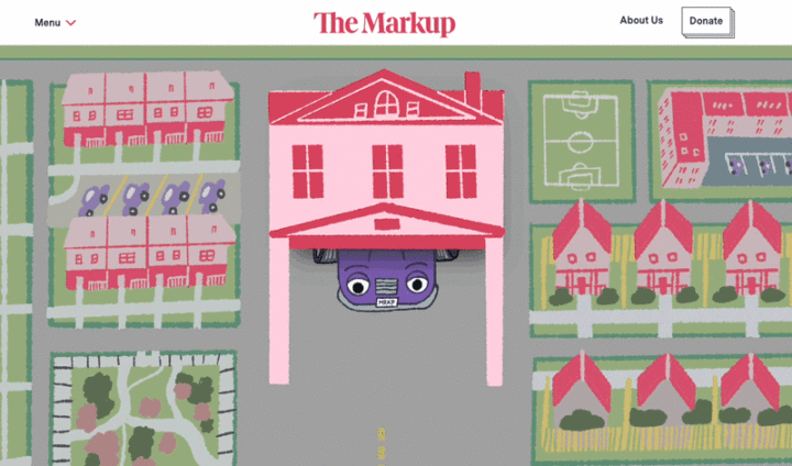
The final result was an opening graphic that introduced readers to an incredibly serious topic in a fun, approachable, and human way. See it in action here. Our newsroom’s focus has always been to humanize stories about technology. Good art can do just that.
Thanks for reading,
Gabriel Hongsdusit
Visual Designer
The Markup & CalMatters