In January 2018, Kelly Ross, a mother of three in Washington, D.C., saw a charge from the children’s education app, ABCmouse, which her kids hadn’t used for nearly four years. She thought she had canceled her subscription and called the company asking why she’d received a bill for about $50.
She remembered the company responded that she should have read the fine print. It wasn’t until Ross called the company out on Twitter that she got a refund, but the experience still frustrates her years later.
“I felt duped in some way because behind the scenes of this wholesome image in this company, they use these deceptive practices,” Ross said. “It should have been more straight-up to be able to cancel it and be done and not have my information on file.”
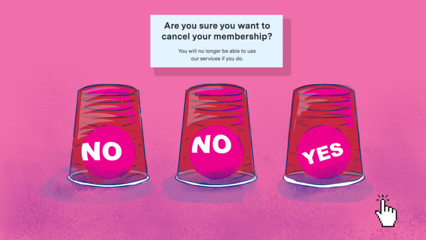
Ross had stumbled across a dark pattern—design choices that steer people into decisions they may not have made under normal conditions. They can take the form of a visual cue like a subscribe button that’s much larger than an opt-out button, or hidden information on pages that people don’t read.
Last September, ABCmouse reached a $10 million settlement with the Federal Trade Commission over its automatic subscription renewals for customers who signed up under a free trial. The company paid out refunds to more than 200,000 people.
“The facts do not support the FTC’s broad claims, and the vast majority of ABCmouse customers are highly satisfied with their memberships,” Kathryn Green, a senior director of communications for ABCmouse’s parent company, Age of Learning, said in an email. “While we cannot comment on litigation, we want every family to have a great experience with ABCmouse and regret any confusion that any subscriber may have had.”
The FTC’s actions come amid growing concerns about dark patterns. The FTC held a workshop on the practice in April, and Sen. Mark Warner, a Democrat from Virginia, and Rep. Lisa Blunt Rochester, a Democrat from Delaware, have said they intend to reintroduce the DETOUR Act to regulate dark patterns.
Tech giants are also facing legal challenges over dark patterns. In January, after researchers accused Amazon of making it too difficult for Prime members to cancel their subscriptions, the Norwegian Consumer Council filed a legal complaint with Norway’s consumer protection authority, while the U.S. consumer advocacy group Public Citizen requested that the FTC investigate Amazon’s dark patterns for maintaining subscriptions. In 2015, LinkedIn settled a lawsuit for $13 million over dark patterns in which it collected new users’ email contacts through deceptive design. The weight loss app Noom faces an ongoing federal lawsuit in the Southern District of New York by a group of consumers who claim they were automatically enrolled into pricey plans.
“Customer trust is at the heart of all of our products and services and we strongly disagree with any claim that our cancellation process creates uncertainty,” Amazon spokesperson Jena Boehnke said in an emailed statement.
LinkedIn spokesperson Leonna Spilman said in an emailed statement that the company works to help members understand how they can manage their information.
“Responsible design is a well-established principle at LinkedIn that has informed our engineering and product development process for years,” she said.
Noom didn’t respond to a request for comment.
In March, California passed a law banning dark patterns, but only for interfaces related to opting out of data collection from the state’s data privacy law.
Harry Brignull, who coined the term back in 2010, said dark patterns have gotten worse.
“I’d hope by naming and shaming these companies and bringing it to light, it would somehow magically make it go away,” Brignull said. “I thought there would be less dark patterns 10 years later. In fact, now, there’s way more than ever before.”
He now runs DarkPatterns.org to crowdsource and call out submitted dark patterns.
Can you spot dark patterns? Take our quiz and see how you do.
-
1 of 6 While shopping you see the following prompt. Is there a dark pattern on this page?
You were shown the Dark Pattern

You were shown the Ethical Pattern

Sorry, that was the ethical design. The dark pattern version of this would be Confirm Shaming, where Correct. The dark pattern version of this would be Confirm Shaming, where Sorry, this is an example of Confirm Shaming, where Correct, this is an example of Confirm Shaming, where the prompts try to sway you into making a certain choice by framing the alternatives as a bad decision rather than having them on an equal playing field.
In the “Shining a Light on Dark Patterns” study researchers found that confirm shaming had a 19.6% success rate at getting people to select the options that benefited the designers.
-
2 of 6 A messenger app you recently installed asks you if you'd like to share your contacts to find friends using the service. Is there a dark pattern on this page?
You were shown the Dark Pattern

You were shown the Ethical Pattern

Sorry, that was the ethical design. The dark pattern version of this would be Nagging, where Correct. The dark pattern version of this would be Nagging, where Sorry, this is an example of Nagging, where Correct, this is an example of Nagging, where the designer requests something but doesn’t allow the user to permanently decline the request.
The “Dark Patterns and Where to Find Them” study found that “Nagging” was the most common dark pattern and was present in more than half of the 240 apps the researchers looked at.
-
3 of 6 To cancel a monthly subscription, you visit the account settings page. Is there a dark pattern on this page?
You were shown the Dark Pattern

You were shown the Ethical Pattern

Sorry, that was the ethical design. The dark pattern version of this would be Hard to Cancel, where Correct. The dark pattern version of this would be Hard to Cancel, where Sorry, this is an example of Hard to Cancel, where Correct, this is an example of Hard to Cancel, where canceling a service is more difficult than signing up for it.
This is sometimes referred to as a “Roach Motel” dark pattern because the traps are easy for bugs to enter but difficult to exit. Several companies have been sued over this dark pattern, including ABCmouse and the weight loss app Noom.
-
4 of 6 You're trying to cancel a membership, and the following prompt appears. Is there a dark pattern on this page?
You were shown the Dark Pattern

You were shown the Ethical Pattern
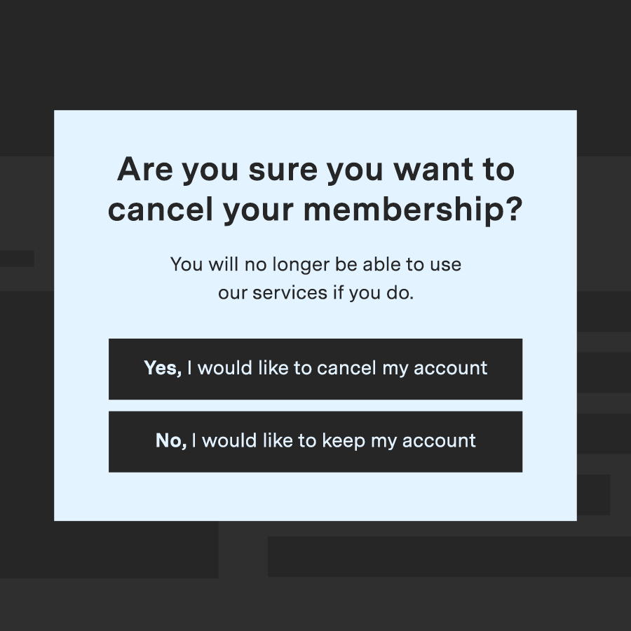
Sorry, that was the ethical design. The dark pattern version of this would be Trick Question, where Correct. The dark pattern version of this would be Trick Question, where Sorry, this is an example of Trick Question, where Correct, this is an example of Trick Question, where the language is ambiguous, making it harder to choose what you actually want.
Researchers found in the “Shining a Light on Dark Patterns” study that trick questions were one of the most effective types of dark patterns.
-
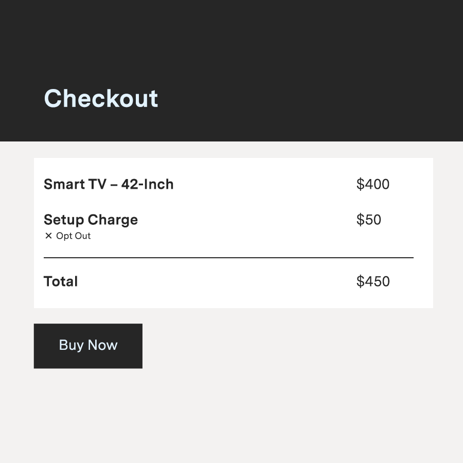
5 of 6 You purchase a new TV online and go to the check-out page. Is there a dark pattern on this page?
You were shown the Dark Pattern
You were shown the Ethical Pattern
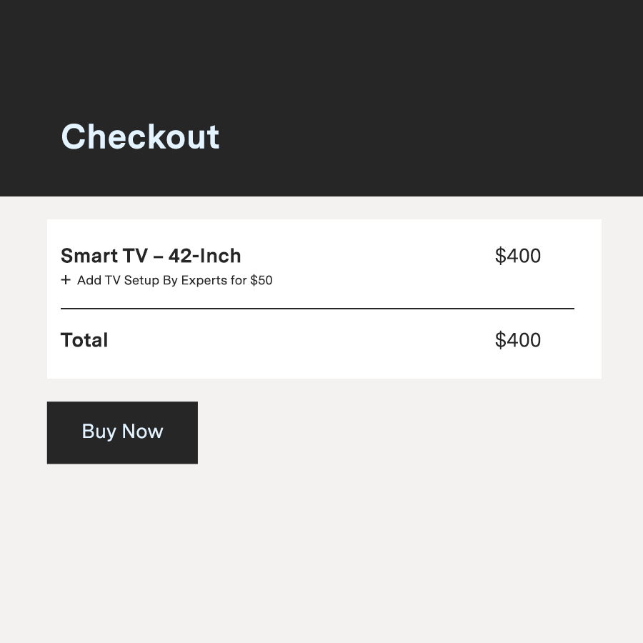
Sorry, that was the ethical design. The dark pattern version of this would be Sneak into Basket, where Correct. The dark pattern version of this would be Sneak into Basket, where Sorry, this is an example of Sneak into Basket, where Correct, this is an example of Sneak into Basket, where items are automatically added into your shopping cart.
These dark patterns take advantage default settings, and advocates argue the practice should be outlawed.
“There are some obvious things that need to stop. You should never be able to sneak things into people’s baskets,” Harry Brignull, the founder of DarkPatterns.org, said.
-
6 of 6 You visit a free website for book reviews to get an opinion on a newly released novel. Is there a dark pattern on this page?
You were shown the Dark Pattern

You were shown the Ethical Pattern
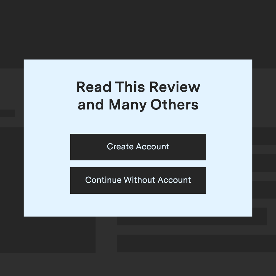
Sorry, that was the ethical design. The dark pattern version of this would be Forced Enrollment, where Correct. The dark pattern version of this would be Forced Enrollment, where Sorry, this is an example of Forced Enrollment, where Correct, this is an example of Forced Enrollment, where you’re required to make an account to use a service.
Researchers classify Forced Enrollment as an “asymmetric” type of dark pattern, where the choices that you have are not equal to the choices the designers have.

