Introduction
In February 2020, the Organ Procurement and Transplantation Network (OPTN), which is the United States’ sole national network for organizing organ transplants, made a change in its policy on how livers are allocated to patients in need of transplants.
The policy change made it so that, in effect, a candidate’s proximity to a donor no longer was the most important factor in deciding who would get the liver. Proponents of the change said this made the system more fair—the policy change would focus on helping sicker people. But opponents have said that poorer states would disproportionately lose out on liver donations, while wealthier states, such as Massachusetts and New York (whose own organ procurement organizations pushed for the change) would benefit.
The Markup, in a reporting partnership with The Washington Post, sought to analyze whether, and to what degree, the allocation policy change did in fact negatively affect these poorer states.
See our data here
The liver transplant and waitlist data OPTN publishes online is aggregated: It can be broken down by state, age group, and other metrics, but it does not get down to the patient level, nor does it show where the livers originated. Without those details, it is impossible to examine the movement of livers in any detail.
So, in order to conduct this analysis, The Markup obtained more detailed datasets through several Freedom of Information Act requests to the Health Resources and Services Administration, a branch of the U.S. Department of Health and Human Services (HHS). The data includes anonymized data on liver transplants, the donors who provided livers, and the candidates waiting for potential transplants, as well as data on the hospitals performing liver recoveries and transplants. We also used data from the Centers for Disease Control and Prevention on the number of deaths from liver disease and cirrhosis that occurred in each state. We used this data to estimate the prevalence of liver disease and thus the possible need for liver transplants, as all candidates on the liver transplant waitlist have end-stage liver disease.

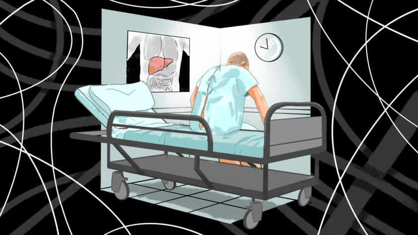
Organ Failure
How a Group of Health Executives Transformed the Liver Transplant System
Hospitals in New York and California engineered a policy shift that let them source livers from hundreds of miles away
Using this data, we analyzed the change in liver transplants occurring in each state before and after the policy change, how the flow of livers into and out of states changed, the change in approximate distance that livers were traveling between donor and recipient, and change in the number of livers that were ultimately discarded.
We found that many of the wealthier states that pushed for the change saw a substantial increase in liver transplants. We also found that those states were often able to perform more transplants by pulling liver donations from nearby states, many of which were simultaneously experiencing declines in liver transplants. Additionally, we found that livers were traveling farther distances following the policy change and that at the same time more livers were being discarded as unusable.
Below, you can find a more detailed explanation of our data sources, methodology, and findings, as well as links to the data and the code we used to analyze it.
Data Sources
Data Obtained From HHS/SRTR
Our analyses primarily depend on datasets we obtained through several Freedom of Information Act requests to the Health Resources and Services Administration, the branch of HHS that oversees that national transplant contract.
That data is primarily maintained by the Scientific Registry of Transplant Recipients (SRTR), which says on its website that it “is responsible for providing statistical and other analytic support to [OPTN].” SRTR is a contractor for HHS.
The records we received include data on:
- Liver transplants: This dataset contains information on 192,982 liver transplants performed from October 1987 to March 2022, including information on the date of organ recovery, date of transplant, the demographics of the donor and recipient, and the state-level organ procurement organizations, or OPOs, that worked to facilitate the transplant.
- Liver donors: This dataset contains additional information on the demographics, death, and organ recovery process associated with each liver donor, including cause of death and more detailed information on their in-hospital care and liver recovery process. The data includes information for 250,941 donors who died and had livers recovered from September 1987 to December 2021.
- Organ transplant candidates: This dataset contains information on the demographics of 341,208 candidates on the waitlist and the severity of each candidate’s liver disease. This dataset includes candidates who have not yet or never received a transplant. The data includes information for candidates who were added to the waitlist from September 1985 to March 2022.
- Organs tracked by OPTN: This dataset includes information on any organs that OPTN considered for recovery and transplantation, even if those organs were never actually recovered and/or used for transplant, sometimes referred to as “discards.” This dataset contains information on the status of 1,048,575 organs considered from September 1987 to June 1997 as well as from January 2013 to March 2022 (with the gap between due to missing data), including the date of recovery (if applicable), the associated OPO, if the organ was shared externally (between states), and if the organ was ultimately used in a transplant. Of the livers in the data, 22 percent were never recovered from the donor, either because an OPO never got authorization for recovery or the recovery failed, and an additional 10 percent were recovered but not used for transplants, either because the liver was ultimately used for other research or not fit for transplant.
Another set of data from HHS/SRTR is information on the hospitals, labs, and other facilities that perform organ recovery and transplants. This data comes collectively from three individual files:
- A data table with information on name, location (city, state, zip code), provider ID, and type of each center (hospital, lab, OPO) involved with transplants. We refer to this as “institution data” below.
- A data table identifying which donors were associated with which hospital, lab, and/or OPO. We refer to this as “donor-hospital crosswalk” below.
- A data table containing the latitude and longitude of each facility. We refer to this as “facility coordinate data” below.
Across these three files, there is information on 712 facilities that perform transplants and 4,553 facilities that recover livers from donors.
Using SRTR’s data on the number of transplant hospitals by state and the U.S. Census Bureau’s data on the total square mile area of each state, we also calculated the number of liver transplant hospitals per square mile for each state.
Other Datasets
Centers for Disease Control and Prevention data: We also used data from the CDC that covers population size and death rates for various different demographic groups (based on race and state of residence), which we downloaded from the CDC’s WONDER database. The WONDER database allows users to download aggregated population and death data based on a variety of demographic factors (including cause of death, age, race, gender, and state of residence). For our analysis, we downloaded data on the deaths associated with chronic liver disease and cirrhosis (ICD-10 disease and condition codes K70, K73-K74) from 2018 to 2021 at four different levels of aggregation: state/year/race (here is the associated query), state/race (query), year/race (query), and state/year (query). We used these different levels of aggregation since the CDC WONDER data suppresses information for smaller demographic groups.
The ICD-10 is the 10th revision of the International Classification of Diseases, which is a universal classification system for designating cause of death. These codes are commonly used for ensuring uniformity in how different diseases and conditions are classified and therefore aggregated in data. We chose the ICD-10 codes above because they are associated with “Chronic liver disease and cirrhosis” within CDC’s WONDER database and because they are also what the CDC uses for its own analyses of chronic liver disease deaths.
Liver transplant counts by OPTN: We also used publicly available aggregated counts of liver transplants from OPTN to validate the number of transplants we counted using the previously mentioned patient-level transplant data. The OPTN data can be downloaded at multiple levels of aggregation (e.g., by state, by recipient race, by donor age) for each year since 1988. We downloaded the count of transplants aggregated by state and recipient age to more accurately compare the count of adult transplants performed in each state during the years analyzed (2018–2022).

Census Bureau data: To add further context to our analyses, we used average household income data from the U.S. Census Bureau’s 2021 American Community Survey. With this data, we used the median household income and examined poverty levels of each state and cross-referenced these measures of state wealth when assessing the states that were affected by the policy change.
Finally, we also used geospatial data from the U.S. Census Bureau that defines the boundaries of the U.S. states and territories. We used this geospatial data to identify the state where a liver was recovered, based on the latitude and longitude listed for that event. (In the donor data we received, the “center” listed for a donor is not the actual hospital where the organ was recovered but rather the OPO responsible for the recovery. Since OPOs can span multiple states, we could not rely on the center-level data listed in the institution data to determine the donor’s state.)
Data Cleaning and Preparation
Time Span Selection
For most of our other analyses, we chose to compare 2019 with 2021 to measure full calendar year data for periods immediately before and immediately after the allocation policy changed in February 2020. We also chose to focus on 2019 and 2021 in an attempt to isolate the impacts of COVID-19 on our findings (see our Limitations section below for more information). To validate this decision, we also conducted similar analyses using two other time periods. First, we tested using OPTN’s publicly available transplant counts and a pre-policy period of 2018–2019 as compared to a post-policy period of 2021–2022. We also tried using pre- and post-policy periods matching those mentioned in OPTN’s own monitoring report that analyzed the impact of the policy change. (OPTN says it uses 730-day periods immediately before and immediately after the policy change date of Feb. 4, 2020, for its analysis, but the date ranges OPTN uses are actually 731 days; we used the same 731-day periods.) In both instances, though the exact data and counts (e.g., the number of transplants performed in each state or the number of discarded livers) varied between these time periods, the major conclusions that we drew from our analyses largely stayed consistent, regardless of the time period used for analysis.
Because of this, though we primarily analyzed data for 2019 and 2021, we cleaned and exported data from January 2018 to February 2022.
States and Territories Included
The data we received includes information on transplants, donors, and candidates from the District of Columbia, Puerto Rico, and the U.S. Virgin Islands. We’ve included the associated data for these in our cleaned data and in our analyses as D.C., Puerto Rico, and the Virgin Islands are all included as part of the OPTN. Throughout this methodology, when we refer to “states” broadly, we are including these nonstates as well, and in all cases, we specify when specific data points or analyses include D.C., Puerto Rico, and/or the Virgin Islands.
In general, data for the District of Columbia is included throughout our analyses. D.C. consistently both performed transplants and exported livers to other states in the years we analyzed, which means it appears just as any other state. The OPTN and CDC both include data on the District of Columbia in their own datasets. The U.S. Census Bureau also considers D.C. as part of the South region, which is where we include it for our regional analyses.
Data for Puerto Rico and the U.S. Virgin Islands appears selectively in our analyses. Puerto Rico both performed transplants and exported livers to other states from 2018 to 2021, and OPTN includes these counts in its publicly available data. The Virgin Islands did not perform any transplants from 2018 to 2021, but there were three transplants during those years where the donor liver came from the Virgin Islands. However, because Puerto Rico and the Virgin Islands are not included in the CDC’s data on death rates and they fall outside of any Census Bureau regions, they are excluded from the analyses that rely on those. Additionally, since there were no transplants performed in the Virgin Islands, the territory is not included in any discussion of state-level transplant counts.
Hospital/Institution Data
We cleaned each hospital’s zip code for uniformity (adding leading zeroes where they were missing and removing the suffixes from ZIP+4 codes) and manually modified the zip code for seven facilities when we observed different zip codes listed for the same facility in the different data files. In these instances, we used the zip code found on each hospital’s website or other directory sources. We cleaned the zip codes for uniformity because they serve as a field, in addition to each facility’s provider ID, for uniquely identifying a hospital when we are determining the coordinates of a candidate’s listing facility.
Candidate Data
We removed candidates listed in need of nonliver transplants (e.g., intestinal transplants) and those who were under 18 when they were listed (since the waitlist and transplant system for children operates differently). In total, those criteria removed 32,707 candidates (approximately 10 percent) of the 341,208 candidates in the raw data. We also limited the dataset to a narrower time span, keeping only candidates who either received a transplant or were added to the waitlist between January 2018 and February 2022. This left us with 57,076 candidates for analysis.
Using the previously cleaned hospital data, we also added data columns indicating the state of the candidate’s listing hospital, based on the facility data discussed above.
Donor Data
We limited the data on donors to those who had their liver recovered in or after January 2018, which left us with 47,919 donors.
Although we excluded child candidates and transplants for children from our other data, we included both (a) children donors and (b) transplants from children donors. The system and process for allocating organs for child candidates is different from the system for adult candidates, which is why we excluded children from our candidate data, but child donors can still donate organs to adult recipients, who are part of the organ allocation system we analyze in this investigation.
Transplant Data
We first limited the data on transplants to those in which the transplant recipient was 18 or older. We also limited the data to transplants that occurred between January 2018 and February 2022, which ultimately left us with 34,526 transplants.
Every donor has a unique ID in SRTR’s system—a series of digits that represents the person without identifying them to the public. This unique donor ID is present in the donor and candidate datasets we received from SRTR but is redacted in the transplant data. (In the candidate data, the ID refers to the candidate’s donor, for candidates who received transplants.) In order to identify the location of each transplant’s donor hospital and recipient hospital, we needed to recover that unique ID. To do so, we compared the demographic information within the transplant data with the demographic information present in the candidate and donor datasets—specifically each person’s age, gender, blood type, race, listing center and/or OPO, date of transplant and/or liver recovery, date of waitlist listing (for candidates), and cause of death (for donors).
We were able to uniquely identify the donor ID for all but eight transplants (34,518 of 34,526, or 99 percent) using the recipient’s demographics alone. Of those eight, all could be identified by additionally matching with the donor’s demographics.
Once we identified the unique donor ID for each transplant, we added the hospital location information (state, latitude, and longitude) for the recipient’s hospital using the cleaned hospital data files. The state, zip code, and provider ID of the recipient’s hospital can be found within the institution data file, which we matched with the recipient based on the facility’s center ID. Using the provider ID and zip code of that facility, we also determined the coordinates of the recipient’s hospital using the facility coordinate file.
To determine the location of the donor’s hospital, we first matched the donor’s ID within the donor-hospital crosswalk, which contains a mixture of unique identifiers for each hospital, including the center type and provider ID. Using these unique hospital identifiers, we matched the donor to the coordinates (latitude and longitude) of the hospital within the facility coordinate data file. For the reasons discussed above, we then used this latitude and longitude to identify the state or territory where the hospital is located.
These processes for identifying the recipient hospital’s and donor hospital’s location (state, latitude, and longitude) succeeded for 95 percent of transplants (32,737 of 34,526). For the remaining 5 percent of transplants (1,789), we were unable to identify the recipient’s or donor’s hospital location for one of two reasons:
- For 1,786 transplants, the transplant was done with a living donor. The data, including location, for living donors is maintained in a separate dataset that we did not have access to.
- For three transplants, the transplant and candidate datasets are missing all information identifying the candidate listing hospital, including center ID, name, and zip code.
These 1,789 transplants are still included in the cleaned transplant data, but we excluded them from any analyses related to donor or recipient location.
Finally, using the latitude and longitude for the facilities that recovered each liver and performed each transplant, we calculated the approximate distance (“shortest path distance”) that the liver traveled between donor and recipient.
Donor Disposition Data
To clean the “donor disposition” data, we limited it to data exclusively associated with livers (as opposed to other organs such as kidneys, lungs, or hearts) and associated with donations that occurred between January 2018 and February 2022, as we did with our other data, leaving us with disposition data for 51,674 donors.
CDC WONDER Data
Upon exporting the various slices of data from the CDC’s WONDER database, we aggregated the statistics into one dataset containing population and death counts for each state, race, and year (e.g., we have a row for all liver disease deaths in Alabama for each year from 2018 to 2021 as well as one row for the combined total from 2018 to 2021). We then used the count of deaths and population provided from the CDC to calculate per capita deaths—the number of deaths divided by the population multiplied by 100,000, to give us metrics such as, “X people out of 100,000 in [state] died of chronic liver disease.”
For these analyses, we exclusively rely on the population and death counts for entire states, as opposed to those of smaller demographic groups (e.g., by race), but we included data for those demographic groups for completeness and in case of any demographic-based analyses in the future.
Core Analyses
Transplants per State
Our first primary analyses set out to answer two related questions: How did the number of transplants change in each state from before and after the policy change? Which states saw the largest increases and decreases in transplants performed?
Using the cleaned transplant data, we calculated the number of transplants that occurred in each state by year and measured the increase or decrease in transplants in each state from 2019 (before the policy changed) to 2021 (after the policy changed). For this calculation, we count the number of transplants in a state based on the location of the hospital that performed the transplant.
In four state-year instances, the number of transplants that we counted using the cleaned transplant data slightly differed from the number of transplants reported on OPTN’s website. These discrepancies were never larger than two transplants in any one state-year and in total account for less than 0.01 percent of our transplants. The OPTN’s transplant counts are updated monthly, according to the SRTR. Additional transplants may have been added retroactively, after we obtained our transplant data.
Additionally, as noted above, we were unable to identify the state where the recipient received a transplant in three instances due to missing data in the transplant and candidate datasets. We excluded these instances from this analysis.
Based on our findings, 14 states plus the District of Columbia had a sizable increase in liver transplants, while seven states plus Puerto Rico had sizable drops in transplants, where we considered sizable to be a shift of more than 5 percent and more than five transplants. The seven states with sizable drops were Alabama, Iowa, Kansas, Louisiana, North Carolina, Pennsylvania, and South Dakota.
Sixteen states did not see a sizable shift. During the same time period, nationally, the number of adult liver transplants increased from 8,345 in 2019 to 8,735 in 2021, a 5 percent increase.
The Coalition for Organ Distribution Equity (CODE) was formed in 2015 to push for the policy change implemented in 2020. Its membership includes 15 organizations (primarily hospitals) across New York, California, and Massachusetts.
Looking specifically at liver transplants in those states, New York saw the biggest increase in absolute liver transplants performed, going from 457 transplants in 2019 to 602 in 2021, a 32 percent increase. California went from performing 903 transplants in 2019 to 959 transplants in 2021, a 6 percent increase. Both New York and California logged their highest number of liver transplants in more than a decade in 2021. Meanwhile, Massachusetts did not see a sizable shift—its absolute liver transplants increased by two.
Of the states that saw sizable drops, despite liver transplants increasing 5 percent nationally, Pennsylvania saw the biggest absolute decrease in liver transplants, dropping from 585 to 505 from 2019 to 2021, a 14 percent decrease. Louisiana saw the next largest drop, from 239 to 174, a 27 percent decrease. Alabama saw the third largest drop, from 128 to 72, a 44 percent decrease.
You can find our complete analysis here.
Per Capita Rates
After analyzing absolute transplant count increases and decreases by state, we looked at our analysis while accounting for each state’s population size. The primary goal of this analysis was to compare and contrast the per capita rate of liver disease, transplant rate, and waitlist size in each state as a way to approximate where transplant needs are unmet relative to the prevalence of liver disease.
When we replicated our transplants per state analysis using per capita rates, we found that three additional states in the South also saw sizable drops: Arizona, Tennessee, and Texas. Again, we consider sizable to be a shift of more than 5 percent and more than five transplants.
Using a combination of the CDC WONDER data and the transplant and candidate data, we calculated per capita rates by first calculating the absolute number of transplants, deaths, and waitlist listings that occurred in the state and then normalizing these based on the CDC’s population estimate to allow for more accurate comparison.
The CDC provides its own version of a per capita death rate in its raw CDC WONDER data. Those are age-adjusted rates, which take into account the fact that different demographic groups have different age distributions. However, calculating age-adjusted rates for other metrics, such as a state’s age-adjusted number of liver waitlist additions per capita, would require data that we do not have access to. For this reason, we used crude per capita calculations for our death rates, so that we could more accurately compare them across all three of our metrics (rate of liver disease, transplants, and waitlist rate/size).
Additionally, when we compare the number of liver disease deaths in a state to the number of liver transplants in a state, there is a subtle difference in the meaning of “in a state.” The CDC counts how many people died of liver disease in each state based on whether their primary residence is in that state. For liver transplant counts, however, we use the state of the hospital where the transplant occurred, even if the recipient who received the transplant primarily lives in another state. For context, recipients received transplants outside of their state of residence 19 percent of the time, among the transplants analyzed from 2018 to 2021.
Using this analysis, we found that following the allocation policy change in 2020, some of the states with the lowest per capita chronic liver disease death rates have the highest per capita liver transplant rates, and that transplant rates got worse for many of the states more affected by chronic liver disease.
From 2018 to 2021, an average of 14.9 people out of 100,000 died from chronic liver disease and/or cirrhosis. Of the 37 states plus the District of Columbia that performed liver transplants during that time, 18 states plus D.C. had lower than average death rates while 19 states had higher than average rates. However, of the 19 with lower than average death rates, 13 plus D.C. saw their transplant rates increase between 2019 and 2021. Meanwhile, only eight of the 19 states that had higher than average death rates saw transplant rate improvements following the policy change.
From these rates, we see that most of the states severely affected by liver disease performed fewer transplants per capita while better off states typically performed more, indicating the policy change did not seem to appropriately change the system to more fairly distribute livers to where they are needed on a per capita basis.
Transplants as a Percentage of Livers Donated, by State
For each state, we also compared the number of liver transplants performed per capita with the number of livers donated per capita, creating a ratio. For example, in 2019, Alabama performed 128 liver transplants and recovered 146 livers, creating a ratio of 0.88. A ratio below 1 indicates a state had more liver donations than transplants. A ratio above 1 indicates a state had more liver transplants than donations. We then analyzed how that ratio changed from 2019 to 2021 across 37 states, D.C., and Puerto Rico.
We found that in 19 states and Puerto Rico, the ratio declined substantially, indicating that the states performed fewer liver transplants relative to the number of livers that they recovered. In 12 states (including New York, California, and Massachusetts) and D.C., we found that the ratio increased. In six states, the ratio stayed consistent, meaning that the change stayed within 5 percentage points.
Because we do not have data on the donating location of living donors, we excluded 1,701 living donor transplants from this analysis.
You can find our complete analysis here.
Liver Import and Export Flow
We also wanted to know whether the policy shift substantially changed the flow of livers between states.
To understand this, we counted the number of transplants that were going out of, and coming into, each pair of states. (e.g., how many transplants had the donor in Texas and the recipient in California and vice versa.)
Additionally, we categorized states based on if they exported a majority of their donated livers to other states (what we called “majority exporters”) and if they imported a majority of the livers they used in transplants (what we called “majority importers”). A state could be both a “majority importer” and “majority exporter” if, for example, it exported all of the livers donated within their state and, as a result, imported any livers necessary for transplants.
As this analysis is largely an extension of the previous analysis of transplants by state, the same caveats apply here. Again, because we do not have data on the donating location of living donors, we excluded the 1,701 living donor transplants from 2018 to 2021 from this analysis.
Through this analysis, we found that states’ liver import and export rates changed dramatically following the policy change. Nationally, the share of livers that were exported for transplant increased from 32 percent in 2019 to 55 percent in 2021. At a state level, in 2019, 22 states (including Puerto Rico and the Virgin Islands) were majority exporters while only nine states were majority importers; in 2021, 42 (including Puerto Rico and D.C.) were majority exporters (82 percent of all states/territories in our analysis) and 31 (including D.C.) were majority importers.
For the median state, the share of livers exported out of a state increased from 42 percent in 2019 to 71 percent in 2021; the share of livers imported also increased, from 31 percent in 2019 to 50 percent in 2021. Additionally, the top importers and exporters for states changed. For example, in 2019, Massachusetts imported 58 percent of its transplanted livers, primarily from neighboring states (Connecticut, Maine, New Hampshire, and Rhode Island). In 2021, it imported 81 percent, with the top providers being New York and Pennsylvania.
You can find our complete analysis here.
Distance Between Donor and Recipient
For this analysis, we wanted to know if the policy change led to transplanted livers traveling farther between donor and recipient.
Using the latitude and longitude of the donor hospital and recipient hospital, we calculated the distance between the locations based on the “shortest distance,” or the haversine method. Using that distance for each transplant, we measured the median distance between the donor and recipient hospitals in the last five years and also counted the number of transplants that traveled more than 200 miles in each year over the last four.
The distance measurement we use does not capture the actual distance traveled by a liver for two reasons:
- The “shortest distance” between the two points is most likely not the actual path the liver took to transport, as it likely had to travel to an airport or along major roads. The measurement we calculate is most likely an underestimate.
- The locations used for the hospital are not necessarily the department or wing where the transplant occurred, which could be in a different side of the hospital or even different part of a city, as some hospitals sprawl across city blocks.
Regardless, our approach is intended as an approximation across thousands of transplants per year, while using the most conservative number possible.
We found that the approximate distance between donor and recipient increased substantially following the policy change, with the median distance being approximately 85 miles in 2019 and 163 miles in 2021. Additionally, the number and share of livers that traveled more than 200 miles rose from 2019 to 2021, increasing from 30 percent of livers in 2019 to 44 percent in 2021.
You can find our complete analysis here.
Discarded Livers
As part of this story, we also sought to understand any trends in the number and rate of discarded livers before, during, and after the policy change.
We conducted this analysis using the “donor disposition” dataset, which shows the status and, if relevant, date of recovery of the organs that are considered for use in transplants.
We determined the status of each liver based on the DON_DISPOSITION (“Disposition of Organ”) field, which indicates where in the transplantation chain the liver ended up. Options include: never authorized for recovery, recovered, never transplanted, and successfully transplanted, among other statuses. We identified livers as being recovered for transplant if the DON_DISPOSITION field was either “Transplanted,” or “Recovered for TX [transplant] but not Tx [used for transplant].” If a liver is labeled as recovered but not used, it indicates that the recovered liver was ultimately discarded.
Though the primary fields used for this analysis appeared to be populated appropriately, some fields in the 2021 data contained a mixture of missing or otherwise unclear values. These included approximately 33 percent of the DON_DISCARD_CD (“Discard Code for Organ Disposition”) field for discarded livers and 36 percent of the DON_ORG_SHARED (“Organ was used in a shared 1 (vs local 0) TX”) field for transplanted livers. When we asked about this, SRTR indicated this is possible for newer data and mentioned that data will likely be filled in over time, meaning there is a chance some values have potential to change in the future based on SRTR revision. Our analysis did not use information from these fields, however, so we do not believe they affect our findings.
We found that after a steady decline in the discard rate in years before 2019 since at least 2013, the number and rate of discarded livers reached a high in 2021 of 949 discarded livers, which is equivalent to 1 in 10 of all recovered livers intended for transplant. The discard rate had increased in 2019 (before the policy change) to 9.5 percent (881 total discarded livers) from its at-least-six-year low of 8.4 percent in 2018, and the additional increase in 2021 indicates an increasing trend in the number of discards, even though that trend began before the policy change.
You can find our complete analysis here.
Donor Cause of Death
States in the Midwest and South historically have had higher per capita rates of donations than other states—in 2021, nine of the 10 states with the most liver donations per capita were in the Midwest and South. The reasons for this are complex, but experts say a primary reason appears to be that these states often have higher rates of death from causes that leave organs like the liver in better condition for transplant. To assess this claim, we first analyzed the cause of death and “mechanism” of death listed for each transplant from 2018 to 2021 to determine the most common causes that leave livers viable for transplant. We then analyzed the rates at which these predominant causes of death occur nationally and by Census Bureau region.
The first part of this analysis (determining the most common causes of death for liver donors) relied on two fields in the transplant data: DON_DEATH_CIRCUM, which refers to circumstance of the donor’s death (most commonly marked as “death from natural causes” or “MVA [motor vehicle accident]” or “Non-MVA [non-motor vehicle accident]”); and DON_DEATH_MECH, which refers to the mechanism of death (most commonly marked as “intracranial hemorrhage/stroke” or “blunt injury”). We did not clean or modify those columns from the original data. There are 1,701 transplants that are missing any classification for either field because these 1,701 transplants are associated with living donors.
Our analysis found that strokes have been the top cause of death among donors nationally since at least 2018 and that drug intoxication became the second most common cause of death nationally starting in 2020 (it was previously fourth, behind blunt injury and cardiovascular-related deaths). By region, as of 2021, strokes rank No. 1 throughout, but drug intoxication is the second most common only in the South and Midwest. In the Northeast and West, drug intoxications rank third, with cardiovascular-related deaths being second in the Northeast and blunt injury being second in the West.
Using this list of top causes of death among donors, we then reviewed data from the CDC to determine if adults more broadly, as opposed to just donors, in the South and Midwest die from these causes at higher rates. To do this, we reviewed two datasets from CDC’s WONDER database. First, we reviewed data from the CDC on the top 15 causes of death among adults in 2020 (the latest year of data), which we reviewed nationally (here is the associated query) or by region (query for the Midwest; query for the South). We also reviewed data on the number and relative death rates due to drug- and alcohol-induced deaths among adults in 2020, both nationally (query) and by region (query).
From these data tables from the CDC, we saw that in 2020, adults in the Midwest and South died at above average rates for both drug-induced causes and cerebrovascular diseases, a category of conditions that include and are most commonly strokes. For example, nationally, an average of 62.3 people out of 100,000 died from cerebrovascular conditions in 2020, while 67.4 out of 100,000 died from those conditions in the Midwest and 68.3 out of 100,000 in the South. This supported the assertions that adults in the Midwest and South die more frequently from causes that are typically associated with viable liver donors.
You can find our complete analysis here.
Limitations
In addition to the specific caveats noted above, there is one broader limitation that applies to our findings.
The OPTN policy change took effect in February 2020, just weeks before the World Health Organization declared COVID-19 a global pandemic. As of this writing, it is still somewhat unclear what sort of impact COVID-19 has had on liver transplants and chronic liver disease death rates. During our investigation, we analyzed the change in transplants from before and after March 2020 and found that there was a sizable dip in transplants in March and April 2020. However, the number of transplants performed per month nationally returned to a normal level within a few months, indicating a negligible lasting impact on overall transplant rates due to that initial COVID surge. As a result, we chose to analyze a pre-policy period of 2019 versus a post-policy period 2021 to limit the potential impacts from COVID, at least during the initial surge of cases in 2020. OPTN and others in the industry have stated they are hoping to study the impact, but as of now, they have not reported findings on the impact COVID-19 has had on the industry.
Responses
The U.S. Department of Health and Human Services declined to answer questions or provide a statement.
Elana Ross, a spokesperson for the Health Resources and Services Administration, a division of HHS that UNOS contracts directly with, said, “The prior administration directed the OPTN to remove the donation service areas (DSAs) and regions from allocation policies and to develop new policies to ensure compliance with federal regulations. The policy is subject to ongoing litigation. The Biden-Harris Administration prioritizes transparency, accountability and equity in organ procurement and transplantation and will continue to assess the current liver acuity circle allocation policy.”
UNOS did not agree to an interview about the policy despite repeated requests. Instead, it answered questions in writing after we shared our analysis and said the findings were biased.
UNOS spokesperson James Alcorn said the data The Markup and the Post used for its analyses was out of date. As an alternative, it pointed to a report published last August that set out to analyze the effects of the policy two years after its implementation. To do so, the report includes analyses that compare data from a 731-day period prior to the policy change (Feb. 3, 2018, to Feb. 3, 2020) to a 731-day period after the policy change (Feb. 4, 2020, to Feb. 3, 2022). We reran our analysis, matching the exact timeline used in the report, to see if it would change our results. Though the exact data and counts (e.g., the number of transplants performed in each state or the number of discard livers) varied from our initial results when we used UNOS’s time periods, the major conclusions that we drew from our analyses stayed consistent, regardless of the time period used for analysis.
Alcorn also said the policy resulted in more highly sick patients receiving liver transplants than before the policy and that fewer patients were removed from the list because of death or becoming too sick to withstand a transplant.
As for the uptick in livers not used for transplant, Alcorn suggested there could have been an increase in less-healthy livers procured during the policy. He did not provide data to support this, however.
COVID-19’s impact on transplants is still being studied, Alcorn said, which “has limited our capacity to fully characterize post-policy outcomes in the same way as in the pre-COVID era.” For example, differences in access to emergency care “in various parts of the country during COVID outbreaks has had a real but unquantifiable effect on transplant access at different times.”
Conclusion
Following a change in how donated livers were allocated to patients in need of transplants in February 2020, there was a sizable change in who was receiving livers for transplant. Some states benefited from the change, performing many more transplants per year, while others saw declines in the number of livers they received and transplants performed. From our analysis, we found that the states disadvantaged by this change were mostly in the South and Midwest, had lower median household incomes, and had worse than average rates of death from liver disease.
We also found that, following the implementation of the policy change, many livers traveled significantly farther distances to arrive at their intended recipients. This change coincided with the highest number of discarded livers in a decade.
This policy change went into effect just over three years ago, right before the first major surge of COVID-19 cases hit the United States. The exact impact that this policy change, both in its relative infancy and due to the simultaneous occurrence of COVID-19, had on the liver transplant industry is still to be determined. However, the trends that we observed in the data indicate that while some states saw a noticeable improvement for their local transplant networks, many states are worse off and are on trajectory to worsen even more.