Introduction
Facebook provides each of its 2.7 billion users with a personalized stream of news, advertisements, and recommendations tailored to what Facebook thinks each user will like.
Many believe that the rise of personalized news and information on a massive scale has changed how people view the world. In 2010, Eli Pariser coined the term “filter bubble” to describe the way algorithms like Facebook’s reinforce users’ beliefs by showing them more of what they already prefer.
According to a 2020 Gallup-Knight survey, 60 percent of Americans feel big tech companies are furthering divides on social issues. And Facebook itself, in an internal report, found that its recommendation engine fueled polarization and radicalization.
But it’s difficult to determine the effects of this personalization because independent researchers can’t easily access Facebook’s platform to study its effects.
Our interactive dashboard, Split Screen, gives readers a peek into the content Facebook delivered to people of different demographic backgrounds and voting preferences who participated in our Citizen Browser project.
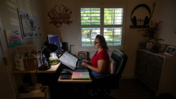
Using Citizen Browser, our custom Facebook inspector, we perform daily captures of Facebook data from paid panelists. These captures collect the content that was displayed on their Facebook feeds at the moment the app performed its automated capture. From Dec. 1, 2020, to March 2, 2021, 2,601 paid participants have contributed their data to the project.
To measure what Facebook’s recommendation algorithm displays to different groupings of people, we compare data captured from each over a two-week period. We look at three different pairings:
- Women vs. Men
- Biden Voters vs. Trump Voters
- Millennials vs. Boomers
We labeled our panelists based on their self-disclosed political leanings, gender, and age. We describe each pairing in more detail in the Pairings section of this article.
For each pair, we examine four types of content served by Facebook: news sources, posts with news links, hashtags, and group recommendations. We compare the percentage points of each grouping that was served each piece of content to that of the other grouping in the pair.
For more information on the data we collect, the panel’s demographic makeup, and the extensive redaction process we undertake to preserve privacy, see our methodology How We Built a Facebook Inspector.
Our observations should not be taken as proof of Facebook’s choosing to target specific content at specific demographic groups. There are many factors that influence any given person’s feed that we do not account for, including users’ friends and social networks. See the Limitations section for more details.
The Pairings
Trump Voters vs. Biden Voters
The feed for Trump and Biden voters compares data captured from panelists who said they voted for Trump in 2020 (674 panelists) with those who said they voted for Biden in 2020 (1,659 panelists). We aimed to get a nationally representative panel; however, we had difficulty recruiting Trump voters, a phenomenon that pollsters similarly faced in the run-up to the presidential election.
Millennials vs. Boomers
The feed for the Millennials and Boomers groupings in our panel is based on generational cohorts with a wide age difference. Boomers (807 panelists) are defined as people born between 1946 and 1964, and Millennials (592 panelists) are defined as people born between 1981 and 1996. This categorization excludes portions of the panel that were not part of these generational groupings. (Sorry, Gen Xers and Zoomers!) While this resulted in smaller group numbers, we chose these categorizations to prevent overlaps between groupings of panelists who would be close to the age cutoffs.
Men vs. Women
The feed for men and women compares data gathered from panelists who self-identified as female (1,542 panelists) with those who self-identified as male (1,058 panelists). Our panel is more heavily skewed toward women.
Measuring Population Differences
For each pair we sought to determine which content was shown to one grouping more often than the other. Focusing on the disparities allowed us to compare content that was popular within a grouping but not necessarily popular overall.
We only consider content that appears in the feed of at least seven distinct panelists or one percent of the total population (whichever is larger) from the groupings being compared in the Citizen Browser project within the specified time span. By default, the time span is set to two weeks, but users can customize the dashboard to display one-week or four-week time spans.
To calculate population percentages in the groupings, we divide the number of unique panelists shown a particular piece of content by the number of panelists in that same grouping during the date range.
To rank content based on population differences, we look for the largest absolute difference in the population percentage points between two groupings (disregarding anything with a difference of less than 0.1 percentage points). So if a piece of content is seen by 5 percent of Trump supporters and 11 percent of Biden supporters, the difference is 6 percentage points. In order to contextualize these values, we look at their distribution in data we have already collected to determine which values are common and which are unusual.
The histogram below shows the distribution of all percentage point differences across all pairings based on content collected over the course of 92 days, from Dec. 1, 2020, to March 2, 2021, a total of 17,332 observations. The most common percentage point difference we observed was between 1 and 2 percent.
Percentage point differences in content shown across all pairings
Counts
Percentage Point Difference
The box plot of this distribution describes it with greater accuracy. The median difference was 3 percentage points, the upper whisker of the box plot is at 17 percentage points, and we consider everything above 17 percentage points to be an outlier in our dataset.
Percentage point differences for content shown across all pairings
Percentage Point Difference
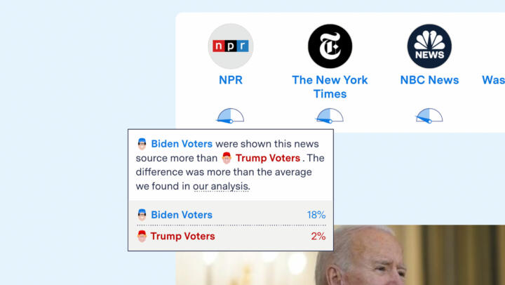
We use the dial below each piece of content to visually represent the difference in the population percentage points between each grouping that was shown the content.
-
Content shown less than the median
-
Content shown more than the median
-
Content shown considerably more than the median
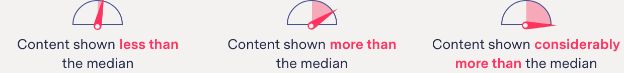
When the dial is in the middle, pointing straight up, the difference is 0 percentage points.
When the dial is pointing all the way to the left or to the right, in the maximum position, the difference between the groupings’ populations is an outlier in our dataset with a value above 17 percentage points.
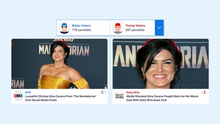
In the example above, the needle for the NPR story points slightly left toward the Biden Voters column because it was seen by 2.7 percent of participants who voted for Biden and 0 percent of participants who voted for Trump. Conversely, for the Daily Wire story, the needle is pointed slightly toward the Trump Voters column because it was seen by 2.9 percent of participants who voted for Trump and 0 percent who voted for Biden.
Additional context is provided in a pop-up window that appears when you hover over the dial (see the figure below). See Appendix 1 for how we identify news links within posts.
Limitations
Inferences
Citizen Browser cannot reverse-engineer Facebook’s recommendation algorithm, and none of our observations should be treated as causal claims that Facebook has targeted a specific piece of content at a specific grouping. A recent Pew Study suggests that “echo chambers” are not an accurate reflection of people’s experiences on social media but rather that most people are exposed to a wide array of political viewpoints and individually choose to block and filter what they do not wish to see.
We do not take into consideration social network information, such as what groups and friends the panelists have voluntarily subscribed to, connected to, or joined, which also influences what content is available for their feed. Using data collected from our Citizen Browser panel, we are only able to demonstrate what Facebook’s recommendations algorithm surfaced to users aggregated by their self-reported demographic and voting preferences data.
We only look at the top seven posts in the news feed in each capture. Unlike Facebook’s CrowdTangle, which measures clicks and likes for posts, Citizen Browser collects how often posts appeared on different participants’ Facebook feeds. The content shown in Split Screen was not necessarily seen or interacted with by our participants.
Proportion of News to Other Links in Facebook Posts
The news stories and news sources shown in the Split Screen dashboard were collected from posts that appeared on each Citizen Browser participant’s Facebook news feed. We found news content makes up only 37 percent of all links at the top of participants’ daily Facebook feeds. See Appendix 1 for how we identify news links.
For news stories and news sources, we do not distinguish among the various possible Facebook accounts that posted it. Whether they came from the news organization, were posted by a group, or were posted by a “friend,” we count them all as the underlying news article.
Sparse Data
Due to the data capture limitations of the Citizen Browser panel, there are instances where there is not enough data to make a comparison between groupings. This happens when we find no links that appeared for at least seven participants and there was not at least 0.1 percentage point difference between how often the content appeared for the two groupings. When this occurs, the interface will display the message “not enough data.”
Grouping Balance
One of the greatest challenges in creating a standalone app for collecting data has been achieving a representative sample. Factors such as distrust of polling and reliance on mobile devices for internet access limited our reach to some panelists. The panel’s demographic makeup and limitations are described in detail in the Panel Description section of our Citizen Browser methodology.
Time Intervals and Panel Makeup
Split Screen gives a peek into the data that was collected in one-week, two-week, and four-week intervals starting on Dec. 1, 2020. The makeup of the panel grouping for each of these time periods is unique because it is based on the cycles of panelists signing up and leaving and the reliability of each panelist’s internet connection on any given day. The median amount of time people participated in our panel was 42 days. During the time panelists participated, they contributed data for a median of 18 days.
Facebook Response
Facebook declined to comment for this story.
Appendix 1
News Sources
In order to categorize a post as a news article, regardless of the source, parsed urls are compared against a dataset of news domains compiled from CrowdTangle’s curated news list, combined with a custom dataset scraped from usnpl.com, which lists newspapers and magazines by state; stationindex.com, which lists television stations by state and by owner; and the websites of several media corporations (Meredith, Sinclair, Nexstar, Tribune, and Hearst). During testing, we added additional urls that appeared in our dataset that were not covered by these sources. Our news repository includes the complete list of news sources used.
Hashtags
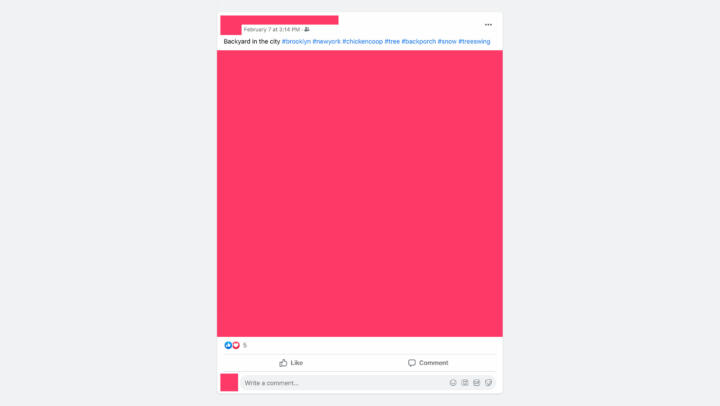
The parser identifies hashtags within post text from the Facebook news feed. All hashtags are converted to lowercase characters. All other text in the post is discarded. In the example below, #brooklyn, #newyork, #chickencoop, #tree, #backporch, #snow, and #treeswing would each be counted as one view.
Group Recommendations
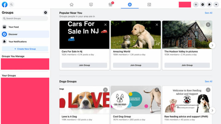
Group recommendations are collected from the panelists’ Facebook Discover page. An average of 31 groups are collected from the Facebook Discover page each time a single panelist’s data is captured. Since Dec. 1, 2020, 124,659 unique group recommendations have been collected.
Correction
This article has been updated to change percentage difference to percentage point difference throughout, for clarity.