Facebook’s financials showed the company made $84.2 billion in advertising revenue in 2020—its major source of revenue. Facebook sells itself as a great way to tailor and deliver ads to highly specific audiences, but how that ad-targeting process works is a mysterious combination of audience selection by advertisers and algorithmic decision-making from Facebook.
Facebook has often played a double game in how it describes its advertising technology, on the one hand downplaying its intrusiveness in communications to users of the platform and on the other pitching companies on the ability to predict future user behaviors and potentially alter those behaviors with advertising.
We can’t completely unravel how Facebook ad targeting works, but we can use our Citizen Browser panel to see if certain groups get more ads than others. Our panel included more than 2,500 people across the country from December 2020 through February 2021 who automatically shared their feed information with us. And as we sifted through the data generated by our panel, we turned up an interesting observation: The average number of ads seen varied by location and demographic characteristics, with state of residence accounting for the largest variation in ads seen.
Discovering Ad Hotspots
To lay the groundwork for our research into Facebook ads, Micha Gorelick—a consultant data scientist for the Citizen Browser project—created a new metric to determine which groups of people were seeing ads more than others: ads per capture.
Ads per capture is a metric that accounts for the fact that the Citizen Browser database is compiled from a series of “data captures” taken from our panelists’ feeds multiple times a day. Each data capture contains a chunk of around 10 to 20 Facebook posts that appeared at the top of the news feed at that moment. (You can learn about the Citizen Browser panelists and data collection process in depth in our methodology.)
So ads per capture (APC) is a number that simply represents the average number of posts that are ads in each data capture we get. In other words, it’s a rough estimate of how many ads a user might see at the top of his or her news feed. And once we have that number for the total dataset, we can refine our understanding by breaking it out by different demographics.
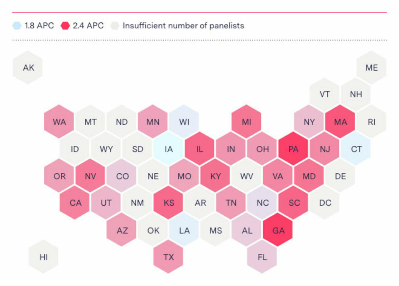
For one thing, we find out that the largest variation in APC corresponds with panelist location. In data from panelists based in Georgia and Pennsylvania, we received an average of just under 2.4 APC between Dec. 1, 2020, and March 1, 2021, with Georgia marginally the higher of the two. These states plus Massachusetts, South Carolina, and Illinois were the top five locations ranked by APC. (As The Markup previously reported, Georgia was the only state in which political Facebook ads were allowed from December to January, which may have impacted the results.)
At the lower end of the spectrum, data from panelists in Iowa, Connecticut, Louisiana, and Wisconsin contained around 1.9 APC, and data from North Carolina averaged 1.96 APC. We discarded data from geographic regions and other demographic groups that comprised less than one percent of our panel size.
Highest and lowest ranked states by APC
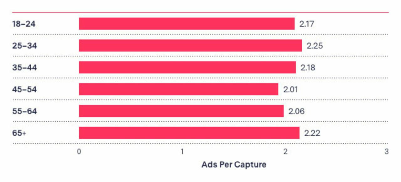
There were also variations by age, gender, and race. Of all the age brackets, data from people aged 25 to 34 had the highest APC, and those 45 to 54 years old had the lowest.
APC by age group
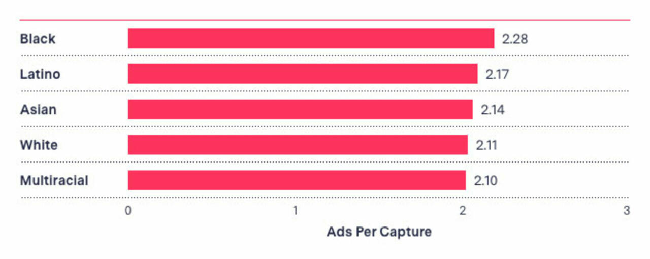
By race, Black panelists had the highest APC, while White panelists and panelists of two or more races had the lowest. Asian/Asian American and Hispanic or Latino panelists ranked somewhere in between.
APC by race
By gender, people who identified as female had a higher APC on average than people who identified as male, although the difference was slight: 2.19 APC for women and 2.08 APC for men. Other classifying characteristics in our analysis, like whether a panelist voted Democrat or Republican in the presidential election, accounted for a negligible difference.
APC by gender
In an email to The Markup, Facebook spokesperson Tom Channick said, “Given its limited number of participants, data from The Markup’s Citizen Browser is not an accurate reflection of the full breadth of ads running on Facebook.”
There are overlaps among categories—a panelist might be a female Asian American aged 65-plus, or a Black millennial living in Georgia—so we can’t compare across categories.
We also can’t say why any group of people in our panel is seeing more ads than others. We don’t know whether these groups see more ads because of targeting toward their demographic category or something else. (The ads we captured in this dataset do not include the information that Facebook discloses about how they were targeted.) As Facebook makes clear in its detailed targeting guidelines, it’s possible for ads to be targeted based on a range of user preferences and behaviors: on-platform activities like previous ad clicks, and other higher-level data like device type and usage, travel history, and the speed of network connection. Given the huge number of variables, it can be hard to say why a particular ad reached a particular group of people.
“We don’t know exactly what factors Facebook uses to choose how to serve ads and to whom,” says Aaron Rieke, managing director of the tech advocacy nonprofit Upturn and co-author of a paper on bias in Facebook ad optimization. “My best guess, which I haven’t seen Facebook refute, is that Facebook uses virtually all the data that it has at its disposal—users’ demographic information, their geography, their interests, and their engagement with content on and off the platform. In such a huge dataset, correlations abound. It’s no surprise, then, that we see massive demographic skews in ad delivery.”
So we’ll keep to the conclusions supported by the data: Based on a pool of more than 2,500 Facebook users and a few hundred thousand posts, we see that for whatever reason, some people are seeing more ads than others.
Thanks for reading.
Corin Faife
Data Reporter
Citizen Browser


